Last updated on
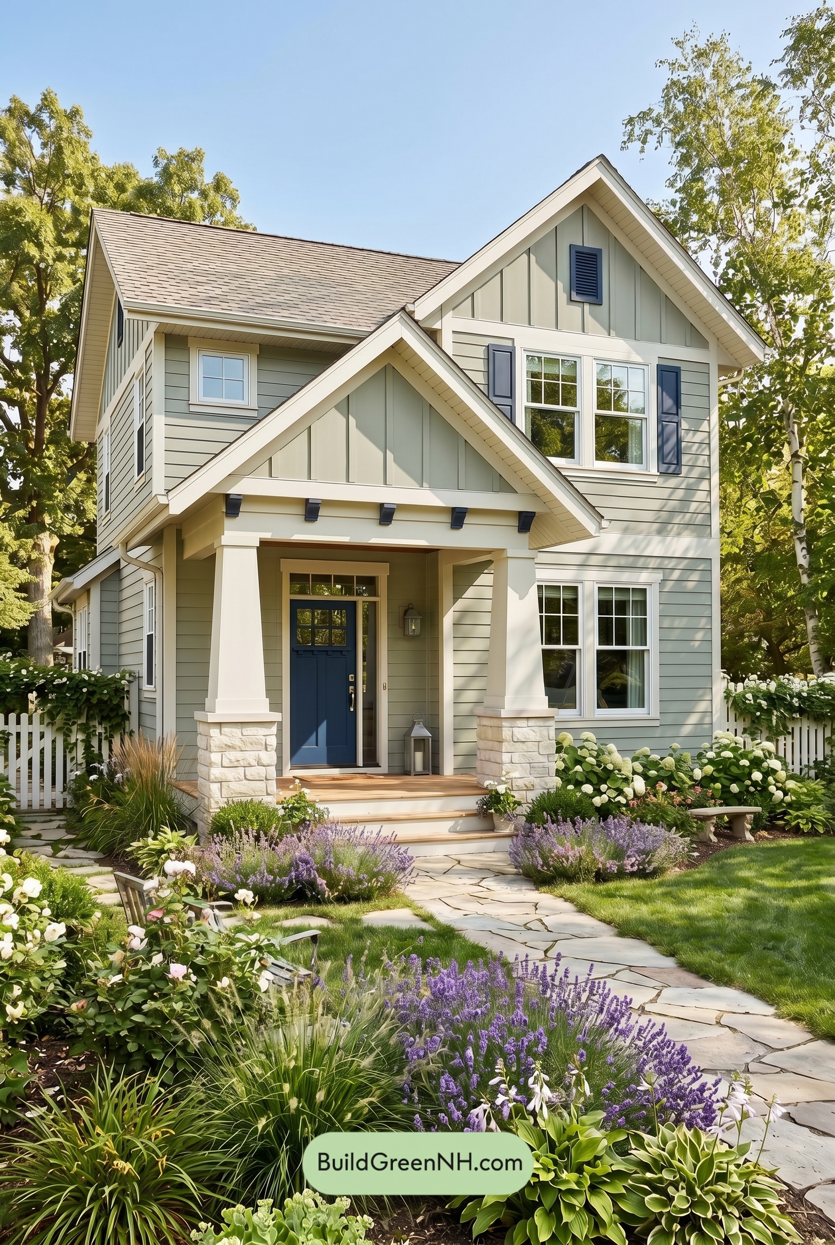

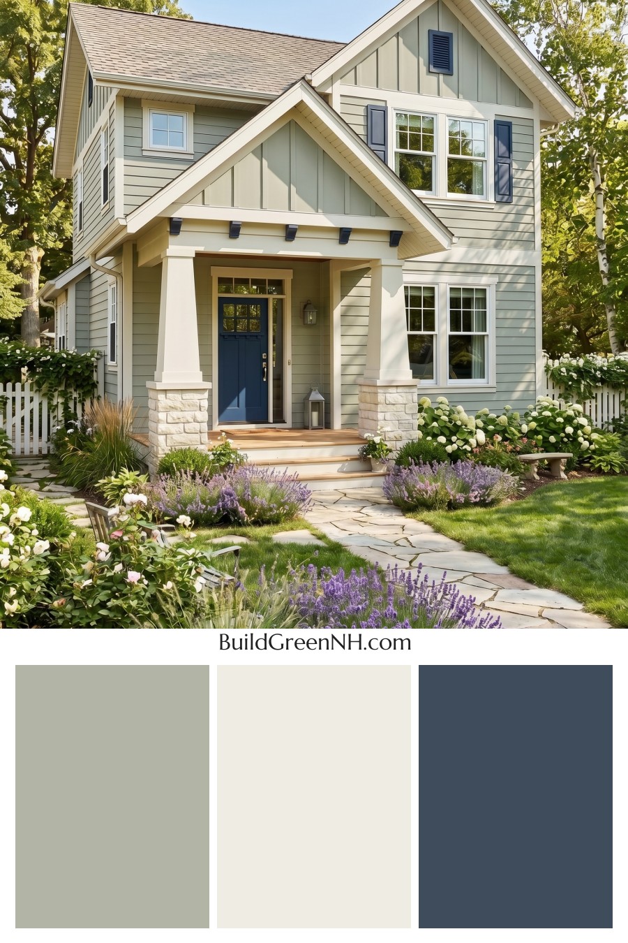
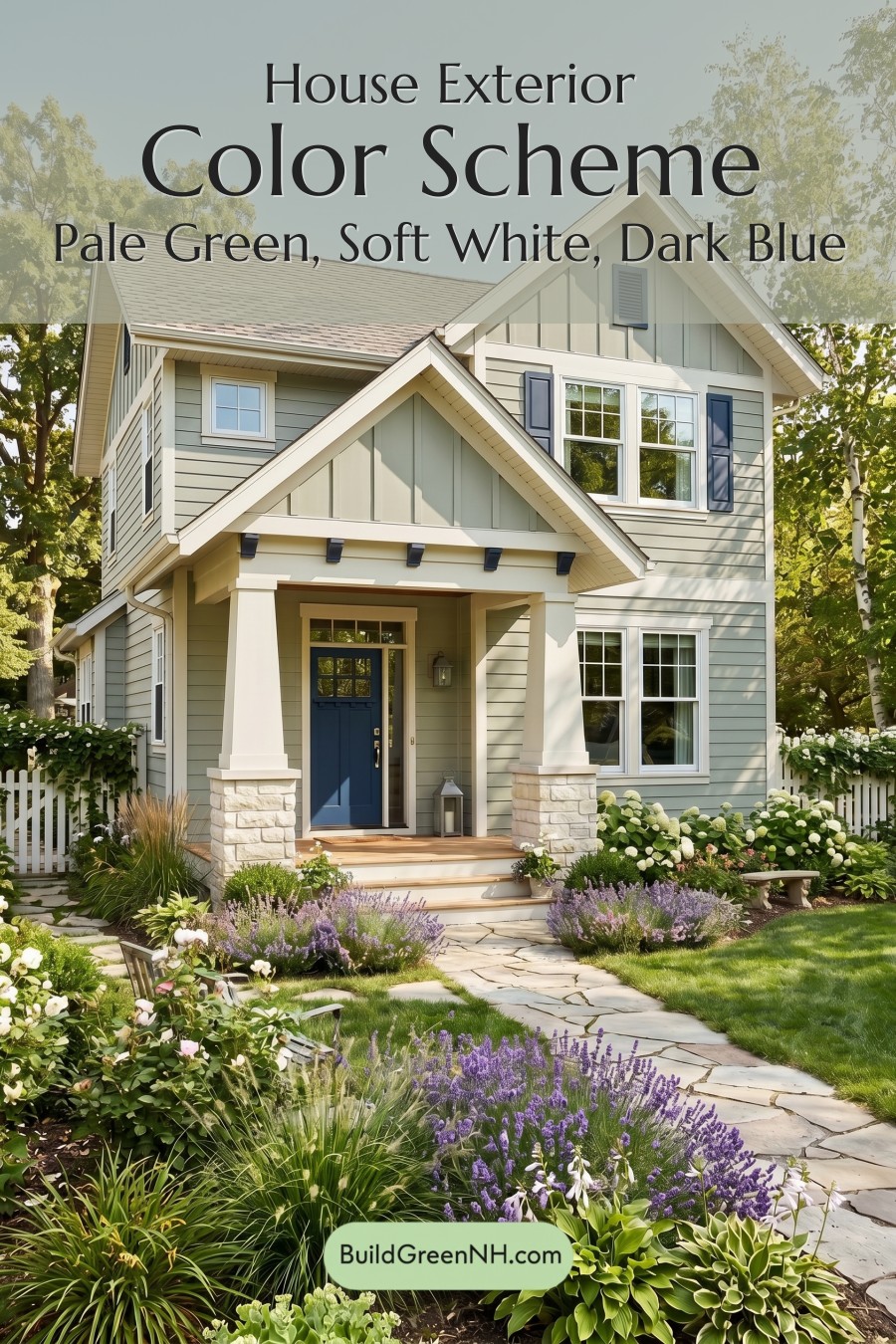
This home’s soft green exterior, crisp white detailing, and deep blue accents create a polished cottage look that feels calm, fresh, and full of curb appeal.
A Gentle Green That Feels Right at Home
The main siding is wrapped in a muted green shade with a relaxed, natural quality. It sits beautifully between earthy and refined, giving the house a grounded presence without feeling heavy. On the upper gables, a similar green family appears in vertical siding, adding subtle texture and height while keeping the palette cohesive.
This layered use of green works especially well with the surrounding trees and garden. Rather than competing with the landscape, the house feels tucked into it, as if the color scheme was chosen to echo the soft greens found outdoors.
Crisp White Trim for Clean Definition
The white trim is a major reason this exterior feels so bright and finished. It outlines the rooflines, windows, porch columns, and gable details with clean contrast, giving the architecture a sharp, tailored look. The white window frames also keep the façade feeling open and airy, especially against the more subdued green siding.
On the porch, the white columns add a welcoming, classic touch. Their pale shade lifts the entire entry area and balances the deeper tones used on the door and shutters.
Deep Blue Accents Add Character
The shutters and front door introduce a rich blue family that brings depth and personality to the palette. This darker accent shade is strong enough to anchor the front elevation, but it still feels calm and traditional beside the green siding.
The front door is especially effective. Set beneath the porch, the deep blue shade draws the eye inward and gives the entry a confident focal point. Matching the shutters to the door helps the whole exterior feel intentional rather than busy.
A Balanced Roof and Natural Base
The roof appears in a soft neutral shade with gentle gray and warm undertones, which keeps the upper portion of the home quiet and complementary. It does not fight the green siding or the blue accents; instead, it acts as a subtle cap that lets the painted elements shine.
At the base, pale stonework and natural porch tones add warmth and texture. These softer neutral elements bridge the crisp white trim and the earthy green siding, making the home feel layered, comfortable, and inviting.
Why the Palette Works So Well
This color scheme succeeds because each shade has a clear role. The green provides softness and connection to the landscape, the white adds structure and brightness, and the deep blue delivers just enough contrast to make the home memorable.
The result is cheerful but not loud, classic but not stiff. It is the kind of exterior palette that feels fresh in spring, lush in summer, and timeless year after year.
Next, see how this color scheme looks under different lighting simulations throughout the day.
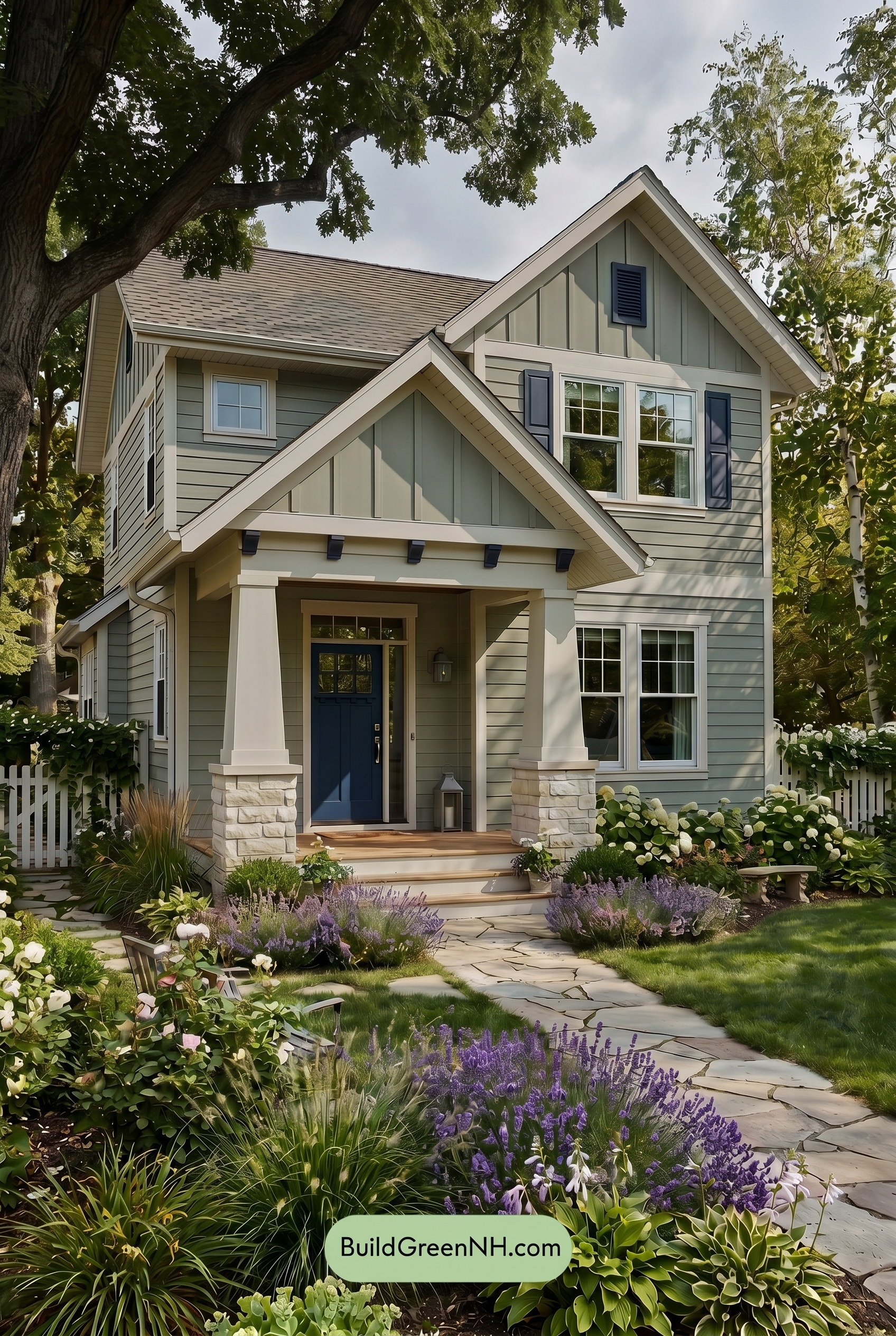
Overcast
Under overcast light, the green siding and upper gables read cooler, quieter, and slightly grayer than they would in neutral daylight. Their saturation softens, so the house feels more muted and relaxed, while the white trim, window frames, and columns lose a bit of crisp brightness and take on a gentler, cloud-filtered warmth.
The blue shutters and front door appear deeper and moodier in this softer light, with fewer sharp highlights to lift them. Shadows become broad and subtle rather than dramatic, reducing contrast across the siding and trim and giving the whole exterior a calm, cozy, understated character.
Golden Hour
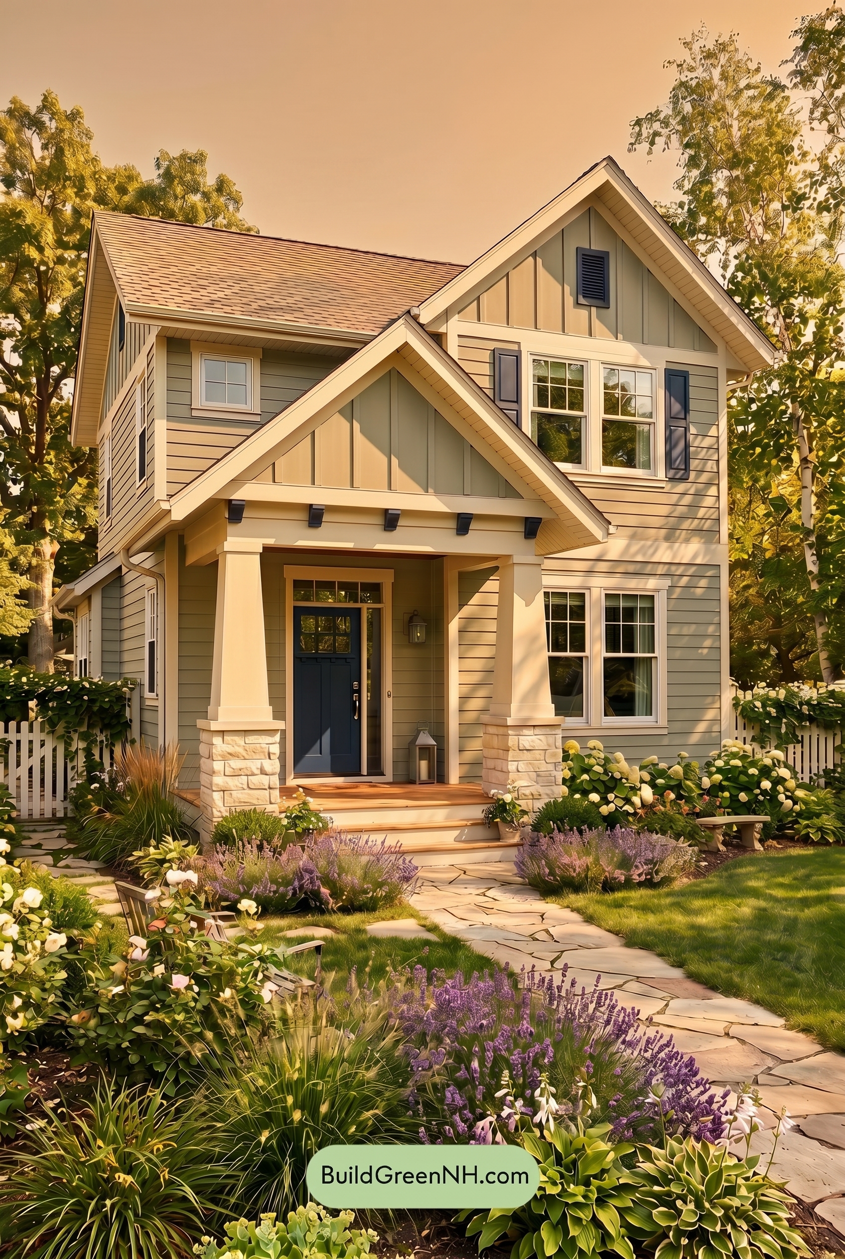
Under Golden Hour, the green siding shifts warmer and more saturated than it would in neutral daylight, taking on a soft, sunlit glow that feels inviting rather than cool. The white trim, window frames, and columns lose some of their crispness and read as gentler warm whites, helping the edges of the rooflines and porch feel softer.
The blue shutters and front door deepen in the low light, creating a richer contrast against the warmed green walls. Longer shadows add dimension across the siding and gables, making the overall palette feel cozier, more layered, and a touch more dramatic than it appears in flat daytime light.
Shade
In shade, the green siding reads cooler and more muted than it would in neutral daylight, with its saturation settling into a softer, mossy feel. The dappled shadows add depth across the boards, making the green shades shift from gentle and airy to richer and more grounded.
The white trim loses a bit of crisp brightness in shade, taking on a warmer, creamier softness that reduces contrast slightly. Meanwhile, the blue shutters and front door deepen noticeably, creating a calmer, more refined mood against the softened green and warm white shades.
Nighttime
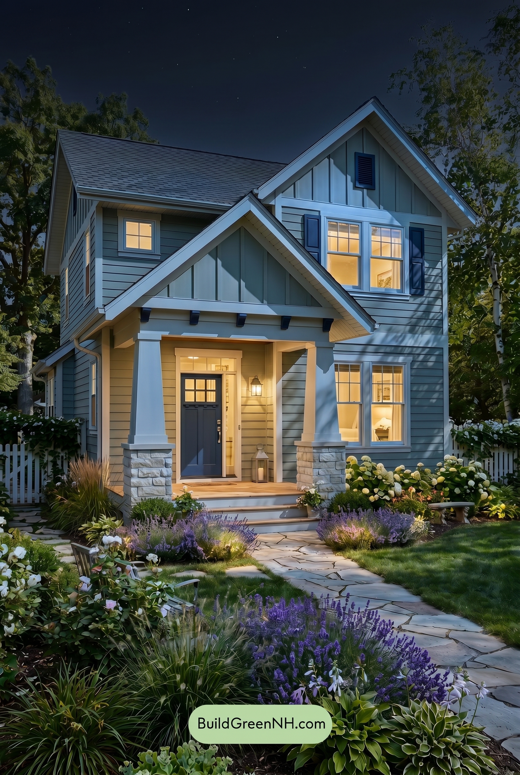
At nighttime, the green siding shifts away from its balanced daylight look and takes on a cooler, deeper cast, with shadows making the shade feel more saturated and layered. The blue shutters and front door also intensify, reading richer and moodier against the darker wall color.
The white trim, window frames, and columns gain stronger contrast after dark, appearing crisp where cool light hits and softer where warm interior glow spills outward. Compared to neutral daylight, the whole palette feels more dramatic and welcoming, with deeper shadows, warmer highlights, and a calm evening mood.
Pin these for later
Want More?
 Green Farmhouse Exterior Color Scheme: Fern White Hearth
 Green Farmhouse Exterior Color Scheme: Pine White Gleam
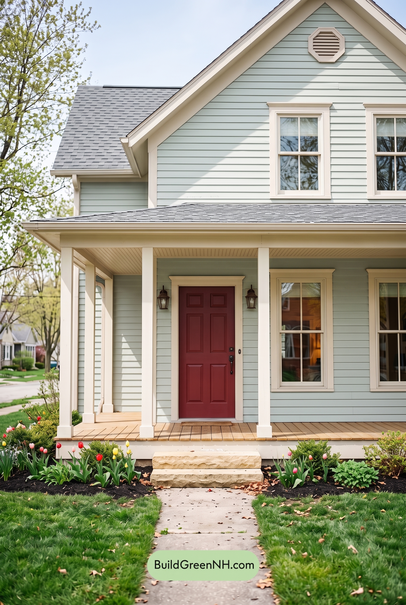 Green Farmhouse Exterior Color Scheme: Mint Cream Welcome
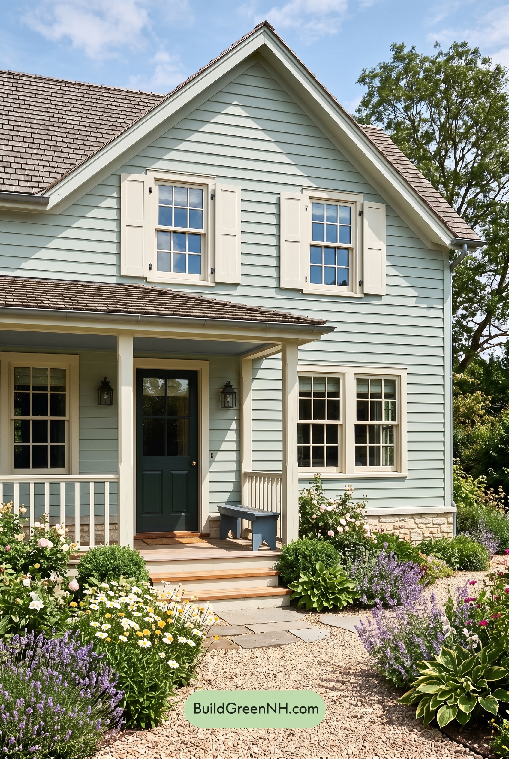 Green Farmhouse Exterior Color Scheme: Celadon Ivory Calm
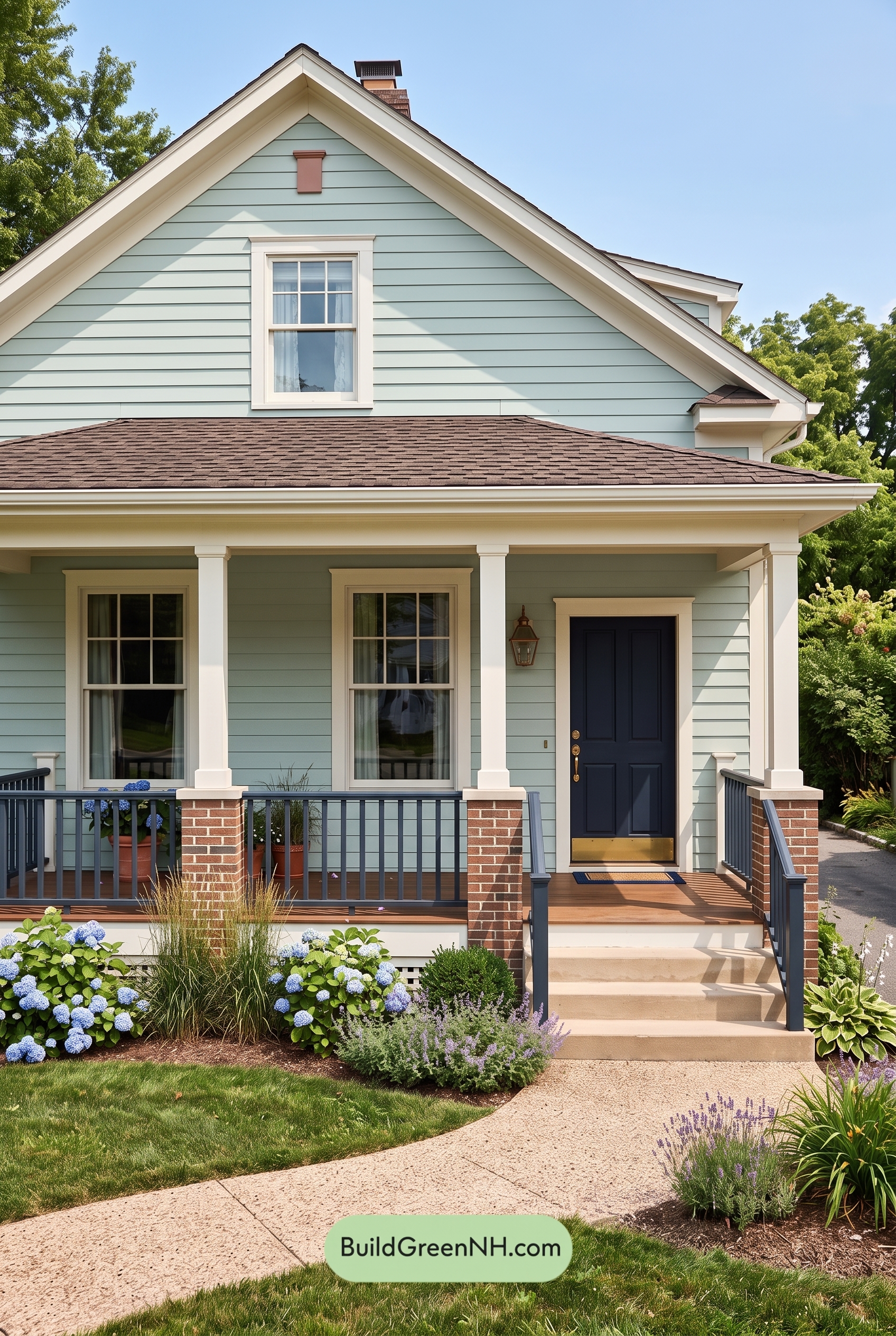 Green Farmhouse Exterior Color Scheme: Seafoam Linen Porch
Table of Contents