Last updated on
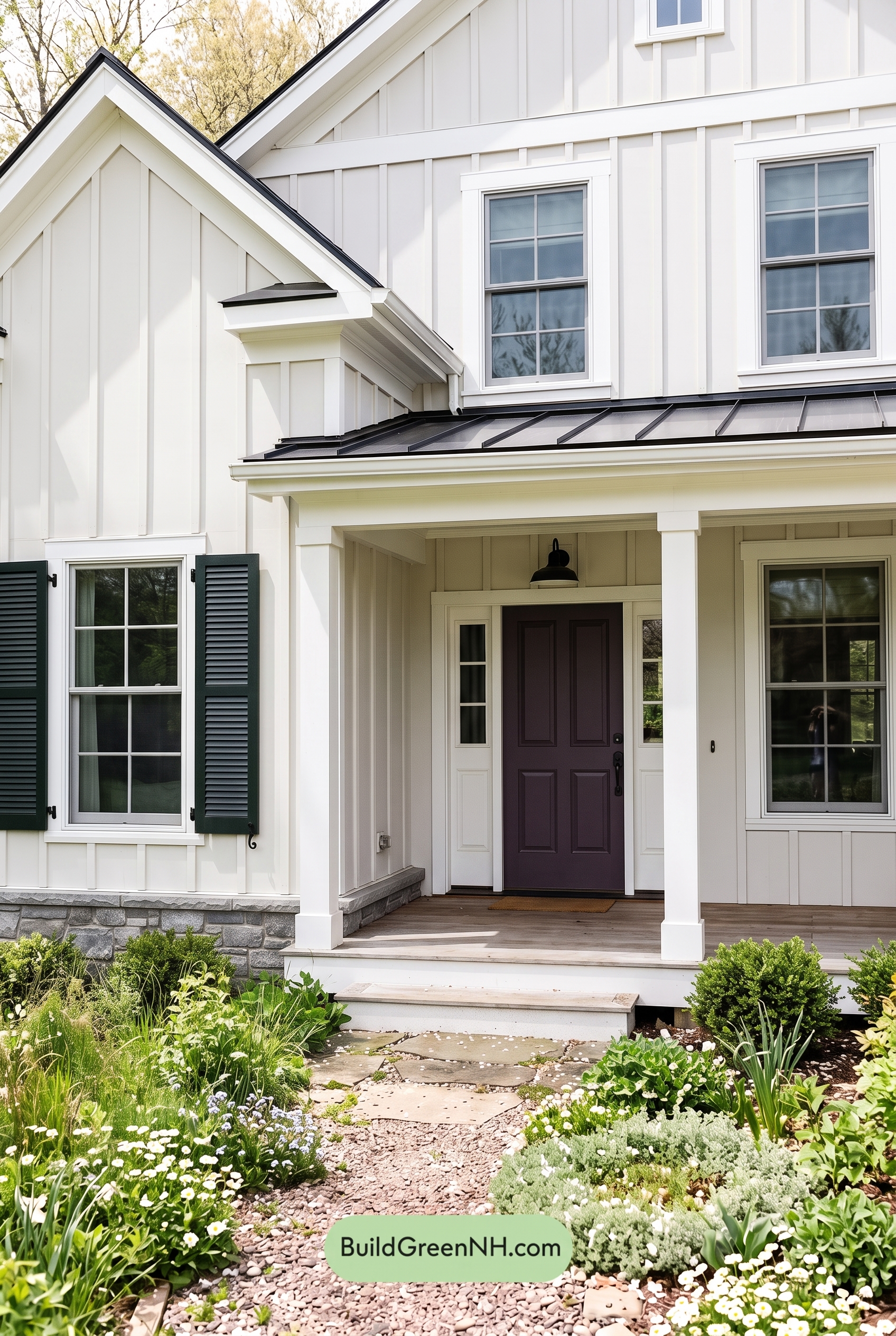

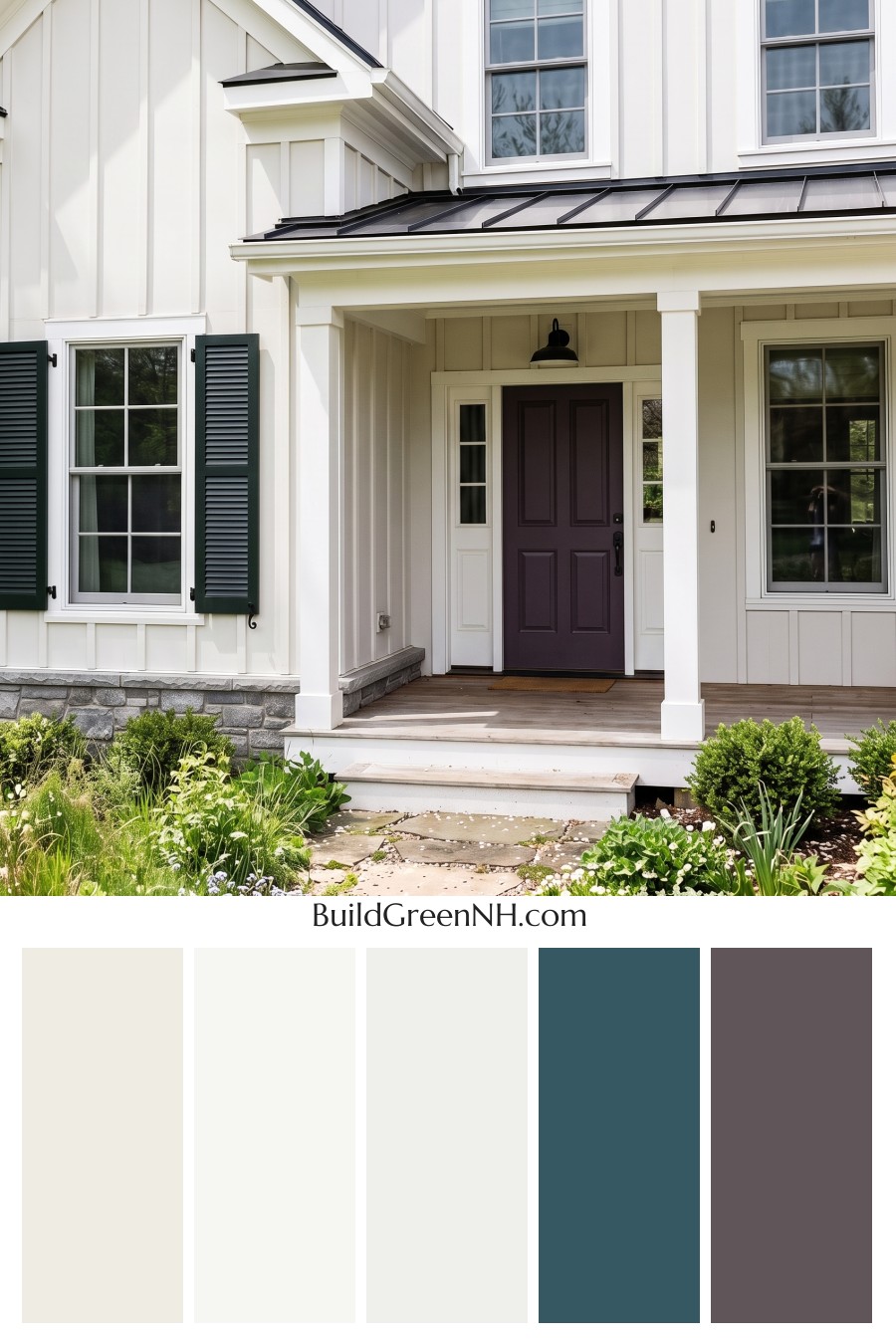
This exterior color scheme shines because its crisp white siding, restrained green details, and deep dark accents create a fresh, polished farmhouse look with just the right amount of contrast.
A Bright, Clean Foundation
The main siding sits in the white family, giving the home an airy and timeless presence. On the board-and-batten surfaces, this light shade highlights the vertical lines beautifully, making the façade feel taller, cleaner, and more architectural.
Because the white shade is soft rather than stark, it feels welcoming instead of cold. It also works especially well with the natural landscaping, letting the greenery, stone base, and porch details stand out without competing for attention.
Green Details That Add Freshness
The trim, columns, and window frames bring in a muted shade from the green family. It is subtle enough to blend gracefully with the white siding, yet it adds a gentle layer of color that keeps the exterior from feeling too plain.
Using the same green family across these details creates a cohesive look. The porch columns feel connected to the windows, the trim feels intentional, and the whole exterior has a calm, nature-inspired rhythm.
Dark Shutters and Roof Accents for Contrast
The shutters introduce a deep shade from the black family, giving the home a confident, classic edge. Against the white siding, these darker accents frame the windows with crisp definition and add visual weight to the lower portion of the house.
The roof accents also lean into a dark shade, which helps ground the palette. This is what makes the overall look feel balanced: the light siding lifts the exterior, while the deeper roofline and shutters give it structure.
A Soft Gray Front Door
The front door uses a darker shade from the gray family, adding a refined focal point beneath the covered porch. It feels understated and elegant, offering contrast without pulling the scheme away from its calm, natural character.
Paired with the surrounding white and green-family details, the gray door feels settled and sophisticated. It gives the entry a sense of depth while still keeping the overall mood relaxed.
Why the Palette Works So Well
This color scheme succeeds because it keeps the main surfaces simple and lets the accents do the storytelling. The white siding feels bright and fresh, the green-family trim and columns add softness, the black-family shutters create definition, and the gray-family door brings quiet depth.
The result is a home exterior that feels clean, charming, and thoughtfully layered. It has classic curb appeal, but the gentle green undertones give it a slightly more organic, garden-friendly personality.
Next, see how this color scheme looks under different lighting simulations throughout the day.
Overcast
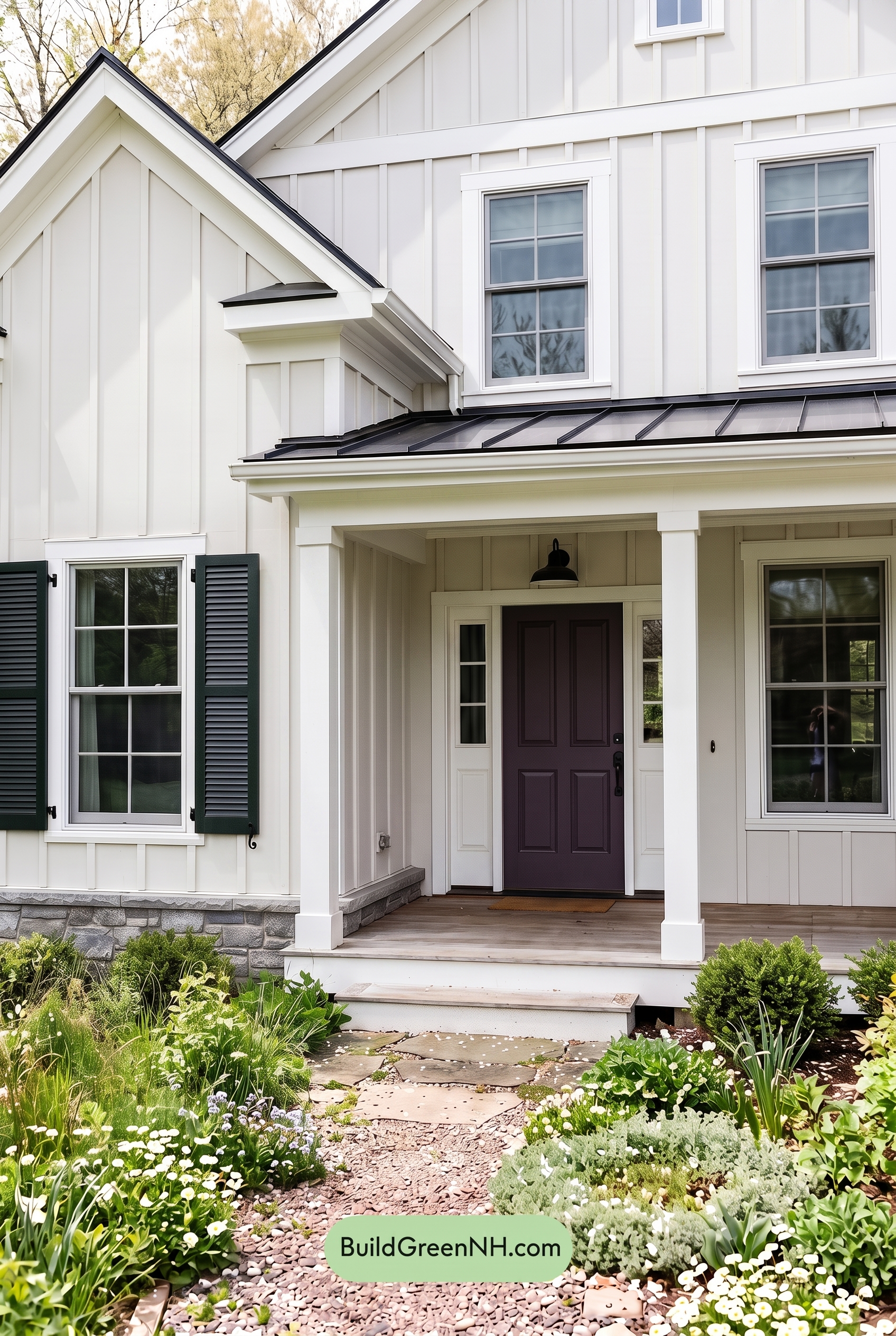
Under overcast light, the white family on the siding and columns loses some of its crisp brightness and takes on a softer, slightly cooler cast. Compared to neutral daylight, the surface feels less warm and less reflective, so the board-and-batten texture reads more gently instead of popping with sharp highlights.
The green family on the trim, columns, and window details appears calmer and a touch deeper, while the black shutters look less stark and more velvety. Shadows become broader and softer, reducing contrast across the façade; the gray front door feels more muted and understated, giving the whole exterior a quiet, cozy mood.
Golden Hour
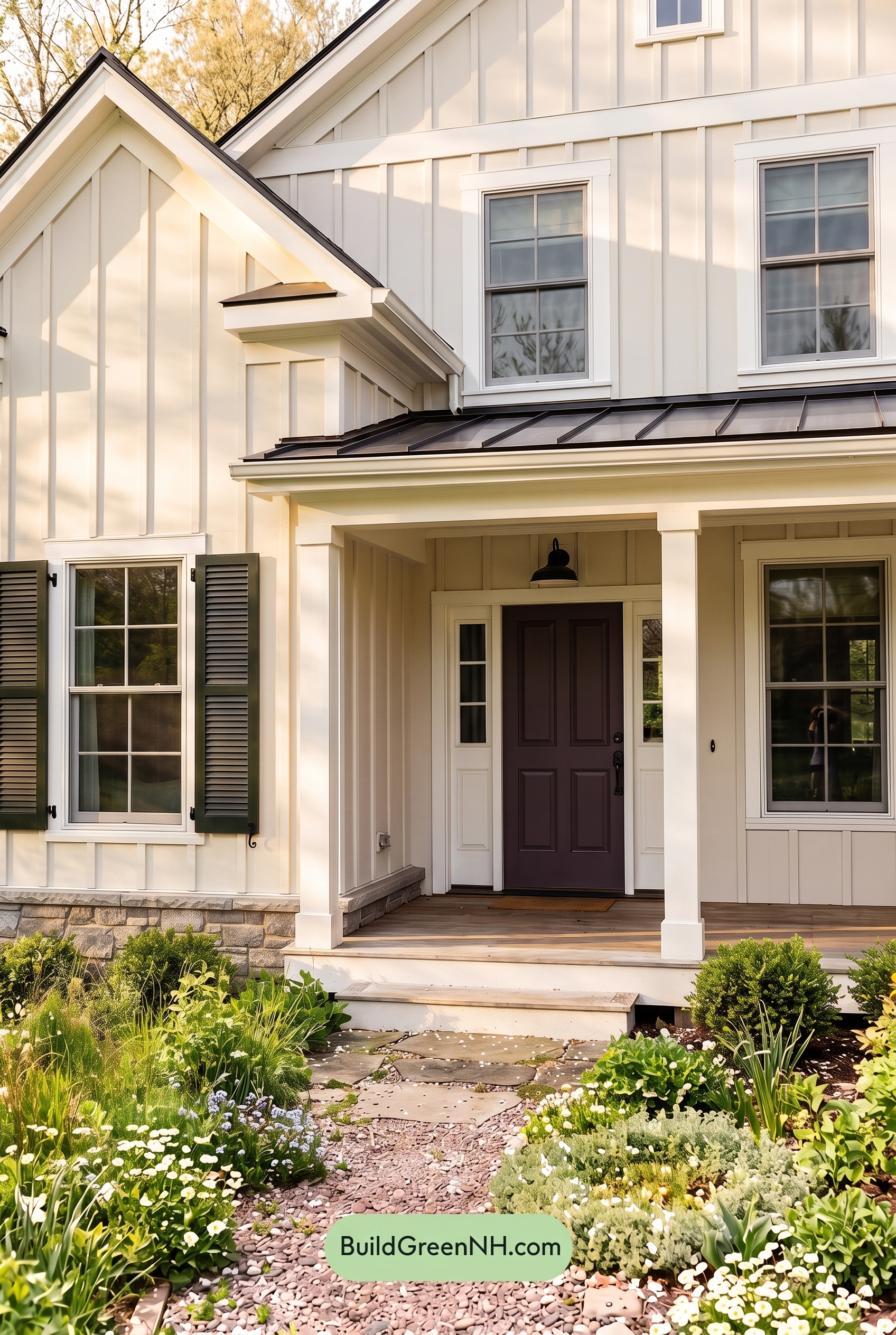
Under Golden Hour light, the white exterior shifts from clean and bright in neutral daylight to a softer, warmer shade with a gentle glow. The green trim, columns, and window frames appear richer and slightly more saturated, while the black shutters feel deeper and more defined against the warmed-up wall color.
Longer shadows add dimension to the board-and-batten texture, creating stronger contrast than flat midday light without making the palette feel harsh. The gray front door takes on a warmer, moodier cast, giving the whole facade a calm, welcoming feel that is less crisp and more romantic than it appears in neutral daylight.
Shade
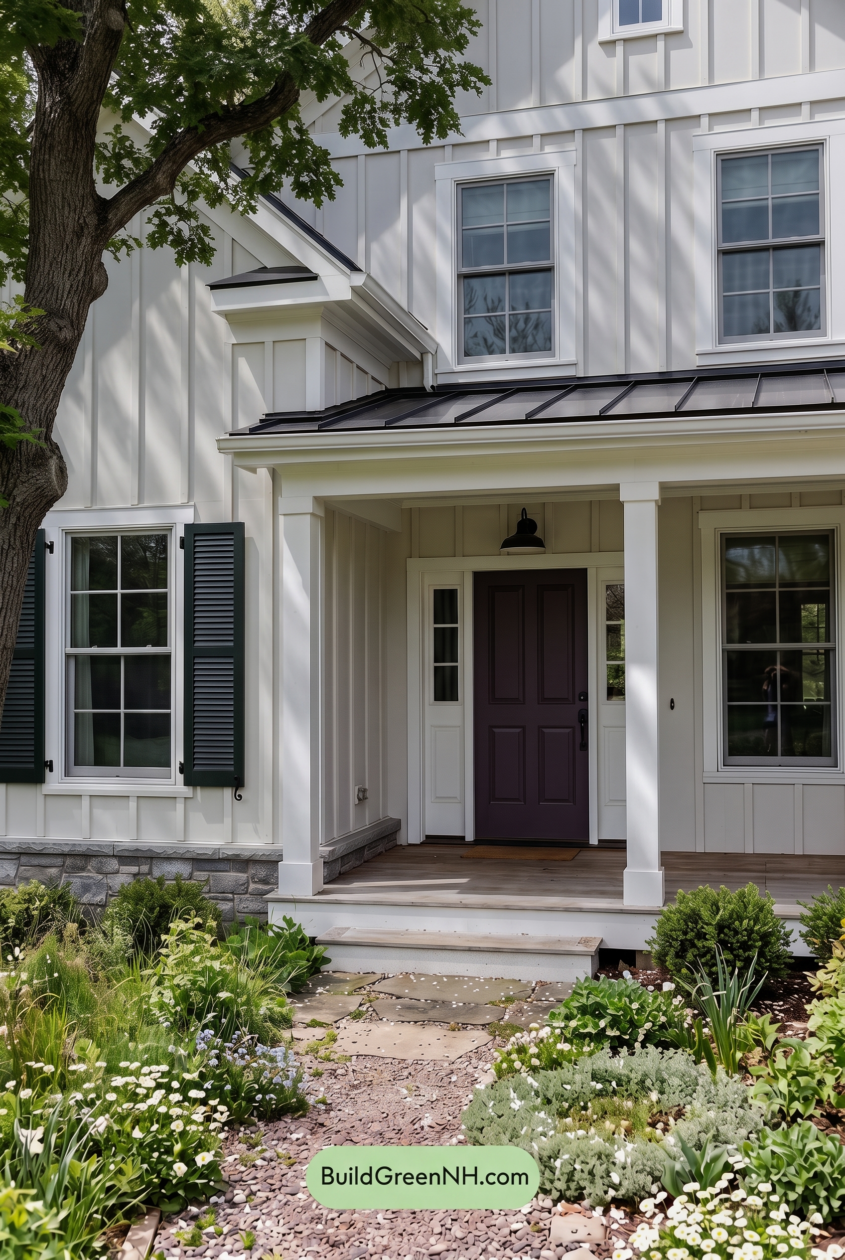
In shade, the white family on the main walls loses some of its bright daylight crispness and reads softer, cooler, and slightly more muted. The green family on the trim, columns, and window frames deepens in saturation, creating a quieter, more grounded frame around the windows and porch.
Compared to neutral daylight, the shadows reduce overall warmth while adding gentle contrast across the siding and architectural details. The black family on the shutters feels more pronounced, the gray family on the front door becomes moodier, and the whole exterior shifts from fresh and bright to calm, shaded, and refined.
Nighttime
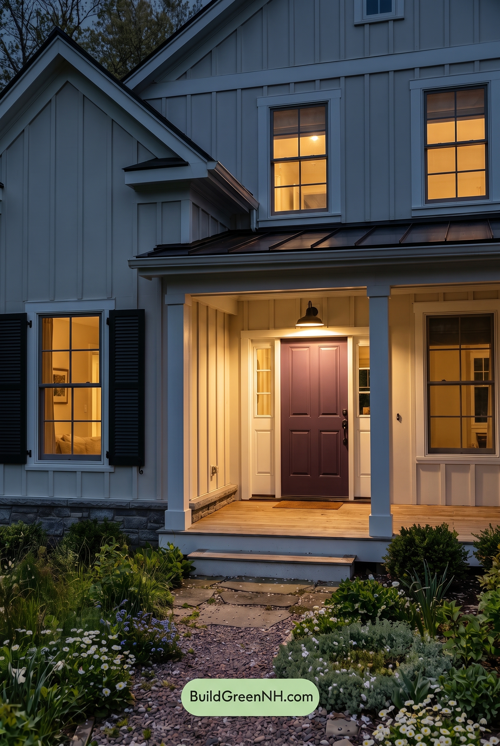
At nighttime, the white family siding shifts away from the crisp balance it would have in neutral daylight, taking on cooler shadowed tones across the upper walls while the porch lighting adds a gentle warmth near the entry. The green family trim, columns, and window frames appear deeper and less saturated in the darker areas, letting the board-and-batten shadows create stronger depth and texture.
The black family shutters become bolder and more graphic after dark, increasing contrast against the softened light walls. Around the front door, the gray family shade feels warmer under the glow, giving the entry a welcoming mood that feels cozier and more dramatic than it would in even daylight.
Pin these for later:
Want More?
 Blue House Front Door Color Scheme: Harbor Saffron
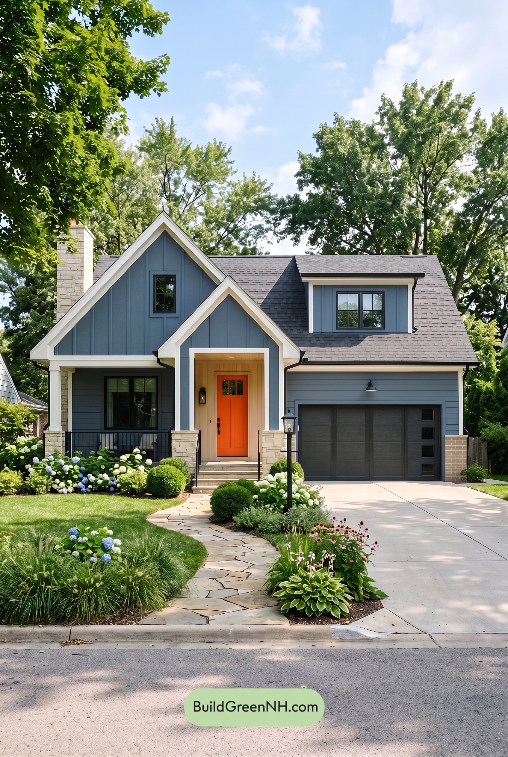 Blue House Front Door Color Scheme: Cobalt Persimmon
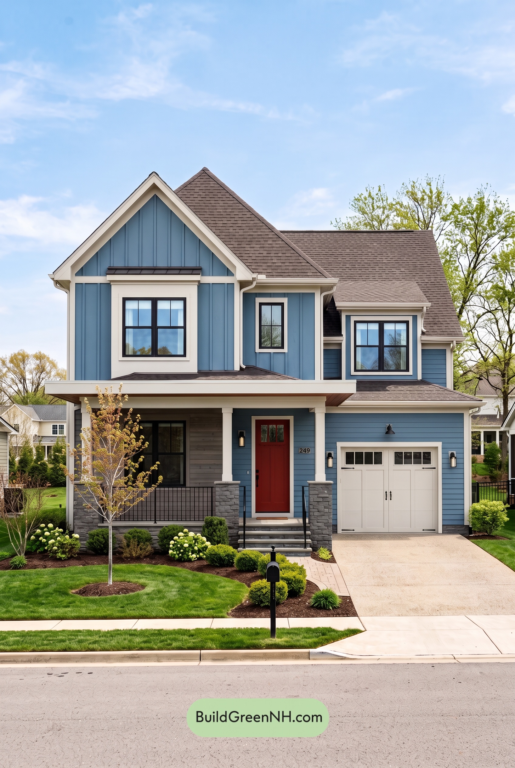 Blue House Front Door Color Scheme: Denim Poppy
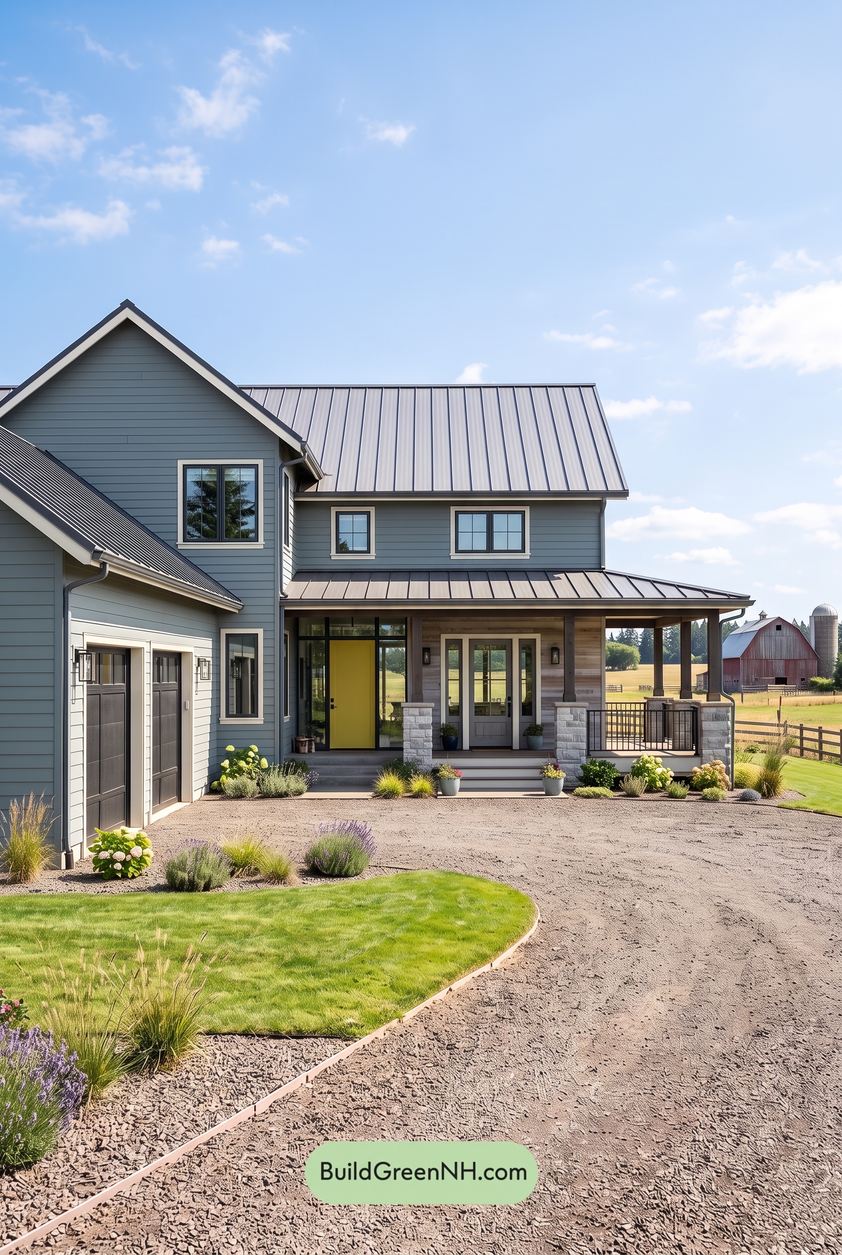 Blue House Front Door Color Scheme: Slate Citron
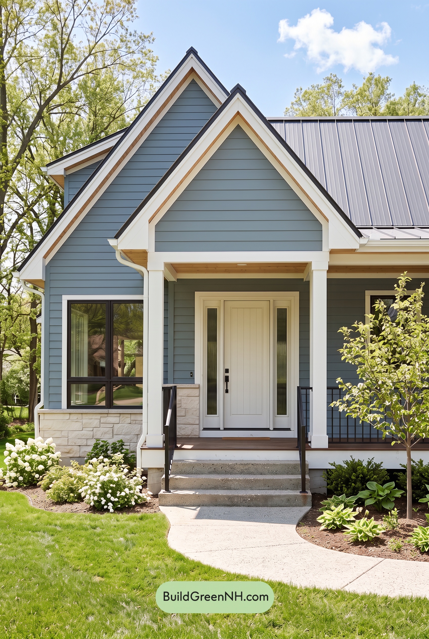 Blue House Front Door Color Scheme: Mist Blue Haven
Table of Contents