Last updated on
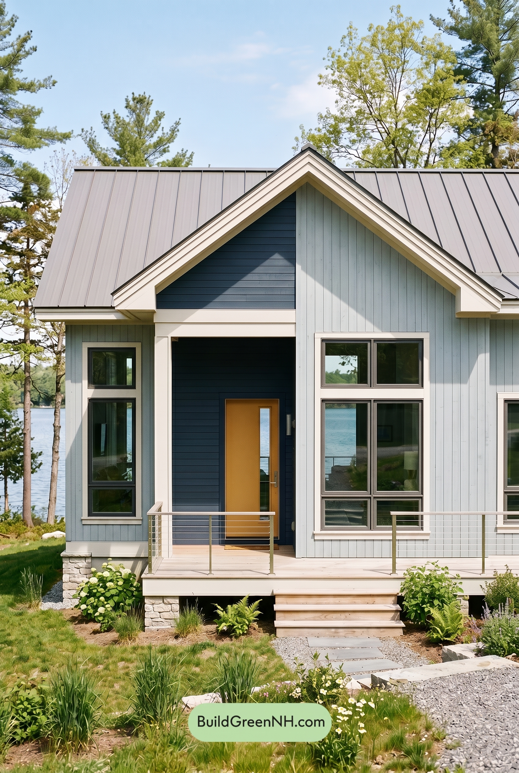

This exterior shines because its cool gray-and-blue palette feels crisp and modern, while the warm orange door adds just the right spark of personality.
A Fresh Take on Cool Neutrals
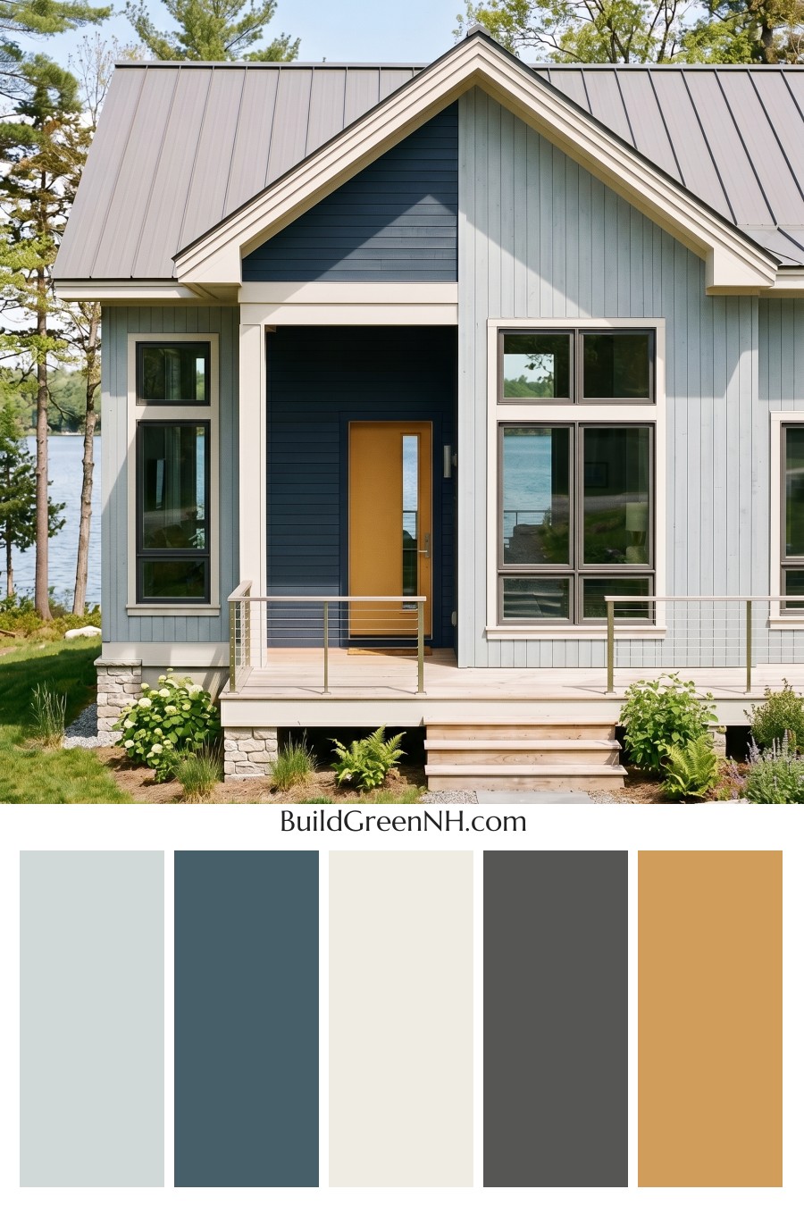
The main siding is dressed in a soft light gray shade, giving the house a calm, airy presence that feels especially suited to its natural setting. The vertical siding helps this gentle gray feel clean and architectural, adding height and rhythm without making the exterior feel busy.
At the entry, a deep blue accent wall creates a strong focal point. Its darker shade adds depth beneath the gable and makes the front door feel more intentional. Because the blue sits within a cool color family, it pairs beautifully with the gray siding while still offering enough contrast to stand out.
Crisp Trim That Defines the Architecture
The trim is finished in a bright white shade, and it does a wonderful job outlining the home’s gables, windows, porch edges, and roofline. This white trim gives the whole exterior a polished finish, sharpening the transition between the light gray siding and the deeper blue accent area.
The white railings continue that clean, fresh look across the porch. They feel light and understated, allowing the stronger blue entry and warm door color to remain the stars of the front elevation.
A Door That Brings the Warmth
The front door introduces a cheerful orange-family shade that instantly warms up the cooler exterior palette. It is bold without feeling loud, and it gives the home a welcoming personality. Against the deep blue backdrop, the door becomes a natural centerpiece.
This warm accent is especially effective because it is used sparingly. Rather than competing with the siding and trim, it adds one confident pop of color right where guests are meant to look.
Roof and Window Details
The roof features a medium gray shade that works seamlessly with the main siding. Its slightly darker tone grounds the upper portion of the home and reinforces the modern, streamlined feel of the exterior.
The window frames also sit in the gray family, bringing a subtle contrast against the white trim. This layered use of gray keeps the palette cohesive while adding enough definition around the glass to make the windows feel crisp and contemporary.
The Overall Mood
This color scheme feels relaxed, refined, and quietly bold. The soft gray siding keeps the home approachable, the deep blue accent adds sophistication, the white trim brings brightness, and the orange door delivers warmth and charm.
Together, these shades create a balanced exterior that feels modern but not cold, colorful but not overwhelming. It is a smart example of how a limited palette can still feel rich, inviting, and full of character.
Next, see how this color scheme looks under different lighting simulations throughout the day.
Overcast
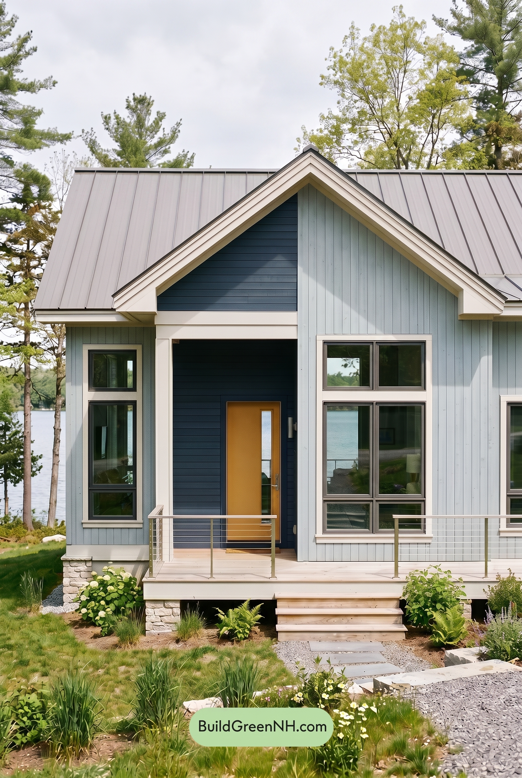
Under overcast light, the gray siding takes on a cooler, softer cast, with less sparkle than it would in neutral daylight. The blue accent shade appears deeper and more muted, while the white trim and railings lose some crisp brightness, creating gentler contrast across the gables and windows.
The orange front door becomes less sun-warmed and more subdued, though it still adds a welcoming lift against the cooler gray and blue families. With shadows diffused and edges softened, the whole exterior feels calmer, quieter, and a bit more refined than it does in clearer daylight.
Golden Hour
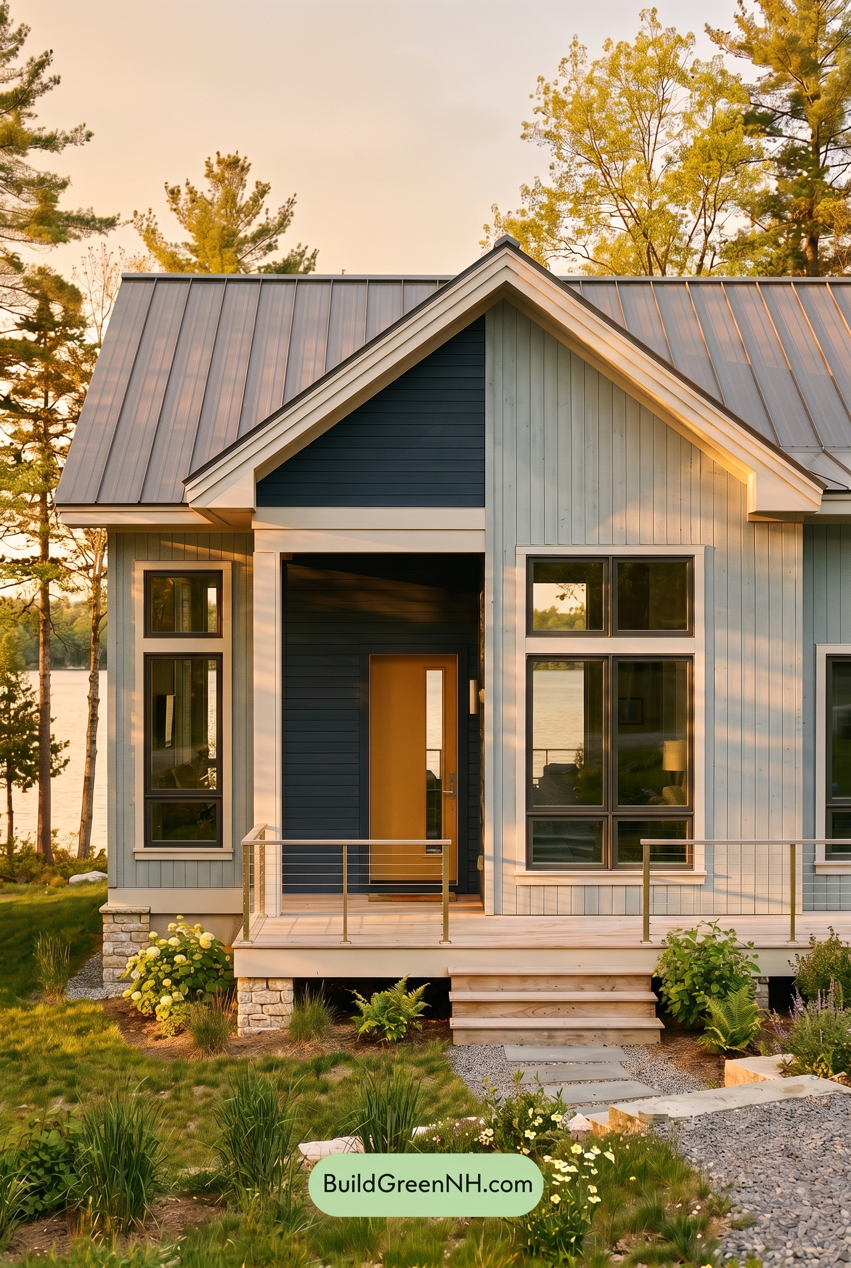
Under Golden Hour light, the gray siding shifts from a cooler, more neutral read to a warmer, softer shade, with the low sun bringing out gentle beige undertones. The blue accent area appears deeper and more saturated than it would in neutral daylight, while the white trim and railings pick up a creamy glow that makes the edges feel less crisp but more inviting.
Longer shadows increase contrast across the façade, especially around the window frames and recessed entry, making the darker shades feel richer and more dimensional. The orange front door becomes warmer and more vibrant, giving the whole exterior a relaxed, welcoming mood compared with the cleaner, flatter balance of midday daylight.
Shade
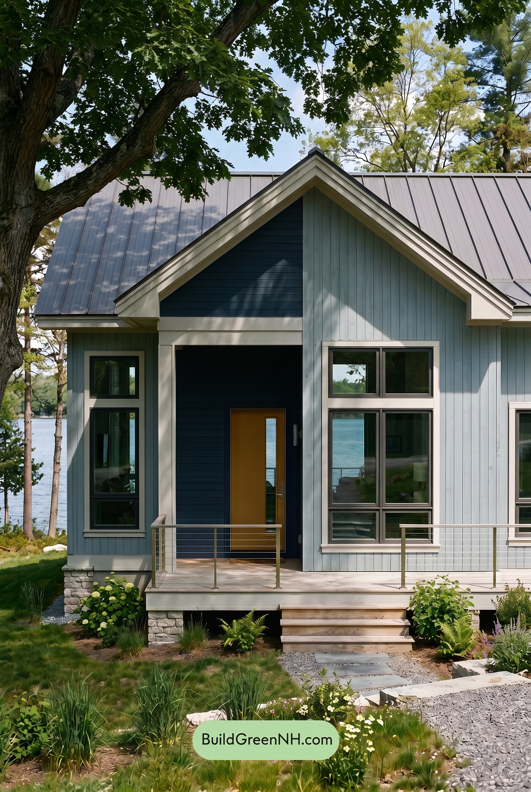
In shade, the gray family on the main walls reads cooler and a bit more subdued than it would in neutral daylight, with lower saturation and softer warmth. The blue accent deepens noticeably, gaining a richer, moodier presence as shadows settle into the siding and increase contrast around the entry.
The white trim and railings lose some crisp brightness in shade, shifting toward a gentler, creamy softness that feels calmer rather than stark. The orange front door stays warm, but its glow becomes more muted, creating a cozy focal point against the darker blue and cool gray shades.
Nighttime
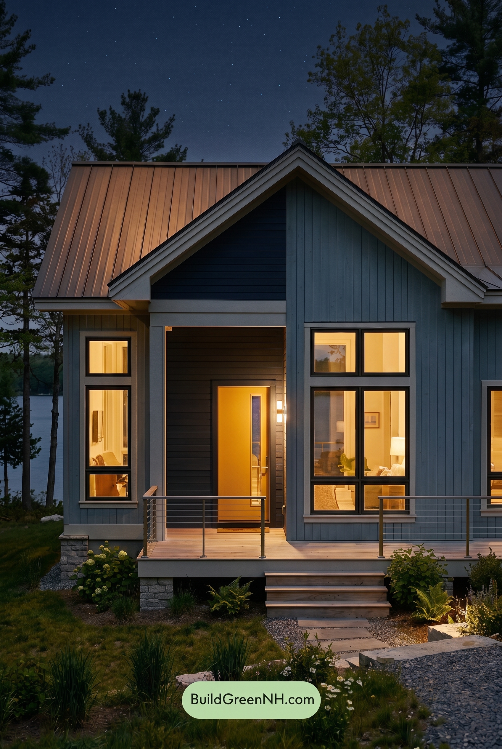
At nighttime, the gray siding cools and deepens compared to neutral daylight, while the blue accent areas become more saturated and shadowed. The white trim and railings catch the limited light with sharper contrast, making the rooflines and window edges feel crisper against the darker wall shades.
Warm interior lighting shifts the mood dramatically, adding a soft golden glow that makes the orange front door feel richer and more welcoming. Shadows gather under the gables and around the darker gray window frames, creating a cozy, high-contrast exterior with a calm, dramatic evening presence.
Pin these for later:
Want More?
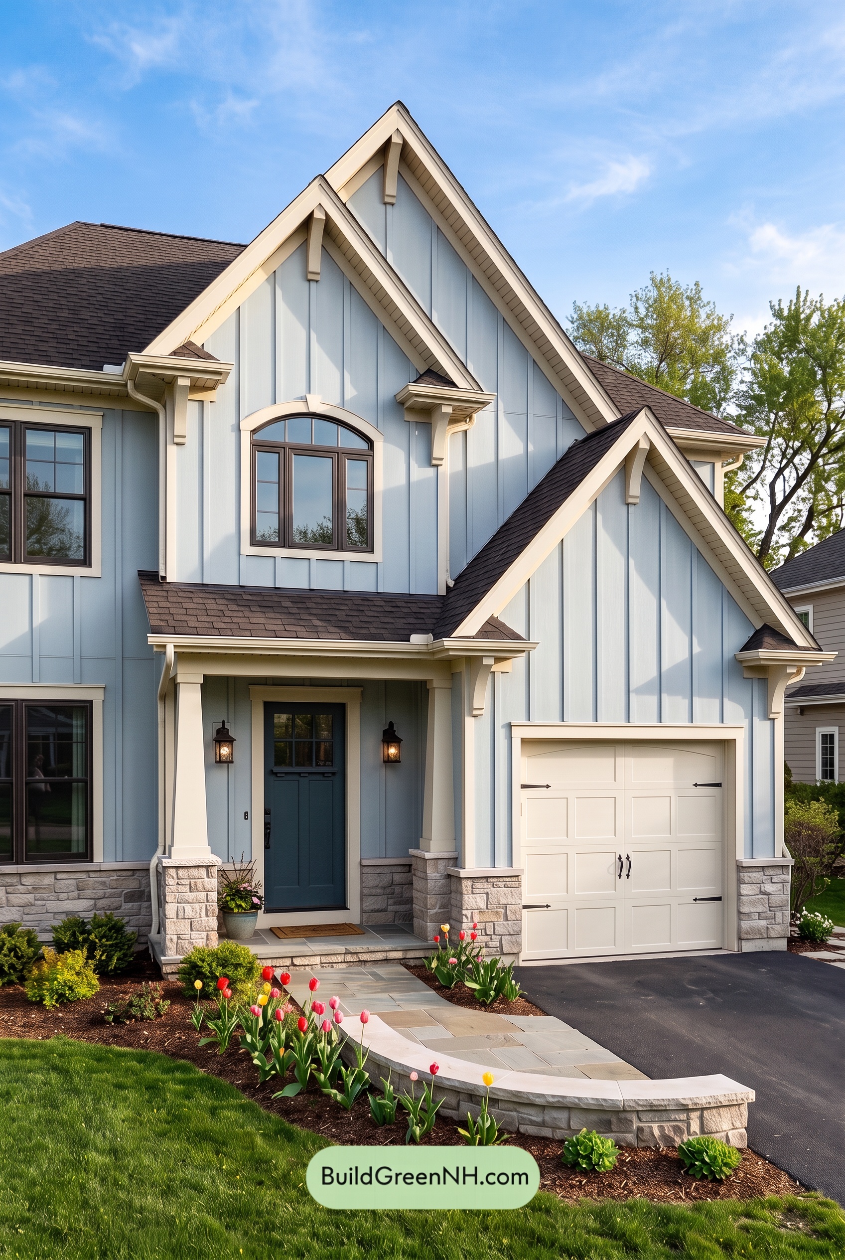 Exterior Color Scheme with Stone Accents: Bluebell Gable Song
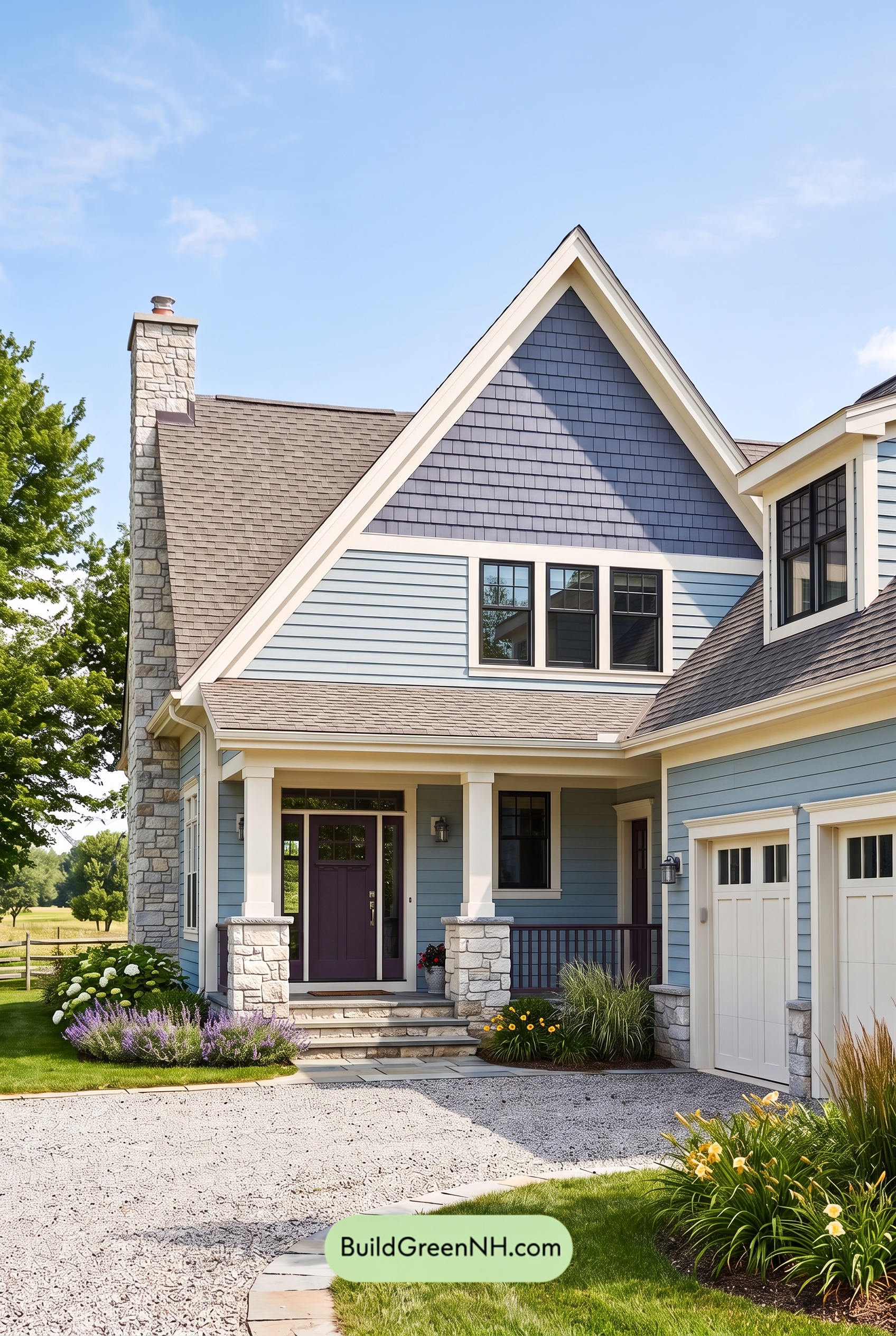 Exterior Color Scheme with Stone Accents: Meadow Bell Welcome
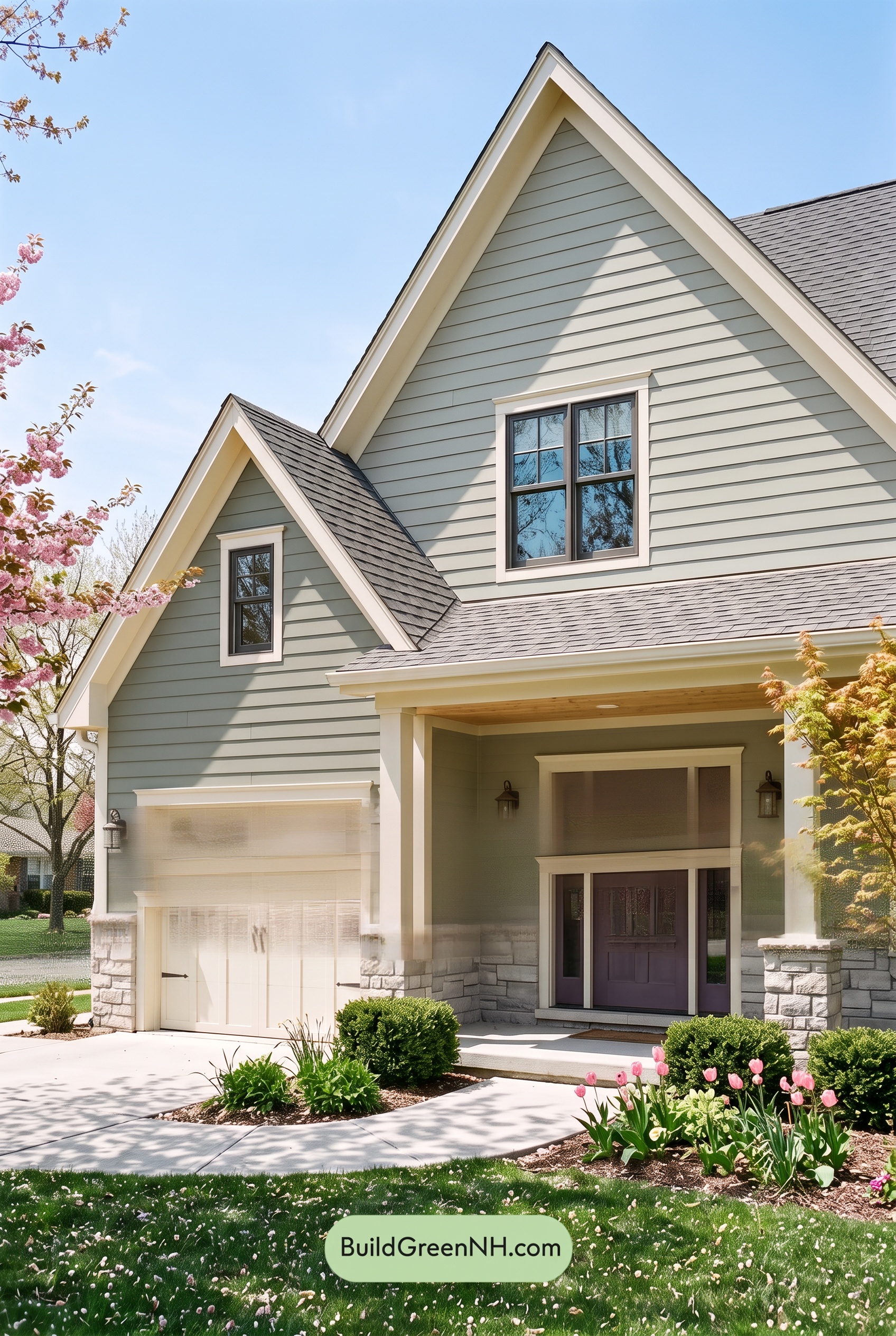 Exterior Color Scheme with Stone Accents: Willow Quartz Porch
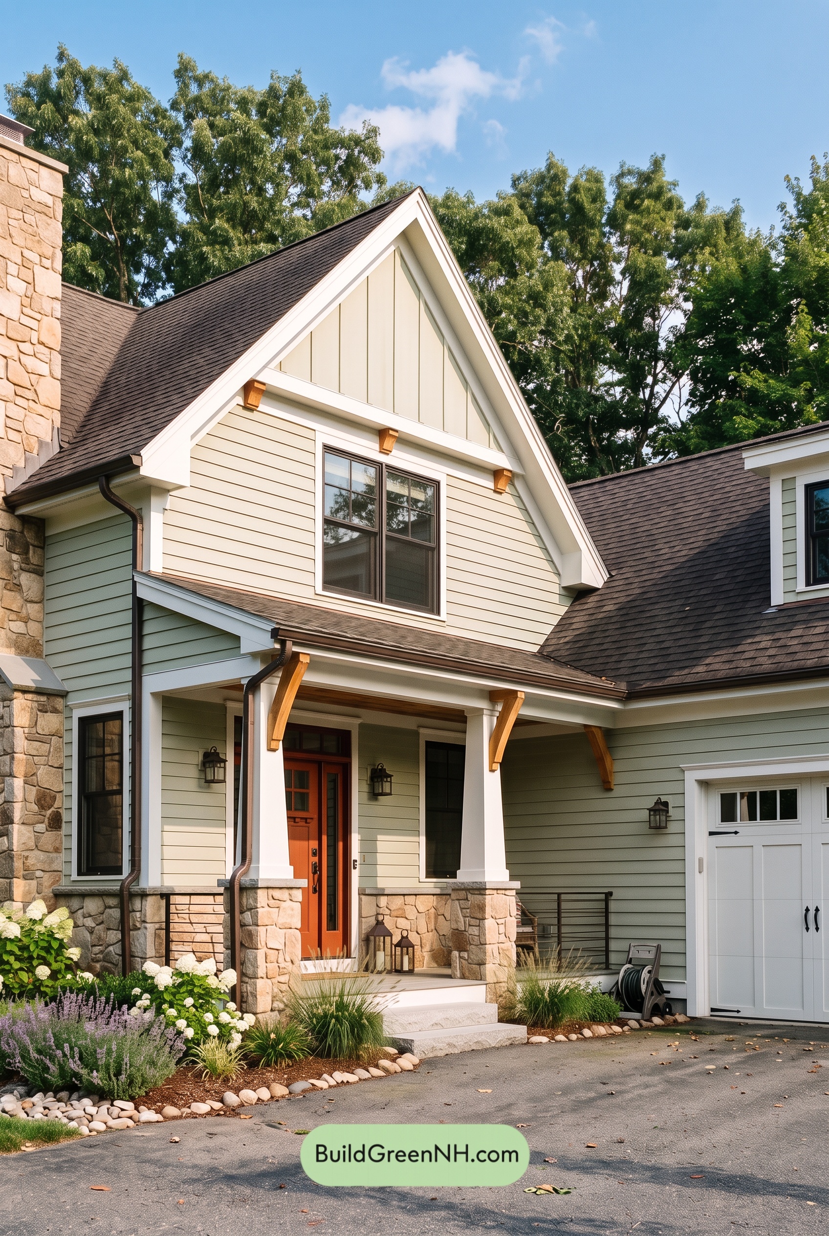 Exterior Color Scheme with Stone Accents: Celadon Ember Gable
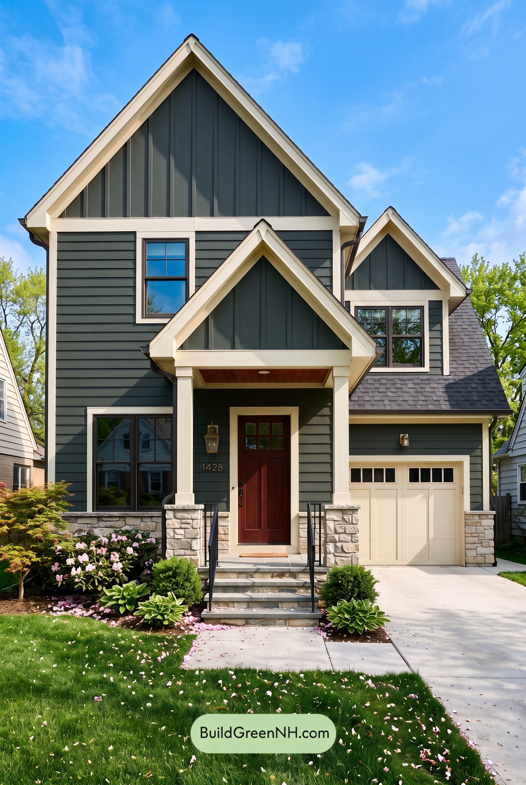 Exterior Color Scheme with Stone Accents: Pine Brass Threshold
Table of Contents