Last updated on
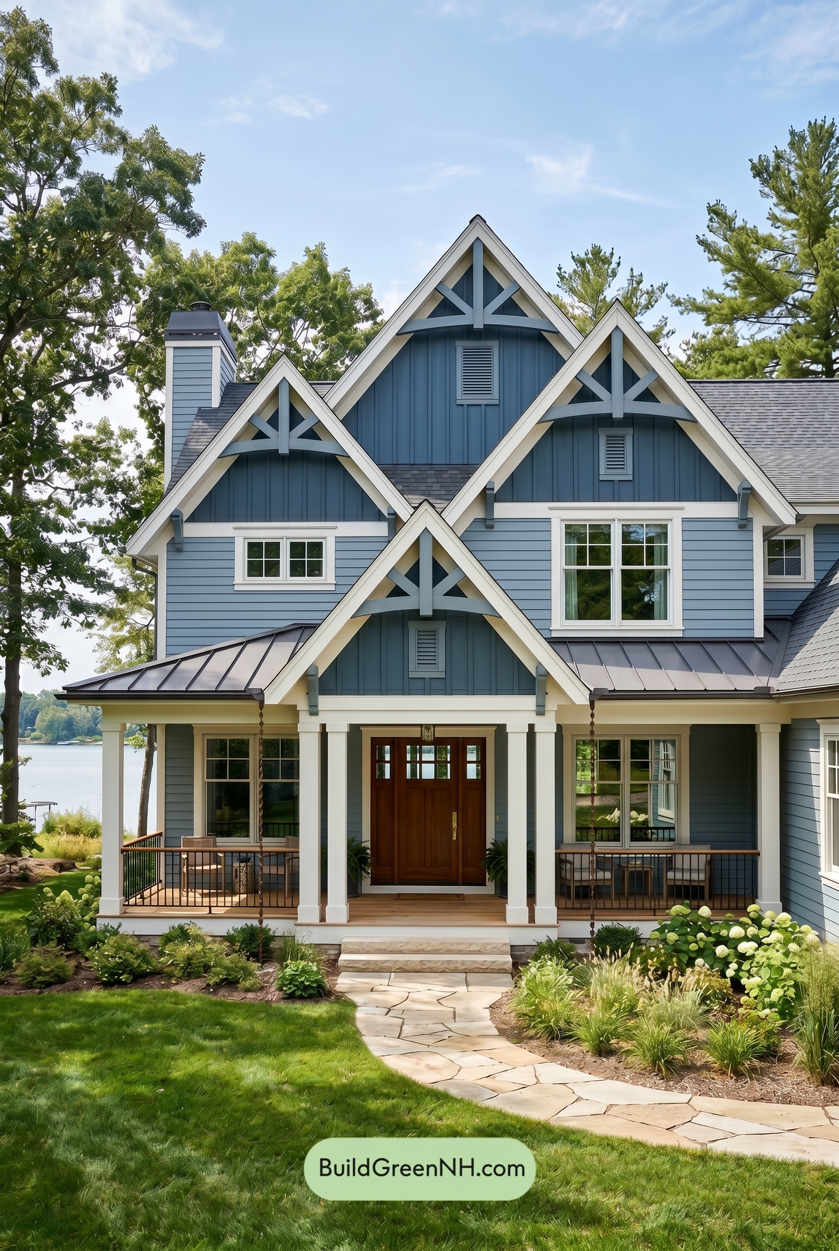

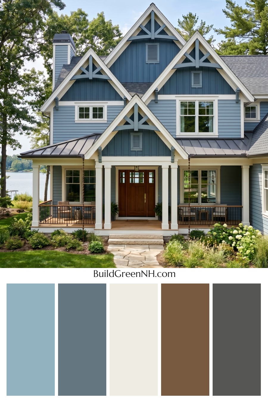
This layered blue-and-white exterior feels fresh, welcoming, and timeless because every shade supports the home’s crisp architecture without overpowering its natural setting.
A Calm Blue Foundation
The main siding is wrapped in a soft medium blue that gives the house an easygoing, coastal-inspired personality. It feels bright without being overly bold, making the exterior cheerful in sunlight and grounded beneath the shaded porch.
On the upper gables, a slightly deeper blue shade adds dimension. Because the vertical siding sits above the lighter horizontal siding, the variation creates a subtle stacked effect that draws the eye upward and celebrates the steep rooflines.
White Trim That Sharpens Every Detail
The trim, window frames, columns, and broad gable edges use a clean white shade that brings structure to the entire palette. Against the blue siding, the white trim feels crisp and architectural, outlining the windows, peaks, porch posts, and roof edges with beautiful clarity.
This white family shade also keeps the many details from feeling busy. With multiple gables, brackets, columns, and window groupings, the light trim acts like a visual organizer, giving the home a polished and intentional look.
Warmth at the Entry
The front door introduces a rich brown shade, and it is exactly the warmth this palette needs. Surrounded by cool blue siding and fresh white trim, the brown door feels inviting and grounded, creating a natural focal point at the center of the porch.
That warm entry color also connects nicely with the wood tones of the porch floor and the surrounding landscape, softening the formality of the crisp blue-and-white combination.
Gray Accents for Balance
The gray railings and roof elements add a steady, understated contrast. Their deeper tone anchors the lighter siding and trim, while still staying quiet enough to let the gables and front entry shine.
These gray shades work especially well with the blue exterior because they share a cool, relaxed quality. The result is harmonious rather than high-contrast, which suits the home’s serene setting beautifully.
The Overall Mood
This color scheme feels graceful, fresh, and welcoming. The blues bring calm and character, the white trim adds brightness and definition, the brown door provides warmth, and the gray accents keep everything grounded.
Together, the palette gives the home a refined cottage feel with just the right amount of sophistication. It is friendly from the curb, elegant up close, and perfectly suited to a house surrounded by greenery and open sky.
Next, see how this color scheme looks under different lighting simulations throughout the day.
Overcast
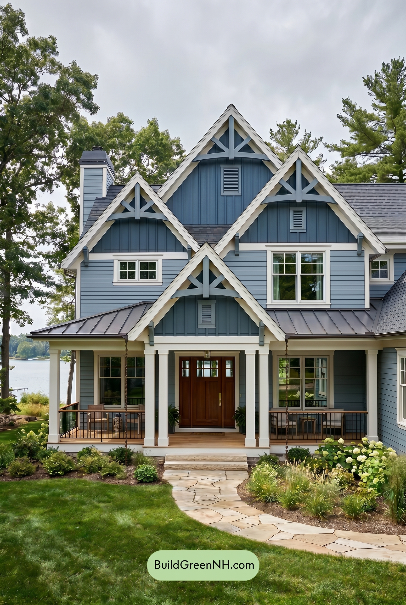
Under overcast light, the blue siding loses a touch of brightness and appears calmer, slightly deeper, and more muted than it would in neutral daylight. The soft sky reduces saturation and warmth, giving the blue family a cooler, more grounded look while keeping the white trim from feeling stark or overly bright.
Shadows become softer and less defined, so the contrast between the white details, gray railings, and blue walls feels gentler. The brown front door also reads less golden and more subdued, adding warmth without sharpness; overall, the house takes on a quiet, polished, and relaxed mood.
Golden Hour
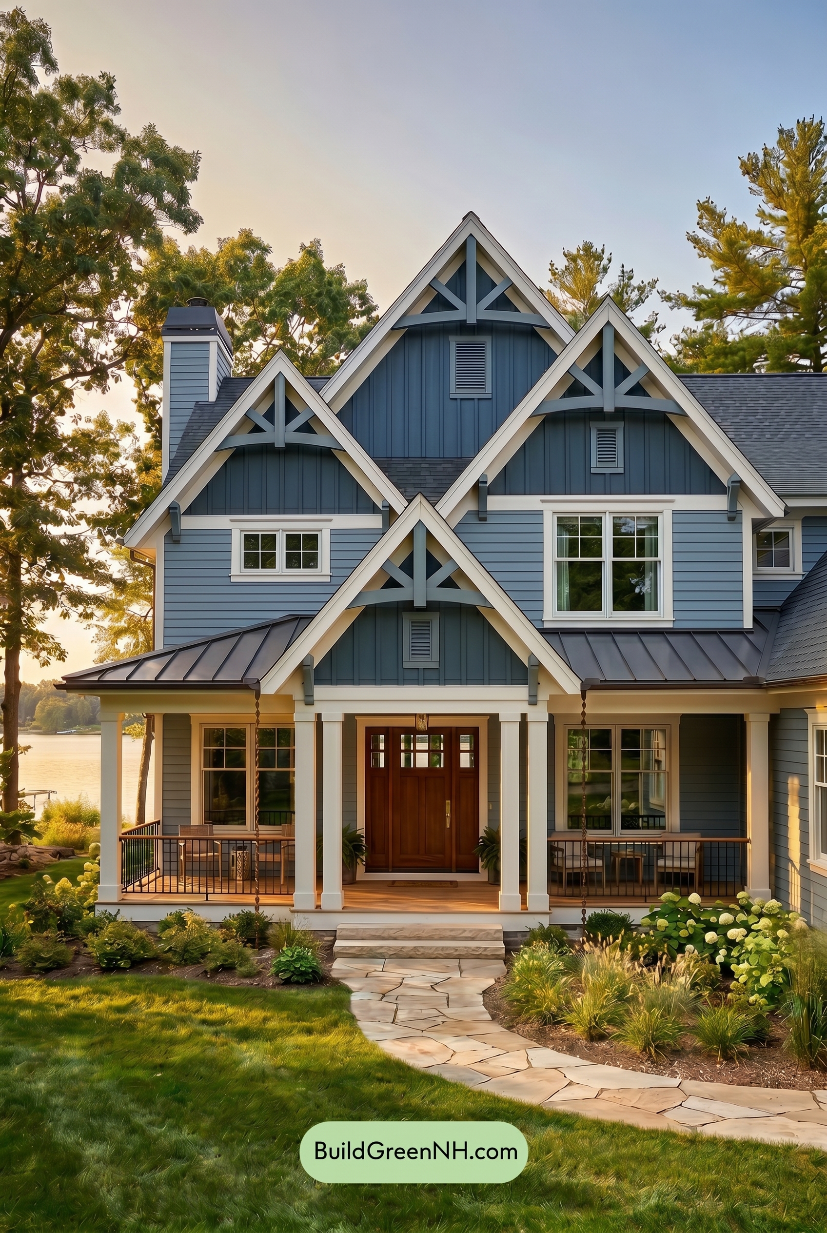
Under Golden Hour light, the blue family siding appears richer and slightly more saturated than it would in neutral daylight, with the lower sun warming the shade just enough to feel softer and more inviting. The white family trim, window frames, and columns lose some of their crisp coolness, taking on a gentle warmth that reduces stark contrast while still outlining the gables beautifully.
Shadows deepen beneath the rooflines and porch, making the upper blue shades feel moodier and adding more dimension to the façade. The brown family front door glows warmer and more welcoming, while the gray family railings look darker and calmer, giving the whole exterior a relaxed, cozy evening mood compared to the clearer, more balanced look of daylight.
Shade
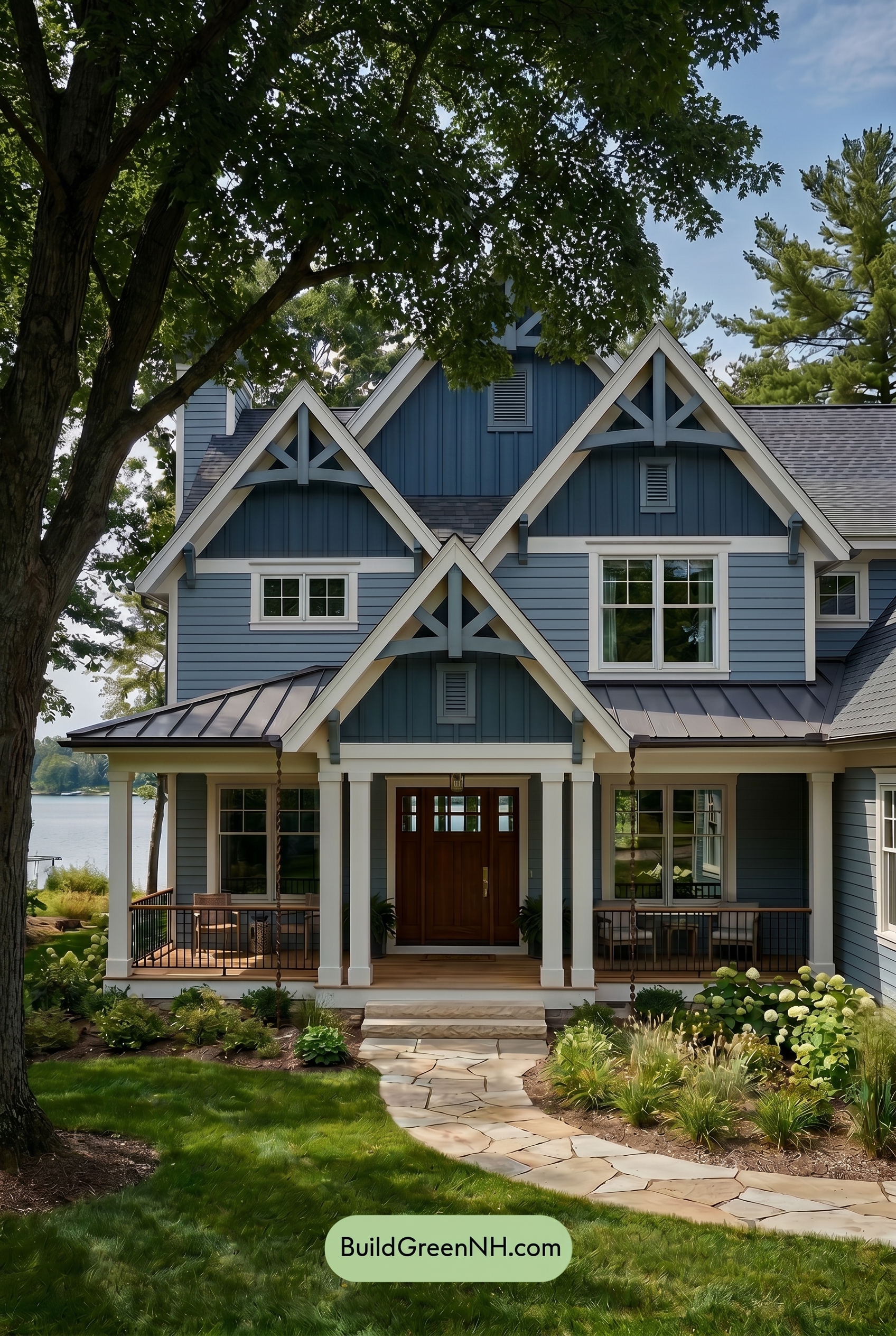
In Shade, the blue siding reads deeper and more saturated than it would in neutral daylight, with the upper gables taking on a cooler, moodier cast. The white trim and columns lose a touch of crisp warmth, shifting softer and slightly muted, while the gray railings blend more quietly into the shadowed porch areas.
Compared with neutral daylight, the shaded setting increases contrast in the recessed panels, rooflines, and window details, making shadows feel more layered and architectural. The brown front door keeps its welcome warmth, but it appears richer and less bright, giving the whole exterior a calm, sheltered mood.
Nighttime
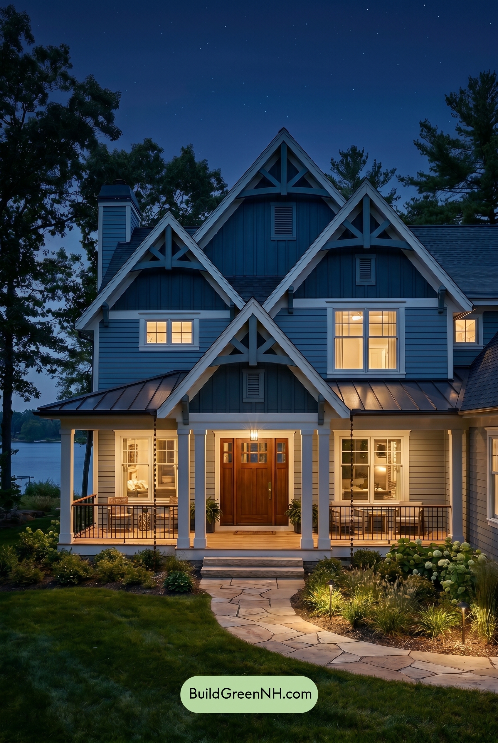
At night, the blue family on the main and upper walls becomes deeper and more saturated than it would in neutral daylight, shifting from crisp and airy to rich and cocooning. Shadows gather beneath the gables and rooflines, increasing contrast and giving the lighter trim a sharper, more luminous edge.
The warm interior lighting softens the white family around the windows and columns, adding a gentle warmth that contrasts beautifully with the cooler blue shades. The brown front door appears richer and more inviting, while the gray railings recede into the shadows, creating a calm, polished evening mood.
Pin these for later:
Want More?
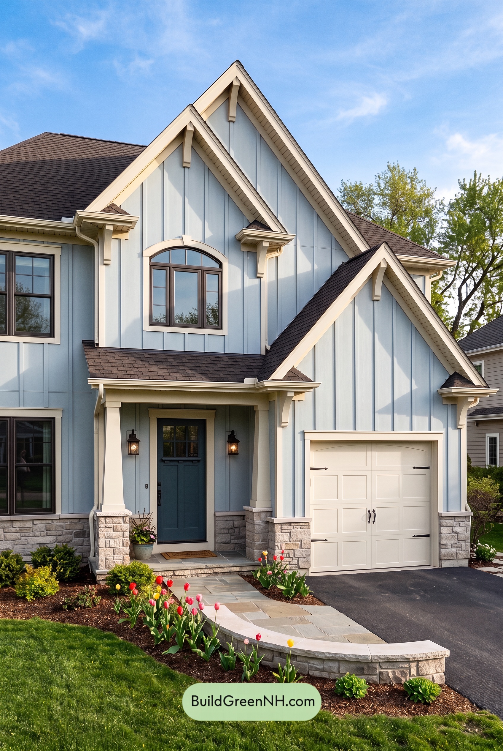 Exterior Color Scheme with Stone Accents: Bluebell Gable Song
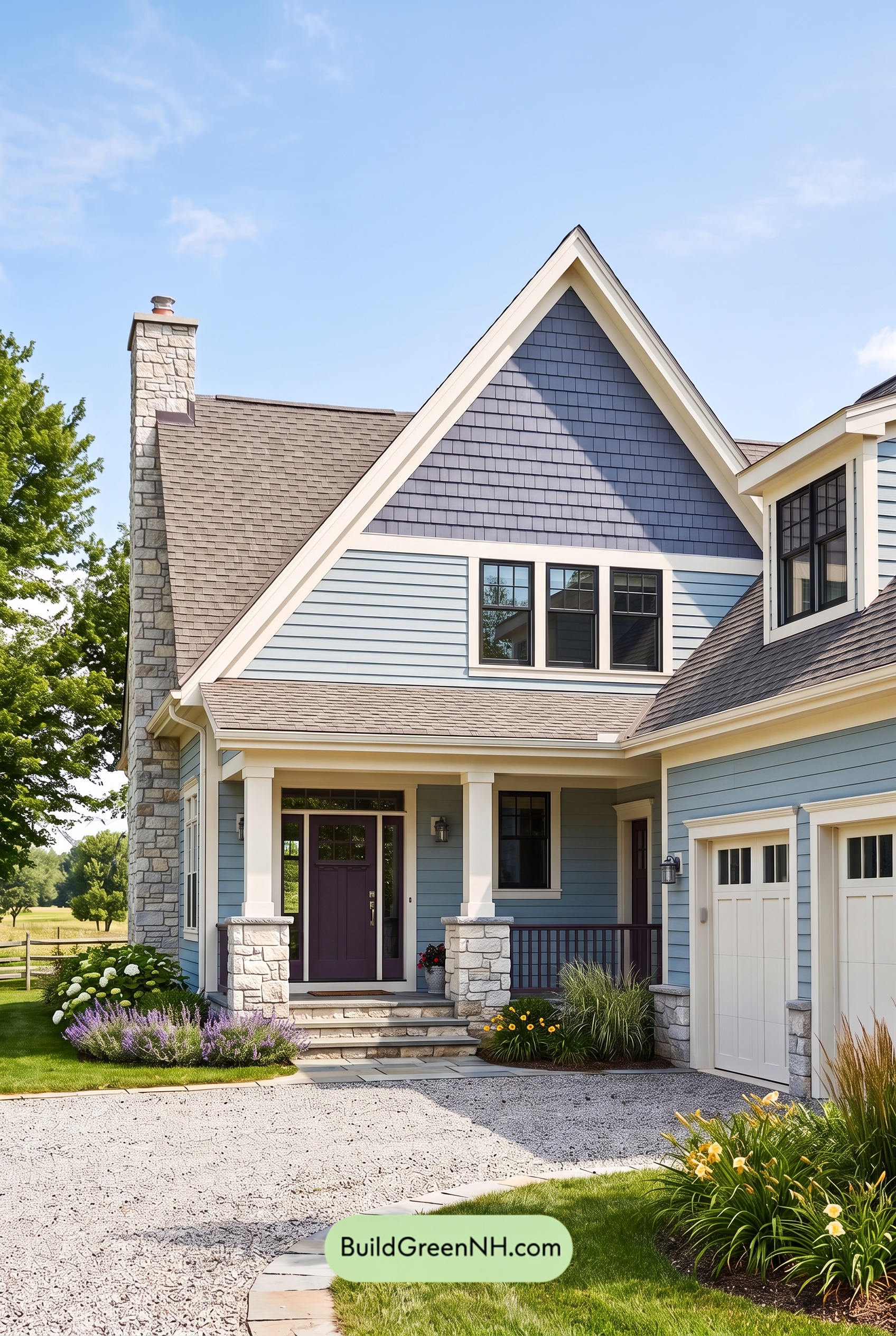 Exterior Color Scheme with Stone Accents: Meadow Bell Welcome
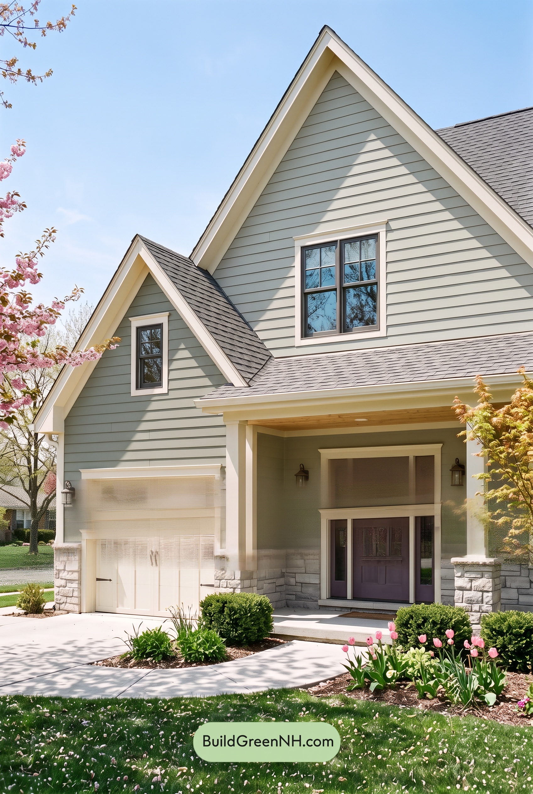 Exterior Color Scheme with Stone Accents: Willow Quartz Porch
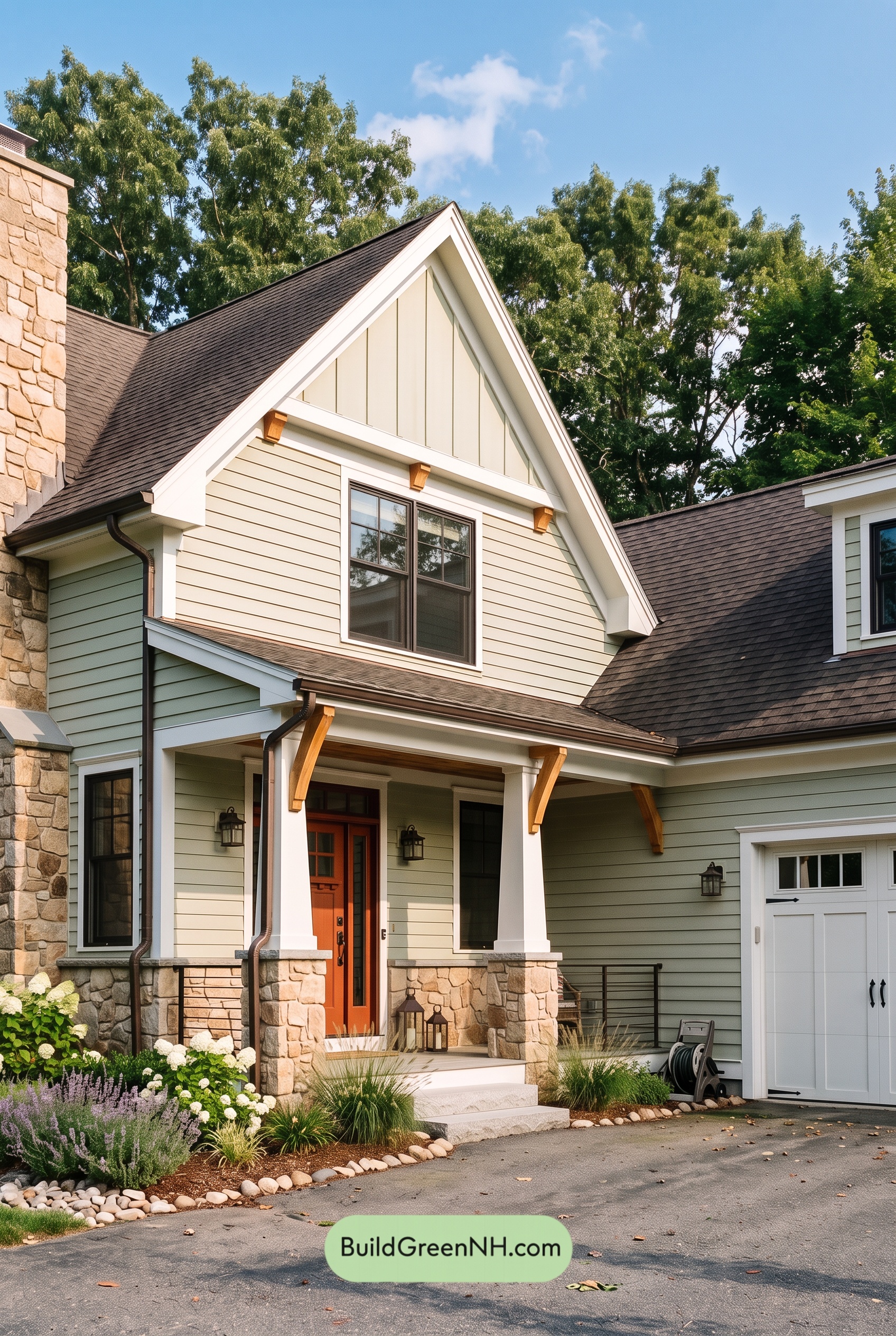 Exterior Color Scheme with Stone Accents: Celadon Ember Gable
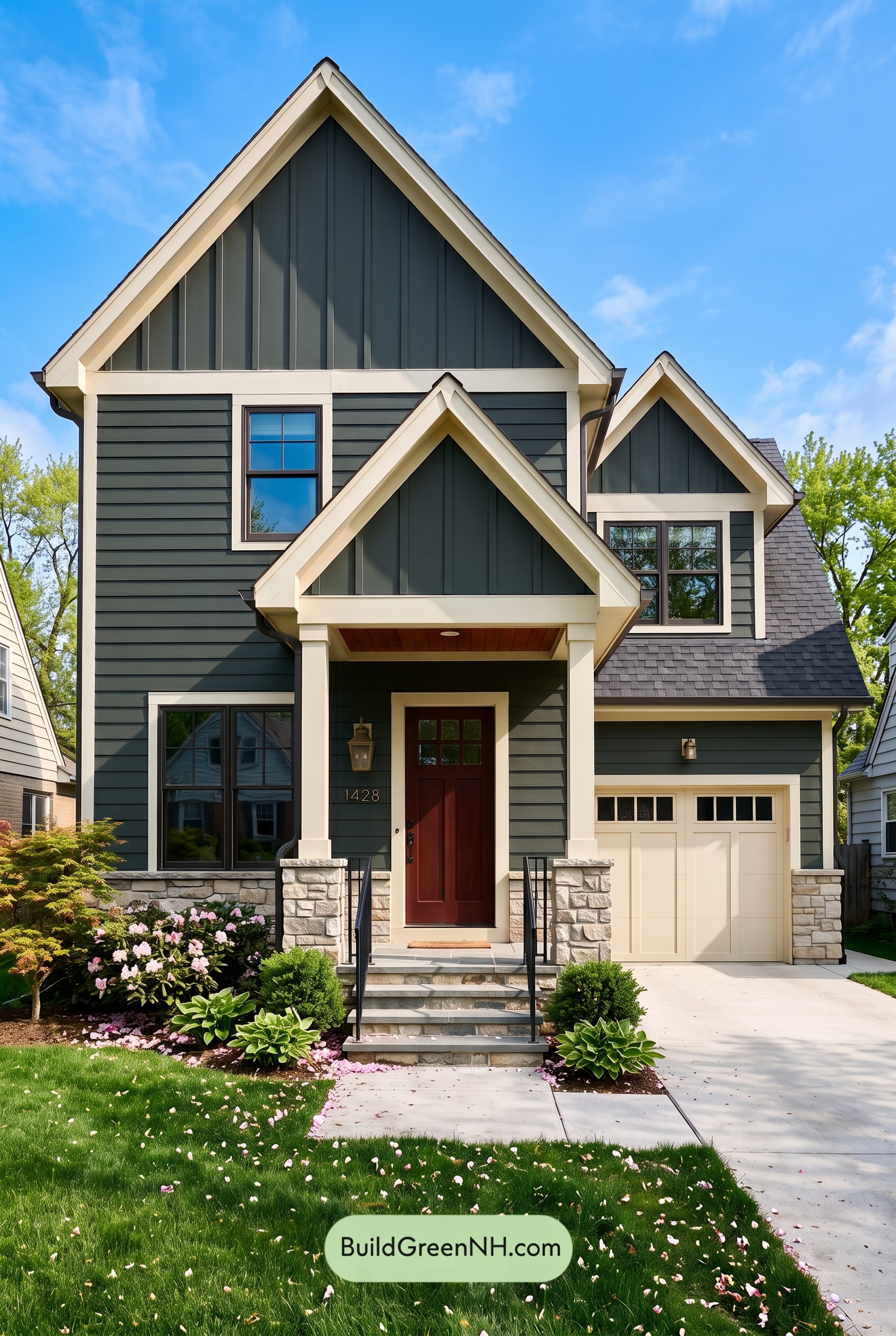 Exterior Color Scheme with Stone Accents: Pine Brass Threshold
Table of Contents