Last updated on
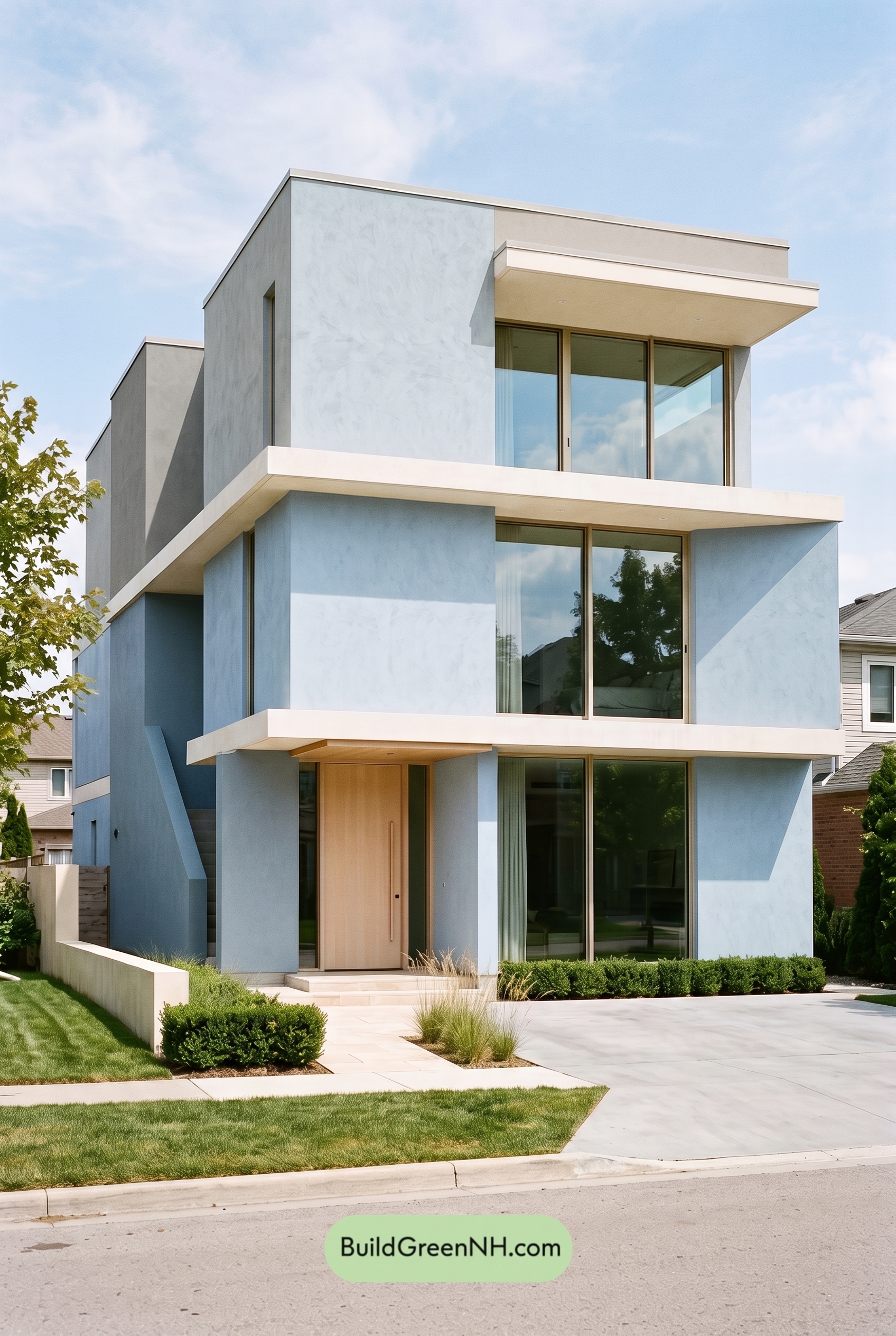

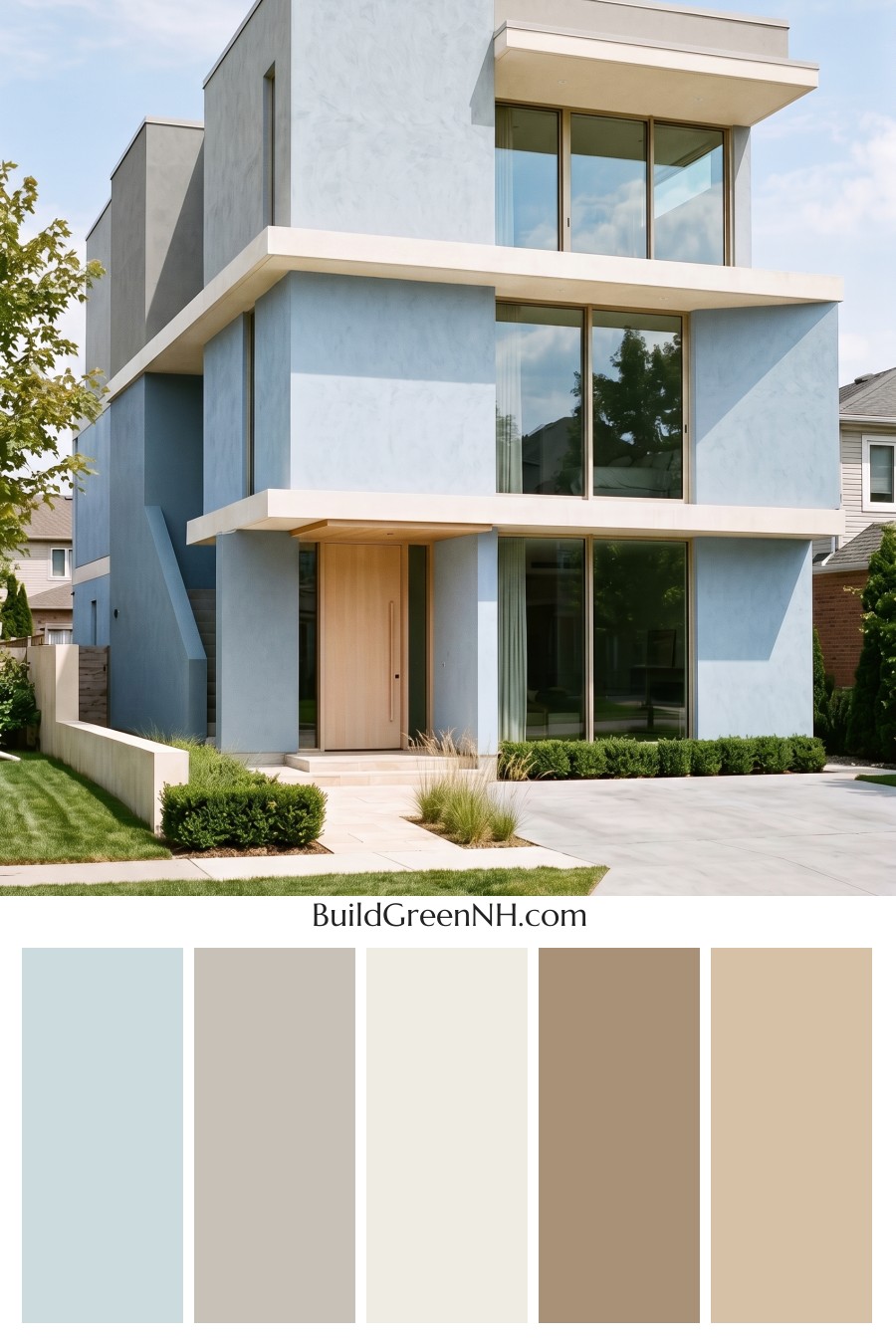
This cool blue-and-warm beige exterior works beautifully because it makes a bold modern home feel bright, balanced, and inviting.
A Fresh Take on Modern Curb Appeal
The main wall surfaces are wrapped in a pale blue shade that gives the home a crisp, airy presence. On such a strong, geometric structure, this soft blue keeps the exterior from feeling too heavy. It adds personality while still staying calm and refined.
Because the blue is light and slightly muted, it works especially well with the home’s clean lines, tall vertical walls, and wide horizontal overhangs. The shade catches daylight beautifully, shifting from fresh and bright in the sun to a cooler, quieter tone in shadow.
Warm Beige Softens the Upper Levels
The upper wall areas introduce a gentle beige shade, creating a warmer cap for the cooler blue below. This contrast is subtle but important. It keeps the palette from feeling one-note and adds a soft, grounded layer to the modern architecture.
The beige window frames and front door continue that warmth throughout the facade. Instead of using a stark dark accent, the design leans into a light, natural beige family that feels relaxed and welcoming.
Crisp White Trim Adds Definition
The white trim is used along the strong horizontal bands, balcony edges, soffits, and roofline details. This bright neutral shade gives the house its sharp, polished outline. It also separates the blue and beige areas cleanly, which helps every architectural plane feel intentional.
On a home with deep overhangs and large glass sections, the white trim is especially effective. It reflects light, highlights the layered structure, and gives the exterior a fresh, high-end finish.
The Door and Frames Bring Warmth to the Entry
The front door stands out in a light warm beige shade, offering a friendly pause within the cooler blue facade. It feels inviting without becoming loud. Paired with the matching beige window frames, the entry has a soft, cohesive look that balances the home’s modern formality.
The large windows also benefit from these beige frames. Against the pale blue walls and white trim, they add just enough warmth and contrast to keep the exterior from feeling overly cool or clinical.
Why the Palette Works So Well
This scheme succeeds because it blends cool, warm, and bright neutrals in the right proportions. The pale blue gives the home freshness and character. The beige shades add warmth and approachability. The white trim brings structure, contrast, and a clean architectural edge.
The overall mood is modern, breezy, and composed. It feels polished but not severe, colorful but not overwhelming. For a contemporary home with strong angles and stacked forms, this palette is a smart choice: light, balanced, and beautifully suited to sunny curb appeal.
Next, see how this color scheme looks under different lighting simulations throughout the day.
Overcast
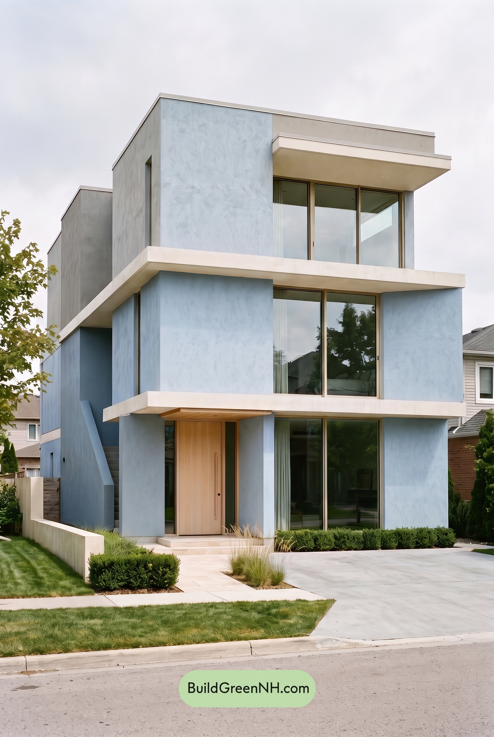
Under overcast light, the blue family on the main walls looks softer and slightly cooler than it would in neutral daylight, with reduced saturation and a mistier, more muted finish. The beige shades on the upper wall, window frames, and front door lose a bit of their sunlit warmth, feeling calmer and more subdued.
Because the cloud cover diffuses the light, shadows become gentler and the contrast between the white trim, beige accents, and blue walls is less crisp. The overall mood shifts from bright and architectural to quiet, airy, and serene, giving the exterior a refined, modern softness.
Golden Hour
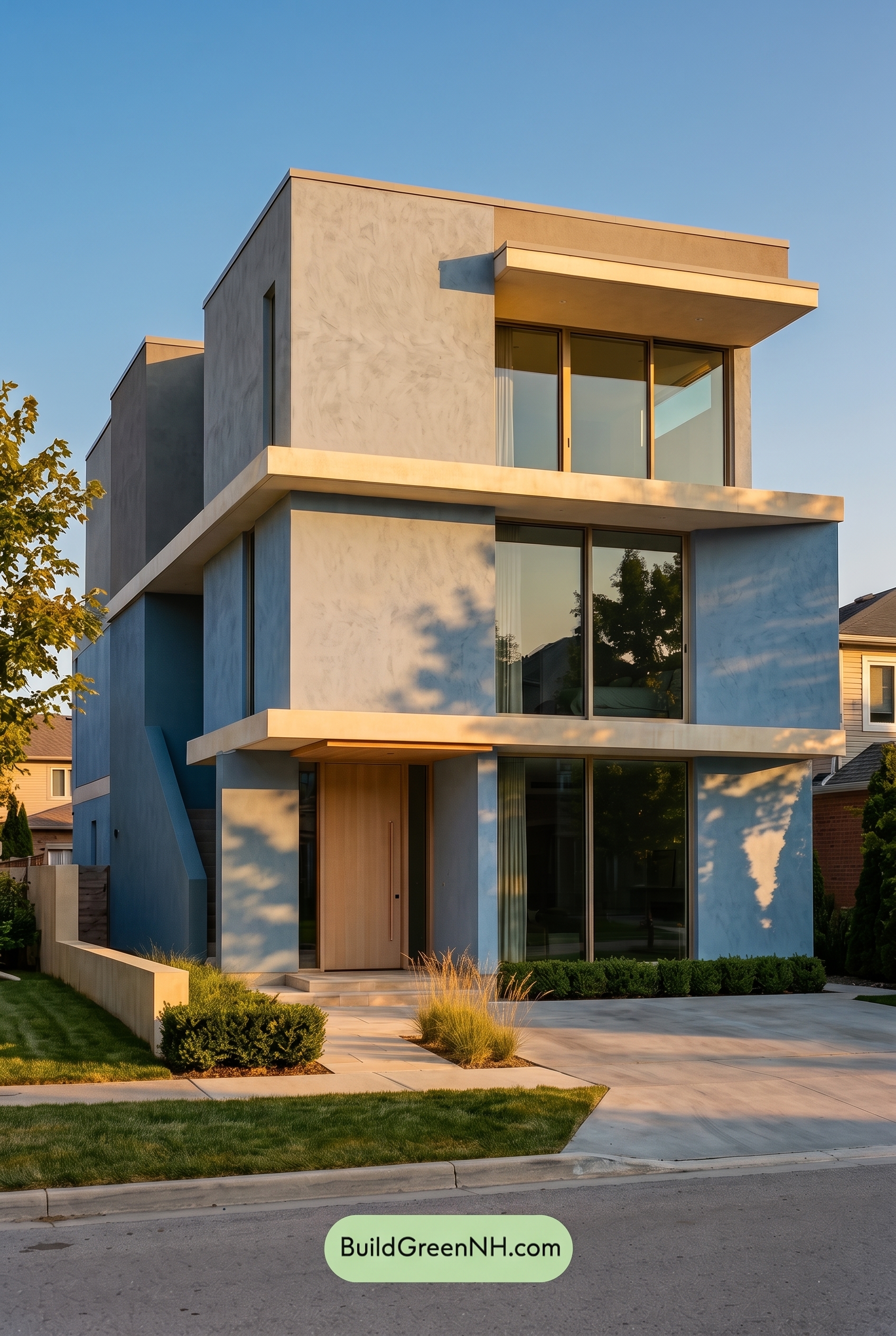
Golden Hour gives the blue family on the main walls a richer, more saturated presence than it has in neutral daylight, especially where the low sun grazes the flat modern planes. The beige family on the upper wall, window frames, and front door turns warmer and softer, while the white family trim picks up a gentle creamy glow instead of reading crisp and bright.
Compared with neutral daylight, shadows become longer and cooler, deepening the blue shade and making the warm neutrals feel more dimensional. The added contrast between glowing edges and shaded recesses creates a calmer, more inviting mood, softening the home’s sharp geometry without losing its clean contemporary look.
Shade
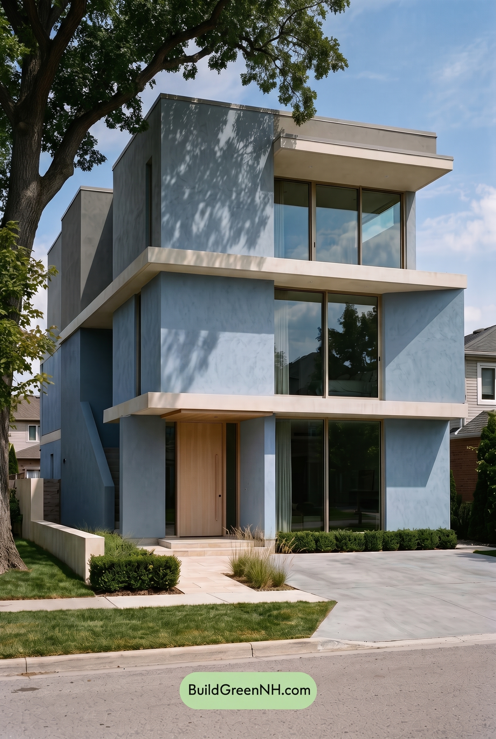
In shade, this shade of blue deepens and cools compared to neutral daylight, with a slightly richer, more subdued saturation. The soft shadow patterns make the blue feel calmer and more dimensional, while the white family trim loses some crisp brightness and reads gentler against the walls.
The beige family shades on the upper wall, window frames, and entry feel less warm in shade, shifting toward a softer, stone-like neutral. Contrast becomes moodier as shadows collect under overhangs and along the modern lines, giving the exterior a quieter, more refined presence than it has in clear neutral daylight.
Nighttime
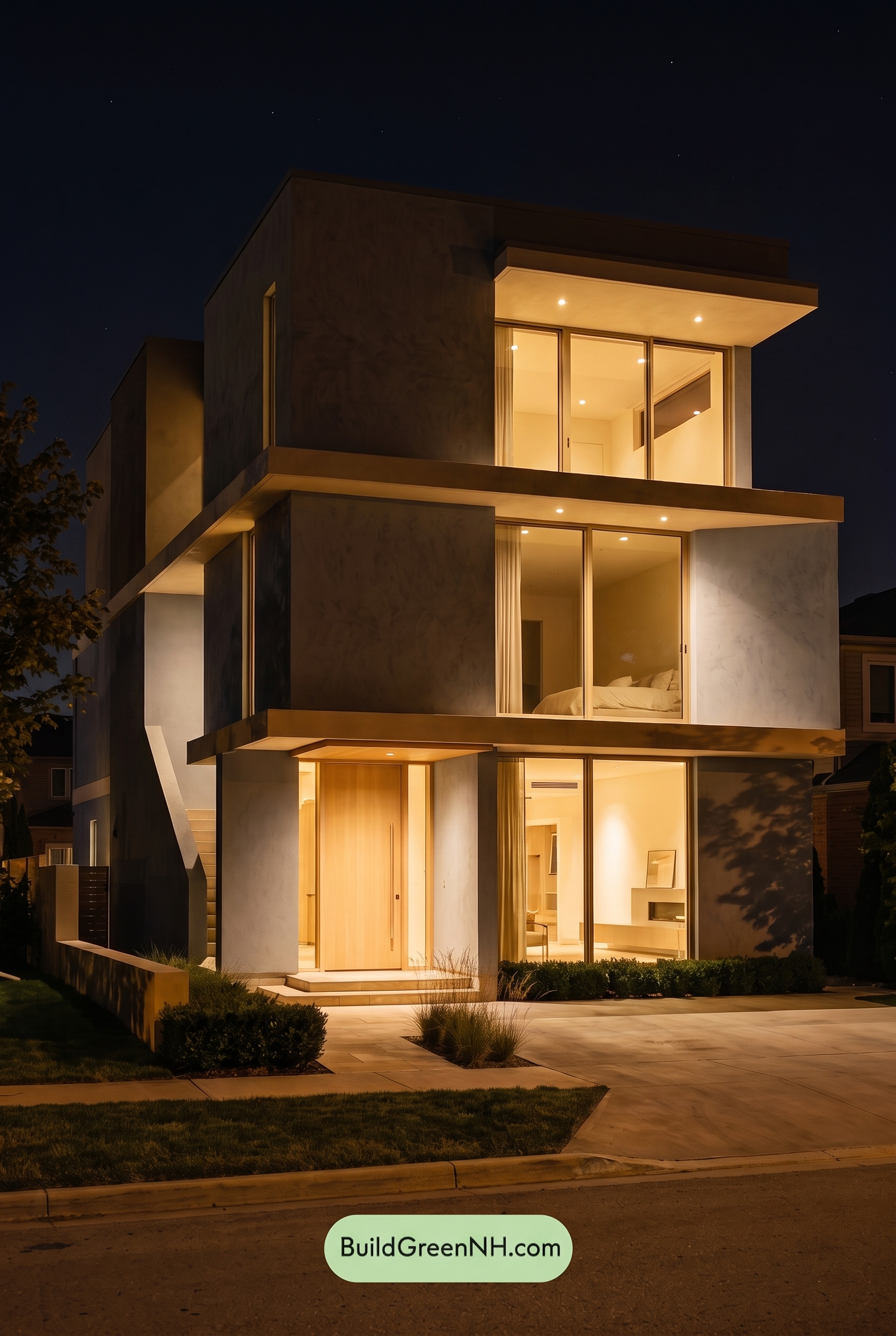
At nighttime, this shade of blue on the main walls deepens and feels more saturated in the shadows than it would in neutral daylight, shifting the home toward a richer, moodier presence. The unlit planes recede, while the warm interior glow makes the beige family on the upper walls, window frames, and front door appear softer, warmer, and more golden.
The white family trim picks up the strongest contrast after dark, looking crisp where light hits it and subdued where shadows fall. Compared with daylight’s even balance, nighttime lighting creates sharper edges, deeper shadow pockets, and a more dramatic, inviting mood across the exterior palette.
Pin these for later:
Want More?
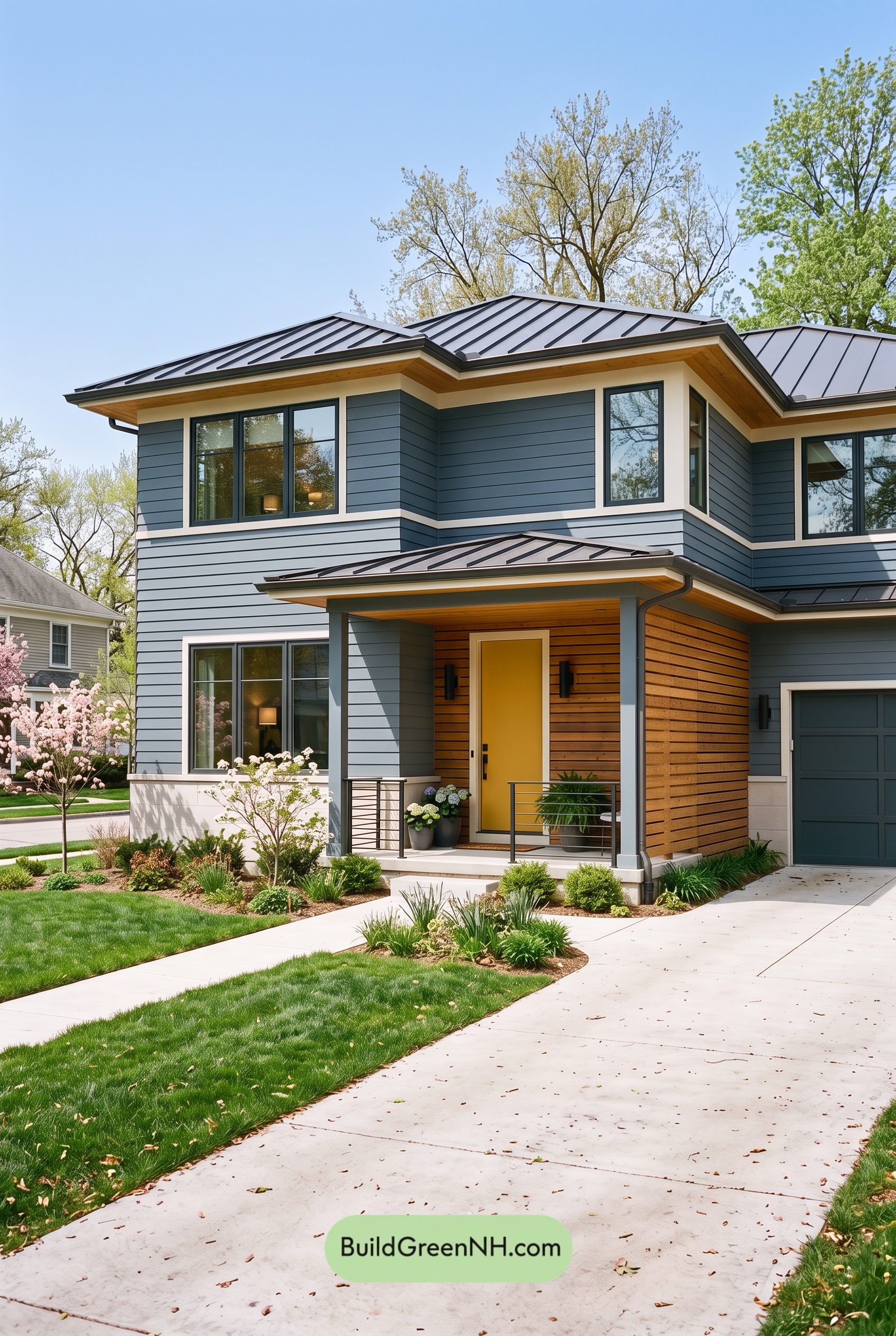 Blue House Front Door Color Scheme: Harbor Saffron
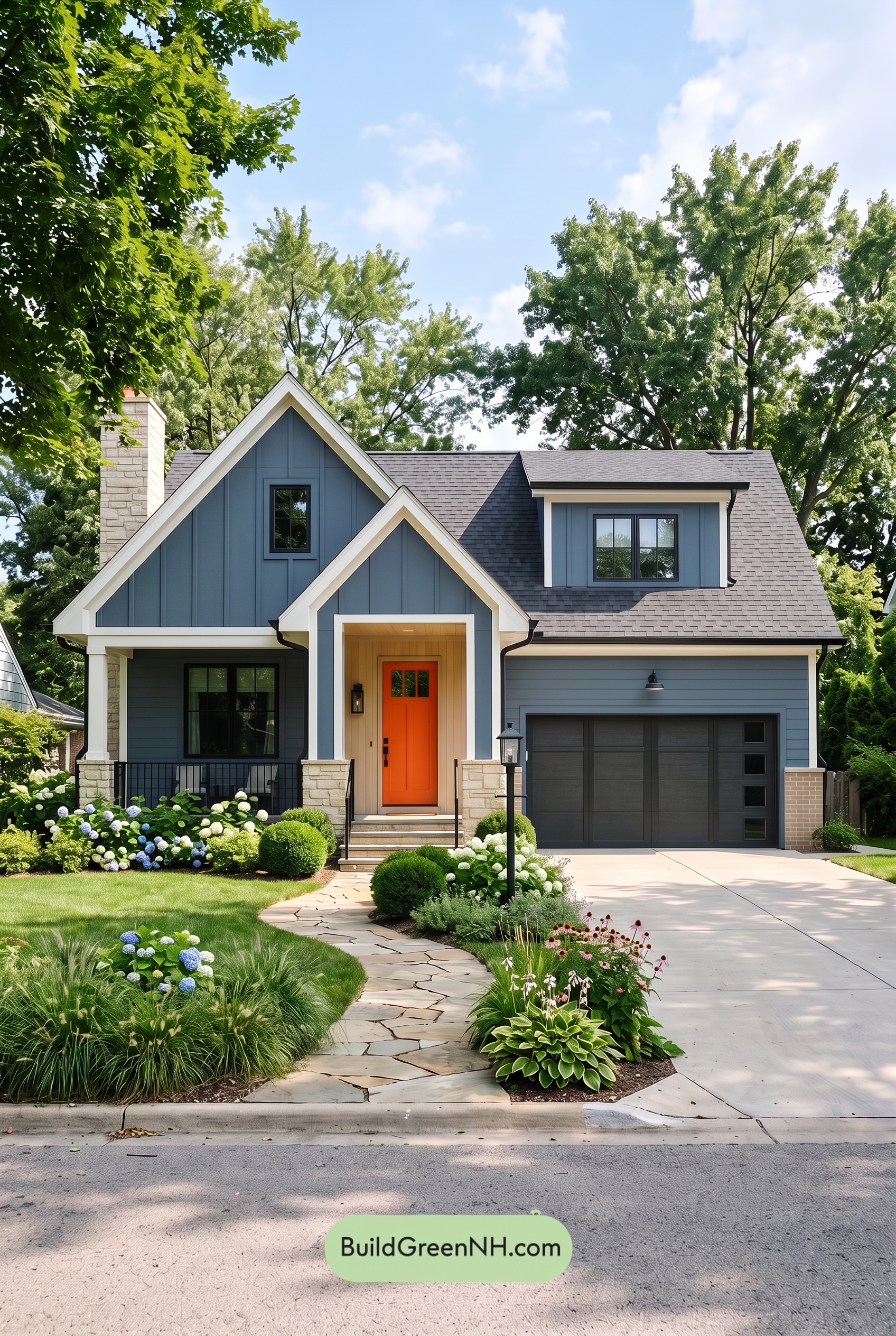 Blue House Front Door Color Scheme: Cobalt Persimmon
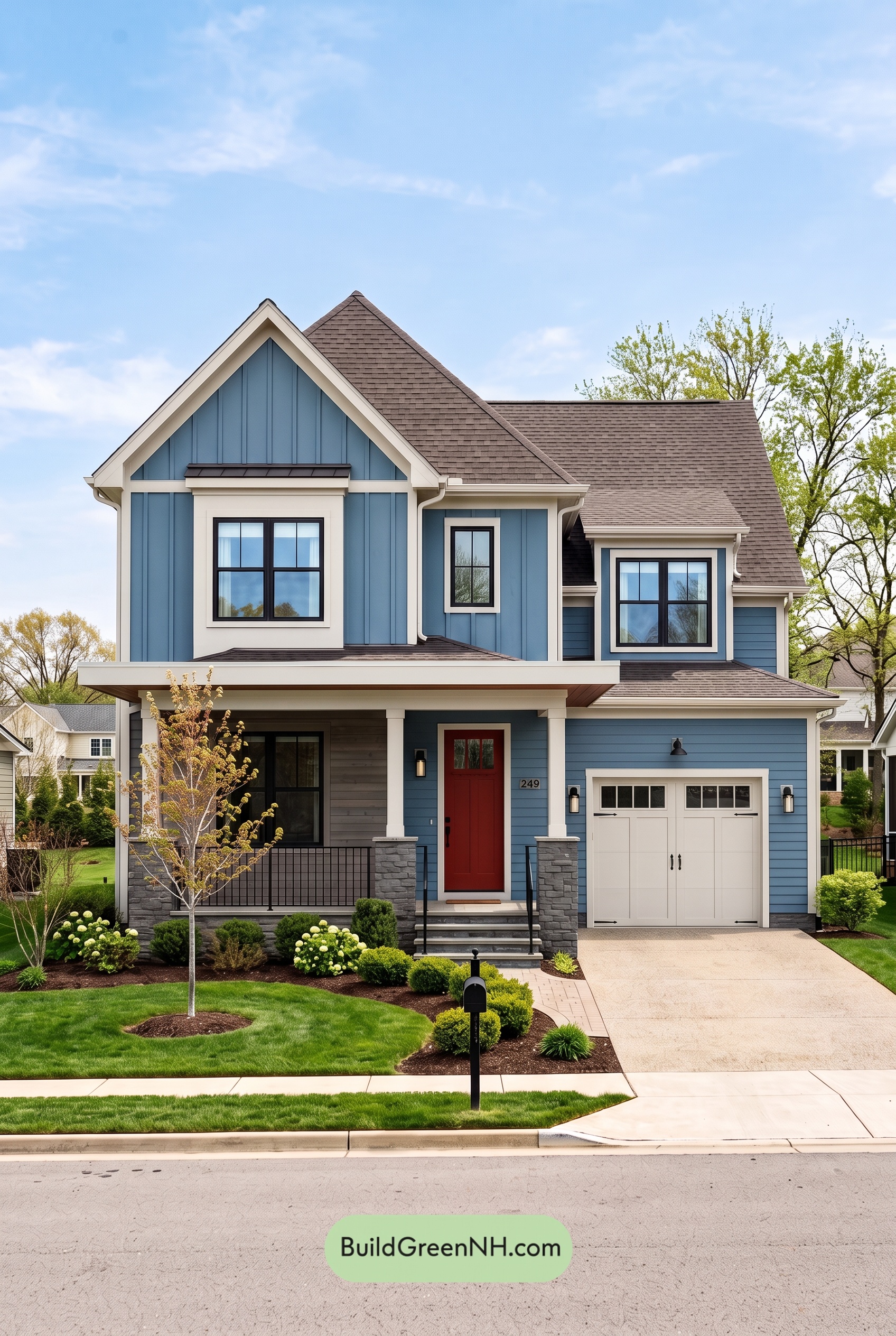 Blue House Front Door Color Scheme: Denim Poppy
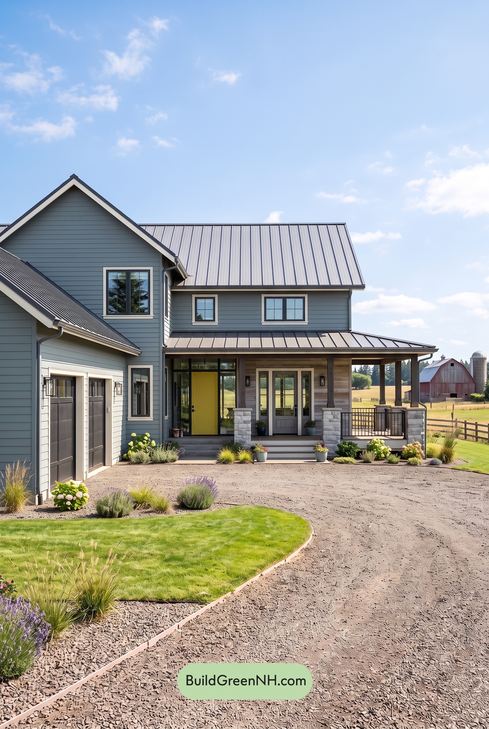 Blue House Front Door Color Scheme: Slate Citron
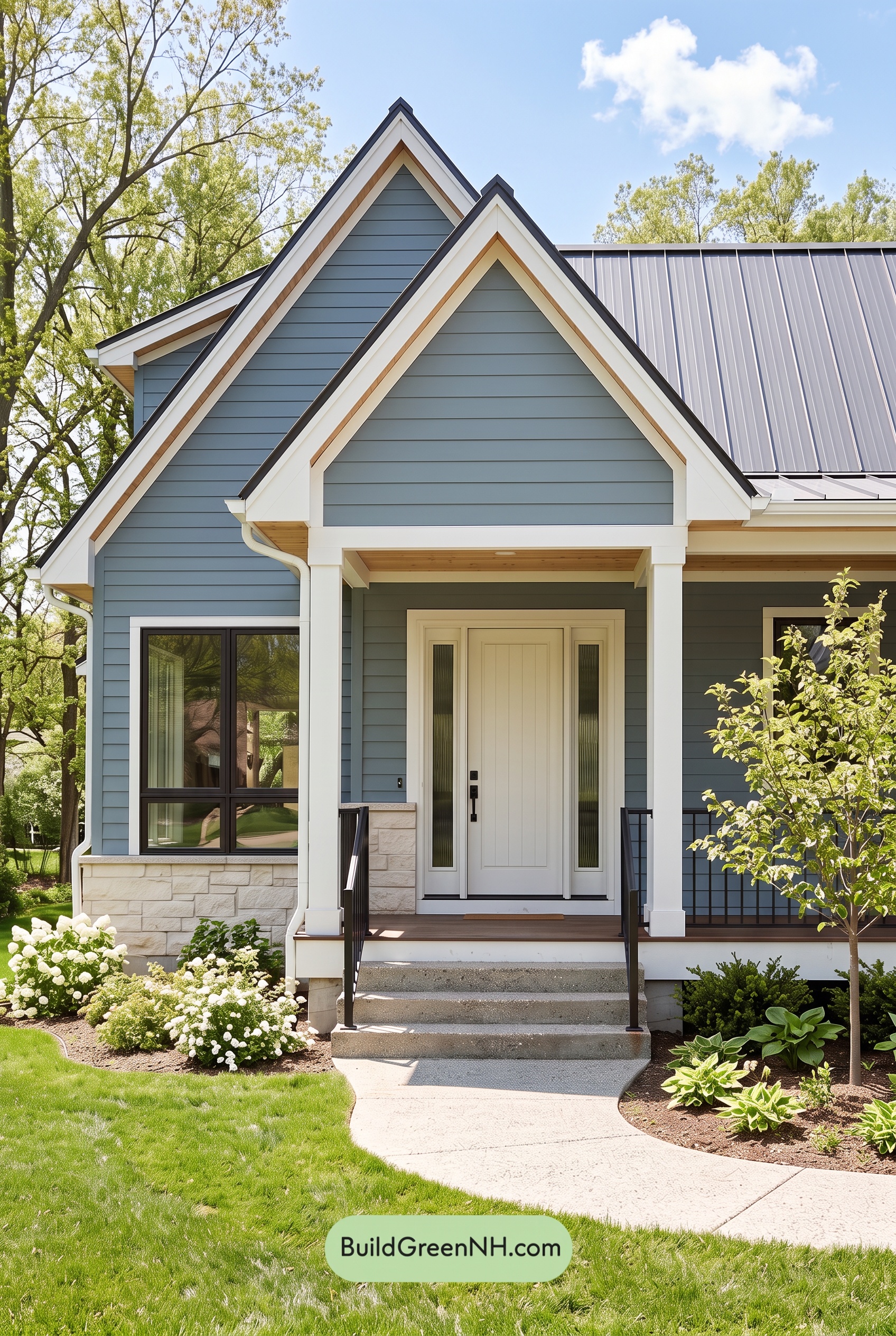 Blue House Front Door Color Scheme: Mist Blue Haven
Table of Contents