Last updated on
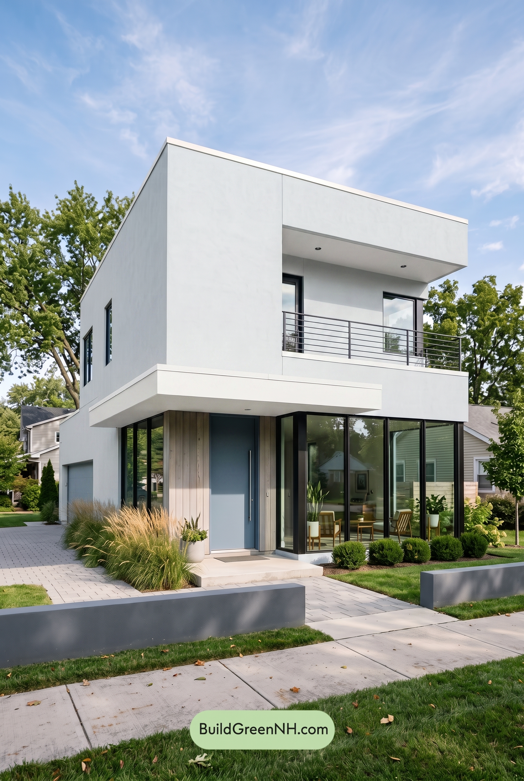

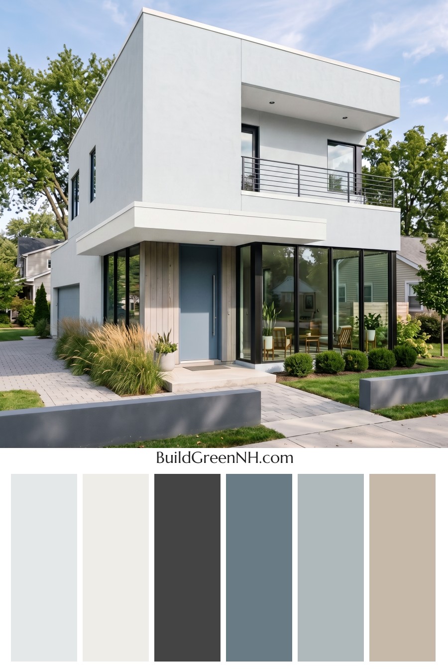
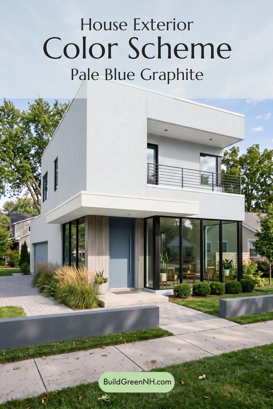
This crisp white, warm beige, cool gray, and muted blue palette gives the home a fresh modern presence that feels polished without losing its warmth.
A Clean White Base with Modern Confidence
The main exterior is wrapped in a bright white shade, which suits the home’s sharp lines and stacked geometric forms beautifully. Because the architecture is so clean and minimal, the white siding helps every plane feel intentional, from the tall upper volume to the projecting balcony sections.
This light exterior also makes the house feel open and airy. In the sunlight, the white surfaces reflect the sky and surrounding greenery, giving the home a crisp, gallery-like quality without feeling cold.
Warm Beige Softens the Architecture
Warm beige trim and accent areas bring a welcome layer of softness to the design. Around the entry, the beige accent wall adds a natural, slightly earthy note that balances the sleek white exterior.
This is a smart choice for a modern home because it keeps the palette from becoming too stark. The beige shade adds texture and warmth, especially near the front door, where it creates a more inviting arrival point.
Cool Gray Details Add Structure
The window frames and railings use a cool gray shade that outlines the architecture with clean precision. Against the white siding, the gray frames create strong contrast without feeling as heavy as a deep black.
The balcony railing also benefits from this gray tone. It feels sleek and urban, but still restrained. The result is a crisp framework that emphasizes the home’s contemporary style while allowing the larger white and beige surfaces to stay calm and uncluttered.
Muted Blue Brings Personality
The front door introduces a muted blue shade that gives the entry a subtle focal point. It is soft enough to blend with the neutral palette, yet colorful enough to make the doorway feel special.
The garage door repeats the blue family in a quieter way, tying the lower level back to the front entry. This repetition helps the color scheme feel cohesive rather than decorative, giving the home a balanced and thoughtfully planned look.
Why the Palette Works So Well
The beauty of this exterior color scheme is in its restraint. White provides the clean modern canvas, beige adds warmth, gray gives definition, and blue offers a calm accent. Each color has a role, and none of them compete.
Overall, the mood is fresh, refined, and welcoming. It feels modern but livable, bright but grounded, and simple without being plain. For a home with bold architectural lines, this palette does exactly what it should: it highlights the shape, softens the edges, and adds just enough color to make the exterior memorable.
Next, see how this color scheme looks under different lighting simulations throughout the day.
Overcast
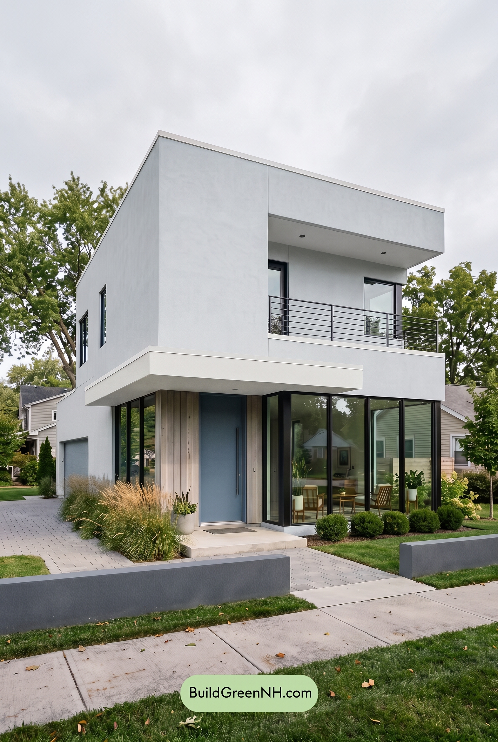
Under overcast light, the white exterior shifts from crisp and bright to a cooler, softer shade, with less sparkle than it would have in neutral daylight. The beige trim and accent areas lose a bit of warmth, appearing more muted and gentle, while the gray window frames and railings feel slightly deeper and steadier.
The blue front door and garage door become more subdued, with saturation pulled back and a calmer, duskier quality. Because the cloud cover softens shadows, contrast across the clean modern lines is lower, giving the whole palette a quieter, more refined mood.
Golden Hour
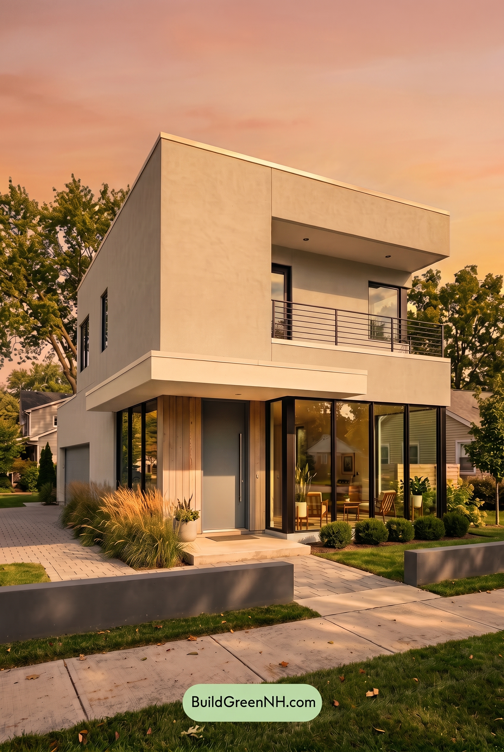
Under Golden Hour light, the white family on the main walls shifts from crisp and neutral to a soft, creamy shade, while the beige family on the trim and accent areas feels warmer and more saturated. Compared with neutral daylight, the exterior loses some of its cool sharpness and takes on a smoother, sun-washed glow.
The gray family on the window frames and railings appears deeper where shadows gather, creating stronger contrast against the warmed walls. The blue family on the front and garage doors feels slightly muted and moodier, balancing the golden warmth with a calm, grounded note.
Shade
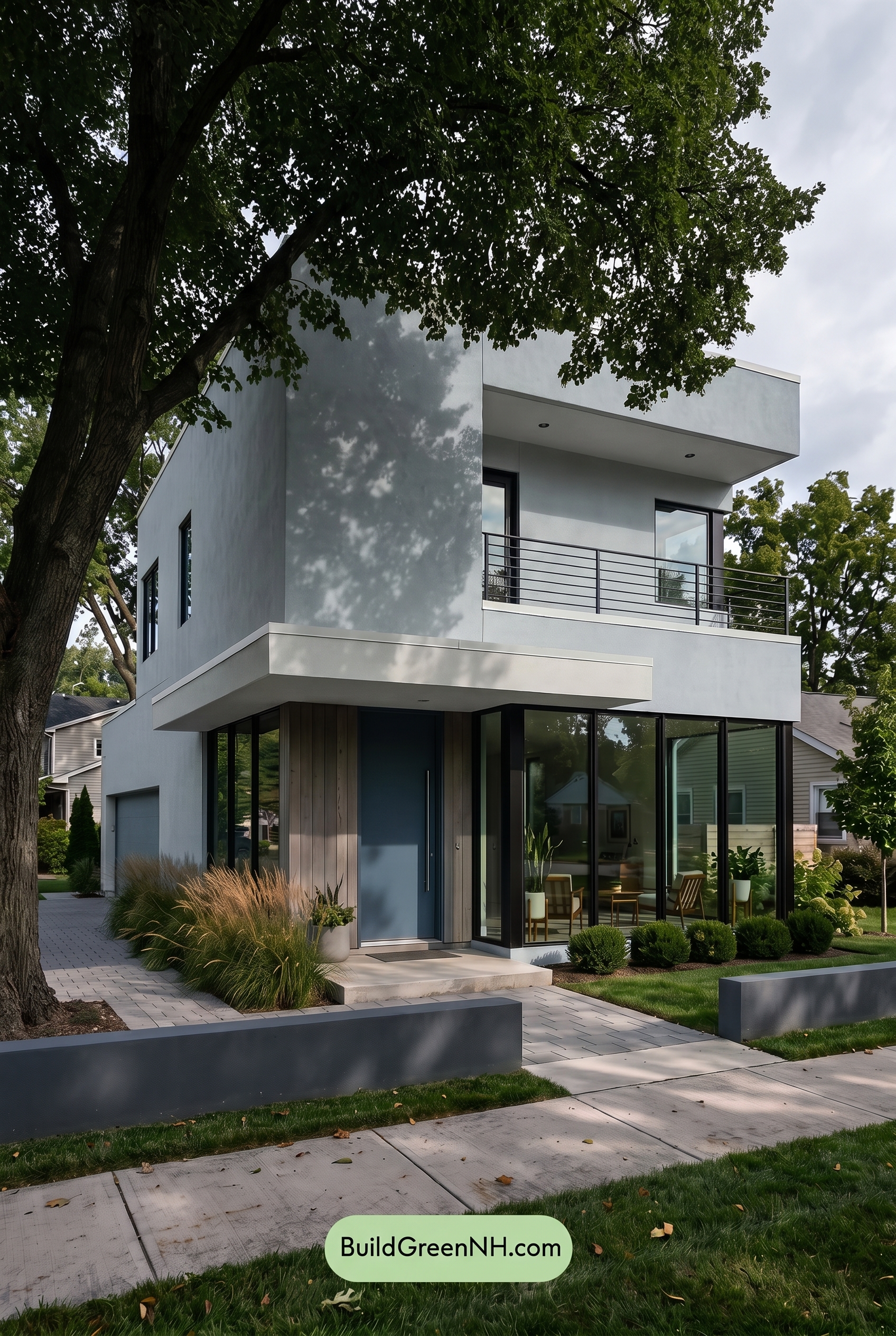
In shade, the white family on the main walls shifts cooler and slightly grayer than it would in neutral daylight, losing some brightness while gaining a softer, quieter feel. The beige family in the trim and accent areas also feels less warm and golden, reading more muted and gentle beneath the tree-filtered shadows.
The gray family on the window frames and railings appears deeper and more defined, creating sharper contrast against the softened white surfaces. Meanwhile, the blue family on the door and garage door becomes more saturated and moody, giving the exterior a calm, refined presence that feels cooler and more intimate than it would in even daylight.
Nighttime
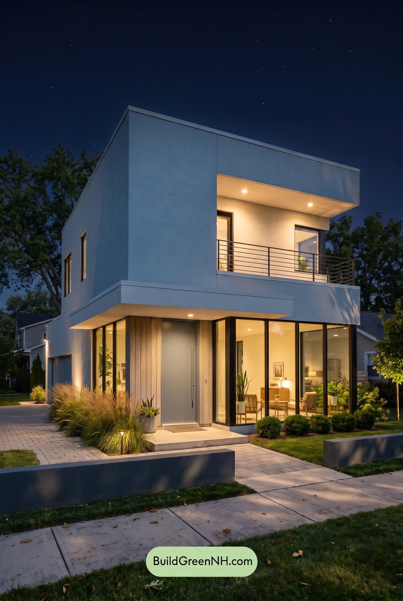
At night, the white exterior shifts from crisp and neutral to a cooler, softer shade, with shadows adding depth across the broad wall surfaces. The warm beige areas near the entry and upper balcony glow under the fixtures, becoming richer and more inviting than they would appear in daylight.
The gray window frames and railings read darker and more defined, increasing contrast against the lighter walls, while the blue door and garage shade feel deeper and slightly more saturated. Overall, the palette moves from clean and minimal in daylight to dramatic, warm, and quietly sophisticated after dark.
Pin these for later:
Want More?
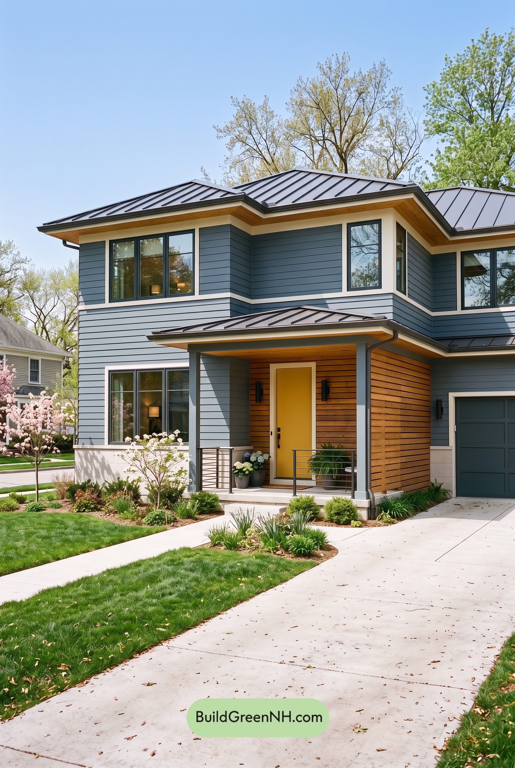 Blue House Front Door Color Scheme: Harbor Saffron
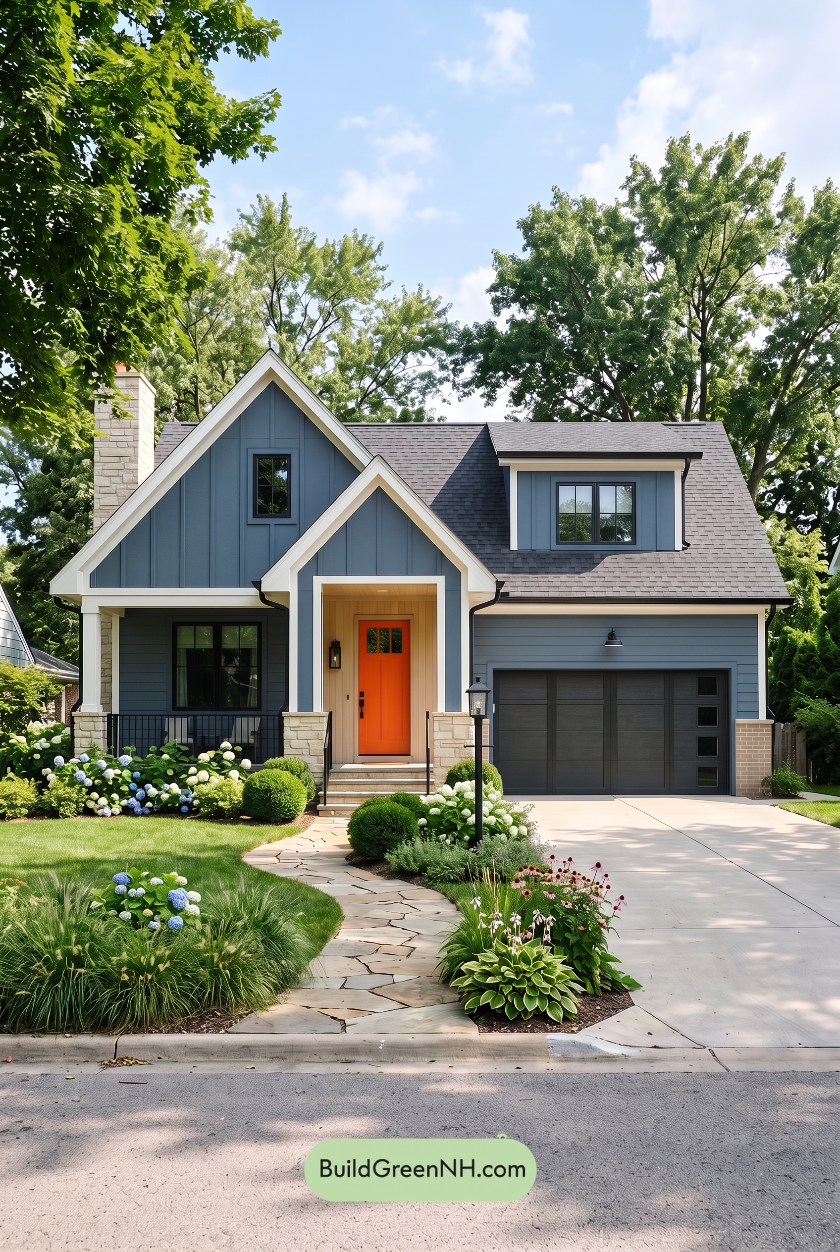 Blue House Front Door Color Scheme: Cobalt Persimmon
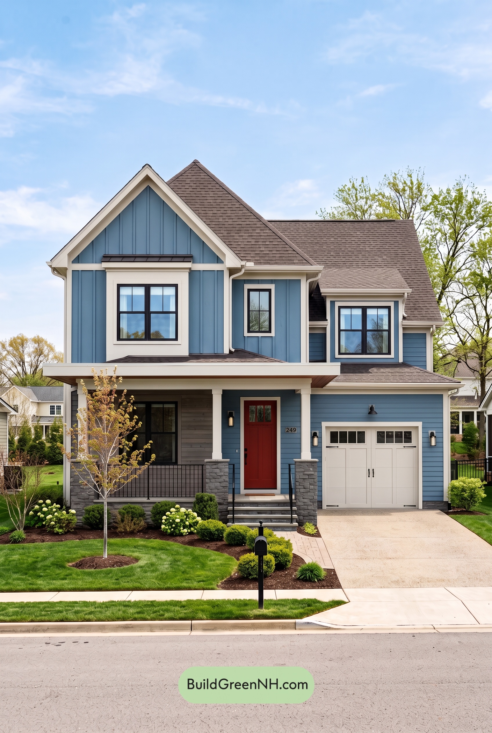 Blue House Front Door Color Scheme: Denim Poppy
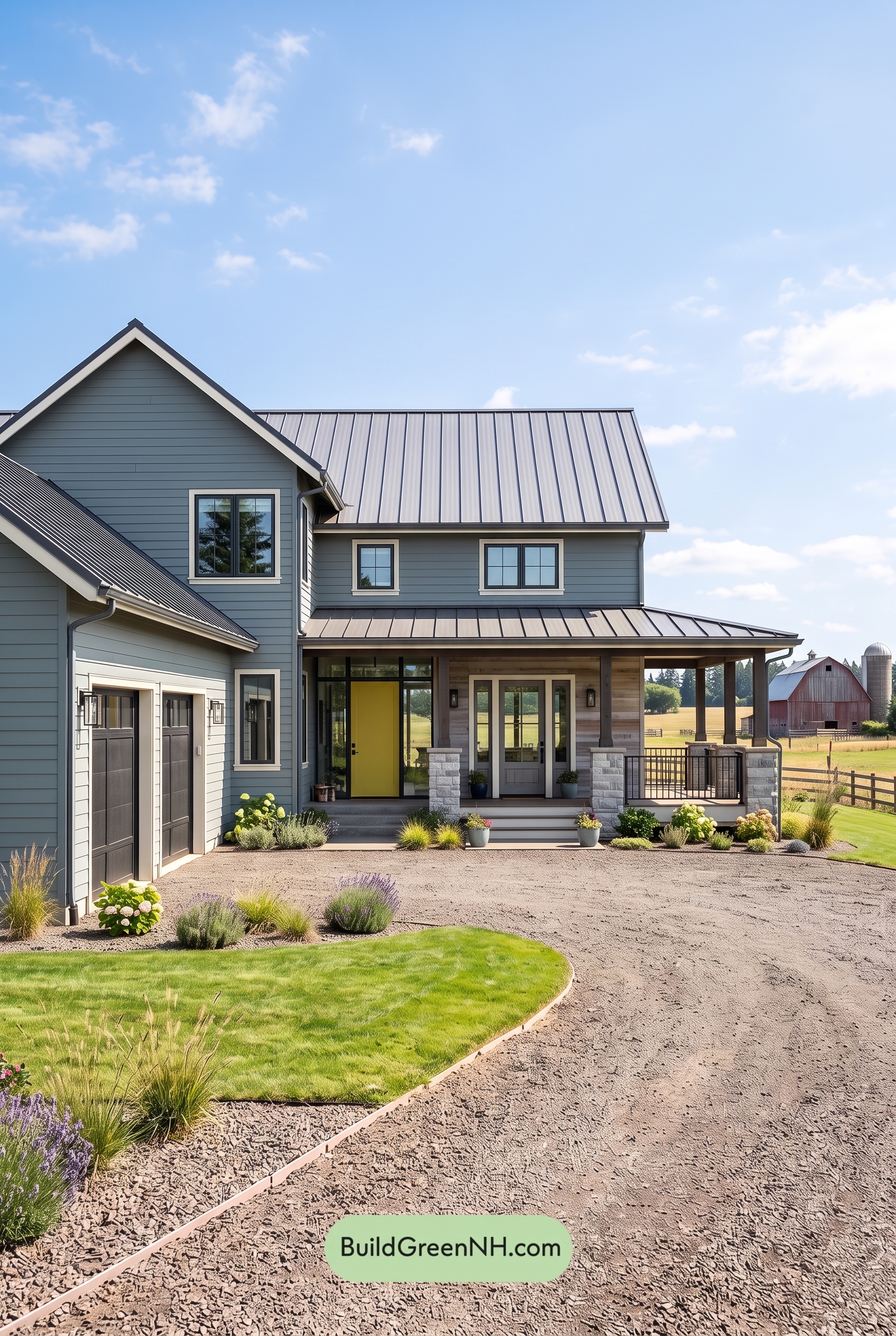 Blue House Front Door Color Scheme: Slate Citron
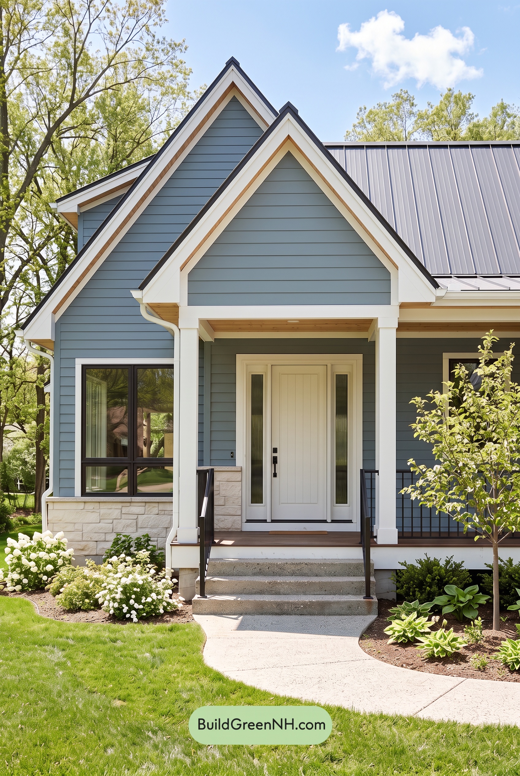 Blue House Front Door Color Scheme: Mist Blue Haven
Table of Contents