Last updated on
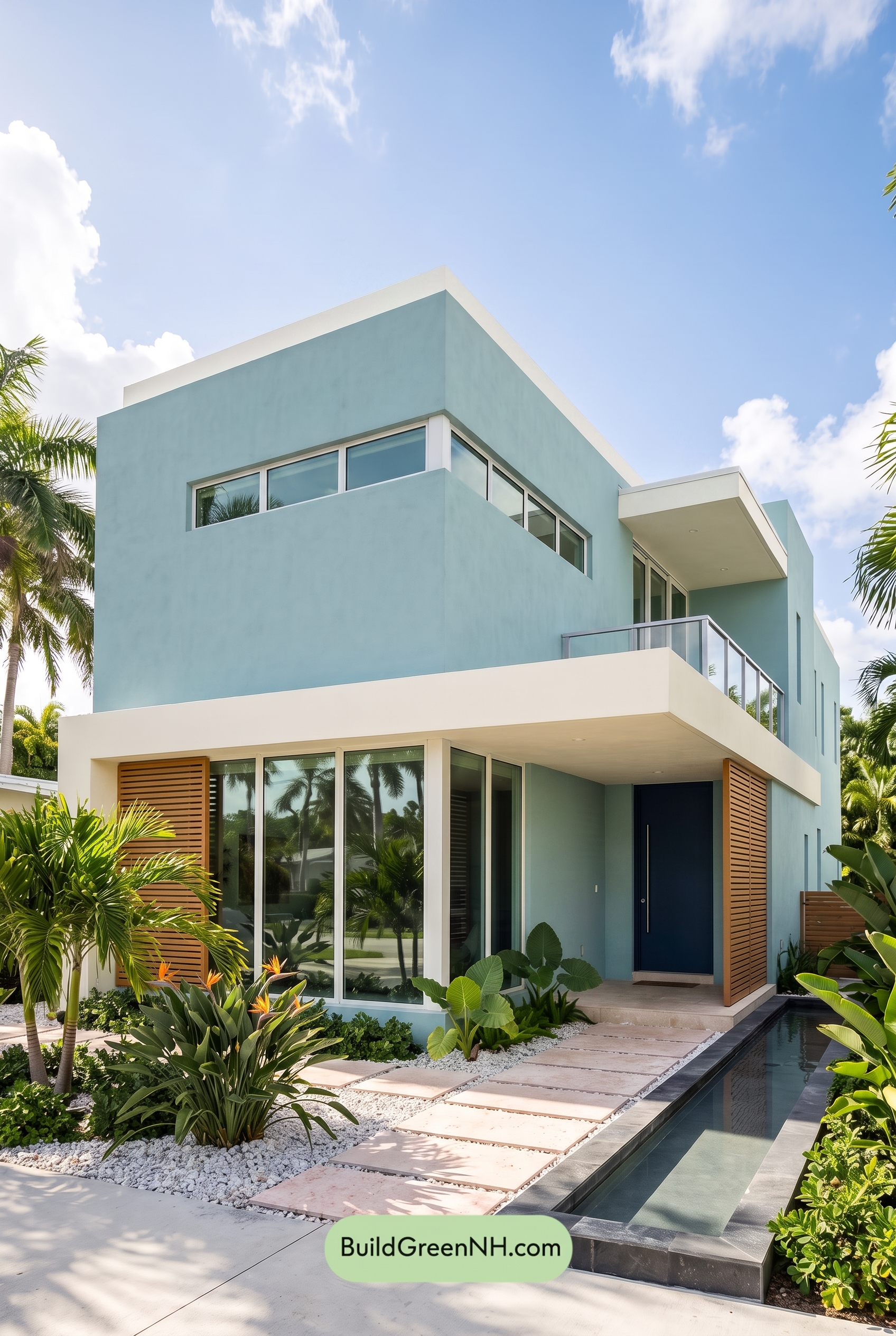

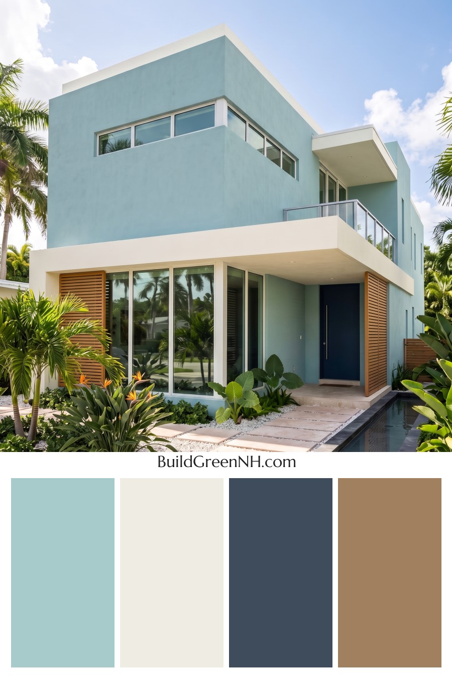
This crisp mix of breezy blue, clean white, rich brown, and a deeper blue door gives the home a polished coastal-modern presence that feels fresh without losing warmth.
A Cool Blue Base With Modern Confidence
The main exterior is wrapped in a soft, airy shade from the blue family, giving the home an immediate sense of calm. On the large, clean wall planes, this pale blue feels especially striking because the architecture is so geometric and minimal. It softens the modern shape without making the house look delicate.
This blue shade also works beautifully in the tropical setting. Surrounded by lush greenery, bright sky, and reflective glass, it feels cool, relaxed, and sun-washed. The result is a home that looks refreshing in full daylight while still feeling refined and intentional.
White Trim Keeps Everything Crisp
The white trim is a major part of what makes this scheme feel so sharp. It outlines the roofline, frames the windows, defines the overhangs, and brightens the columns and railings. Against the blue siding, the white reads clean and architectural.
The flat roof edge and broad horizontal bands use white as a visual pause between the blue wall sections. This keeps the exterior from feeling too heavy and highlights the layered, boxy form of the house. Around the windows, the white frames add a crisp rhythm that suits the modern design perfectly.
Brown Accents Add Warmth and Texture
The brown shutters and slatted accent panels bring in just the right amount of warmth. Their natural, earthy shade balances the coolness of the blue and white palette, making the home feel more welcoming. Without them, the exterior might lean very sleek; with them, it gains depth and personality.
Because these brown elements are used in strong vertical and horizontal lines, they also add texture without clutter. They create a subtle resort-like feeling, especially next to the greenery and the bright paved entry path.
A Deep Blue Door Grounds the Entry
The front door steps into a darker shade of the blue family, giving the entry a confident focal point. It connects back to the main siding while adding contrast and depth. This is a smart move: the house stays cohesive, but the entrance still feels special.
Paired with the surrounding white trim and the warm brown side accents, the deep blue door feels elegant and grounded. It draws the eye inward and gives the front porch a calm, tailored finish.
The Overall Mood
This color scheme feels fresh, coastal, and contemporary. The pale blue siding brings the breeze, the white trim brings clarity, the brown accents bring warmth, and the deeper blue door brings sophistication. Together, the shades create a balanced exterior that feels bright but not stark, modern but not cold.
It is a great example of how a simple palette can do a lot. By keeping the main colors restrained and letting each shade play a clear role, the home feels polished, relaxed, and beautifully connected to its sunny landscape.
Next, see how this color scheme looks under different lighting simulations throughout the day.
Overcast
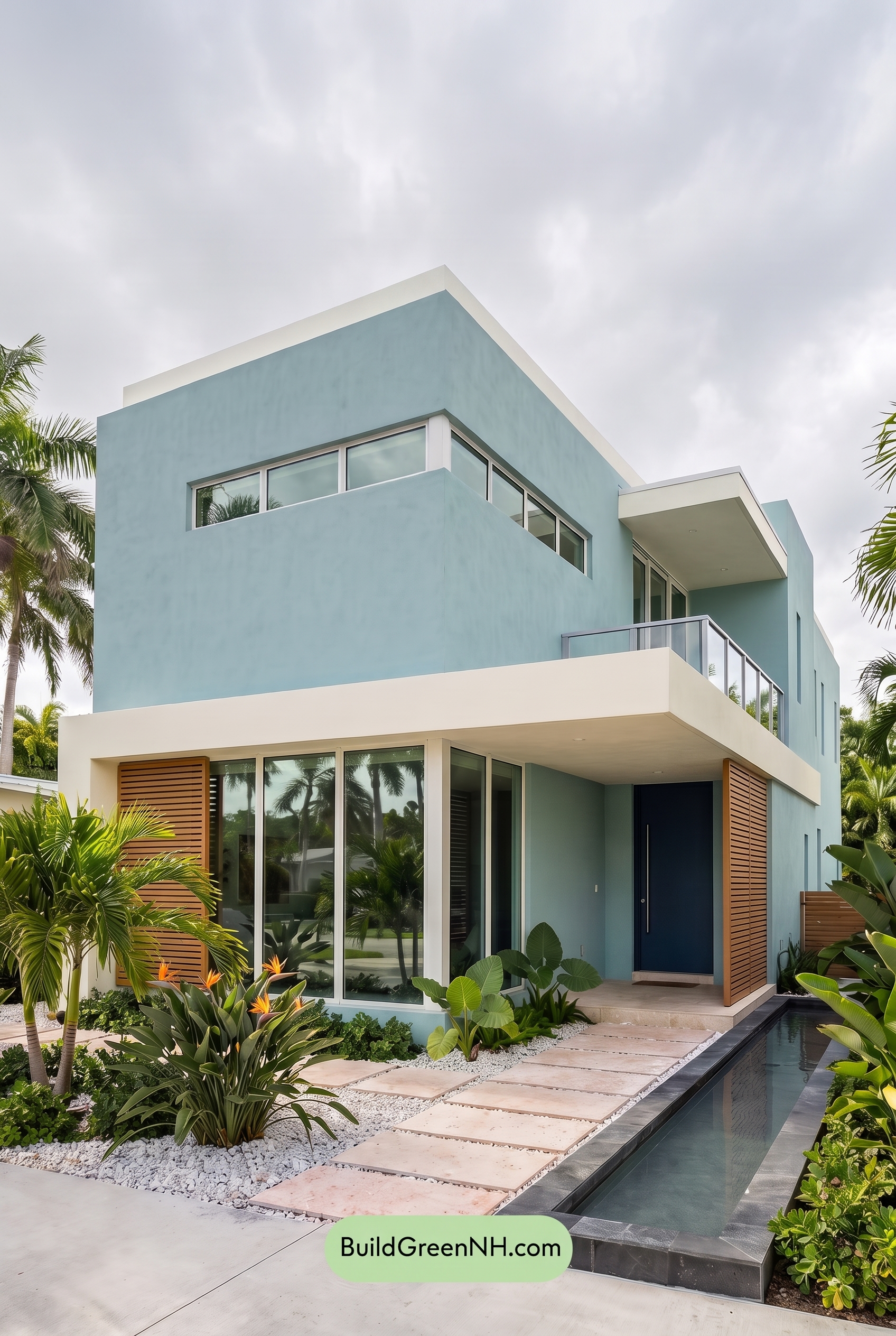
Under overcast light, the blue family on the main walls appears cooler and slightly muted, with less sparkle than it would have in neutral daylight. Its saturation softens, shifting the look from bright and coastal to calm and misty, while the deeper blue shade at the entry feels richer and more grounded.
The white family on the trim, window frames, railings, and broad horizontal bands loses some crisp brightness, reading softer and creamier where shadows gather. The brown family accents feel less warm and sun-kissed, but their natural depth still adds welcome contrast, creating an overall mood that is relaxed, refined, and quietly modern.
Golden Hour
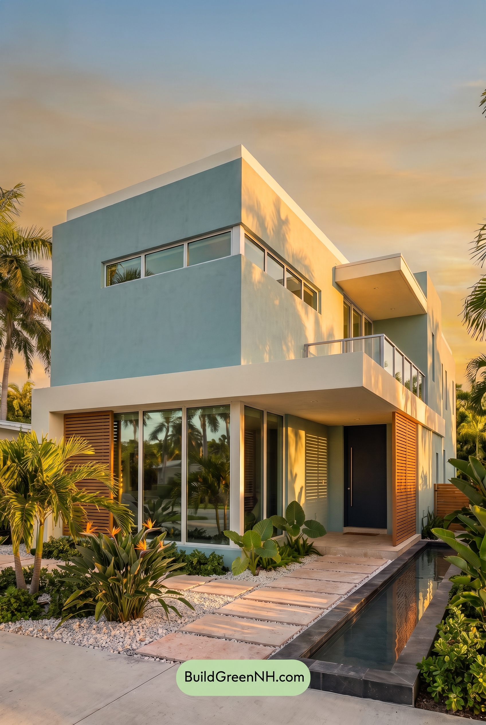
Under neutral daylight, the blue exterior would read cooler and more even, with the white trim crisp and the brown shutters straightforward. In Golden Hour, this shade of blue takes on a softer warmth in the sunlit areas while deepening in shadow, so the façade feels more saturated and dimensional instead of flat.
The white elements pick up a creamy glow, reducing starkness and making the contrast feel gentler where the light hits, while shaded recesses and the dark blue front door become richer and more dramatic. The brown shutters look deeper and more golden, giving the whole exterior a relaxed, inviting mood compared with the cleaner, cooler feel of neutral daylight.
Shade
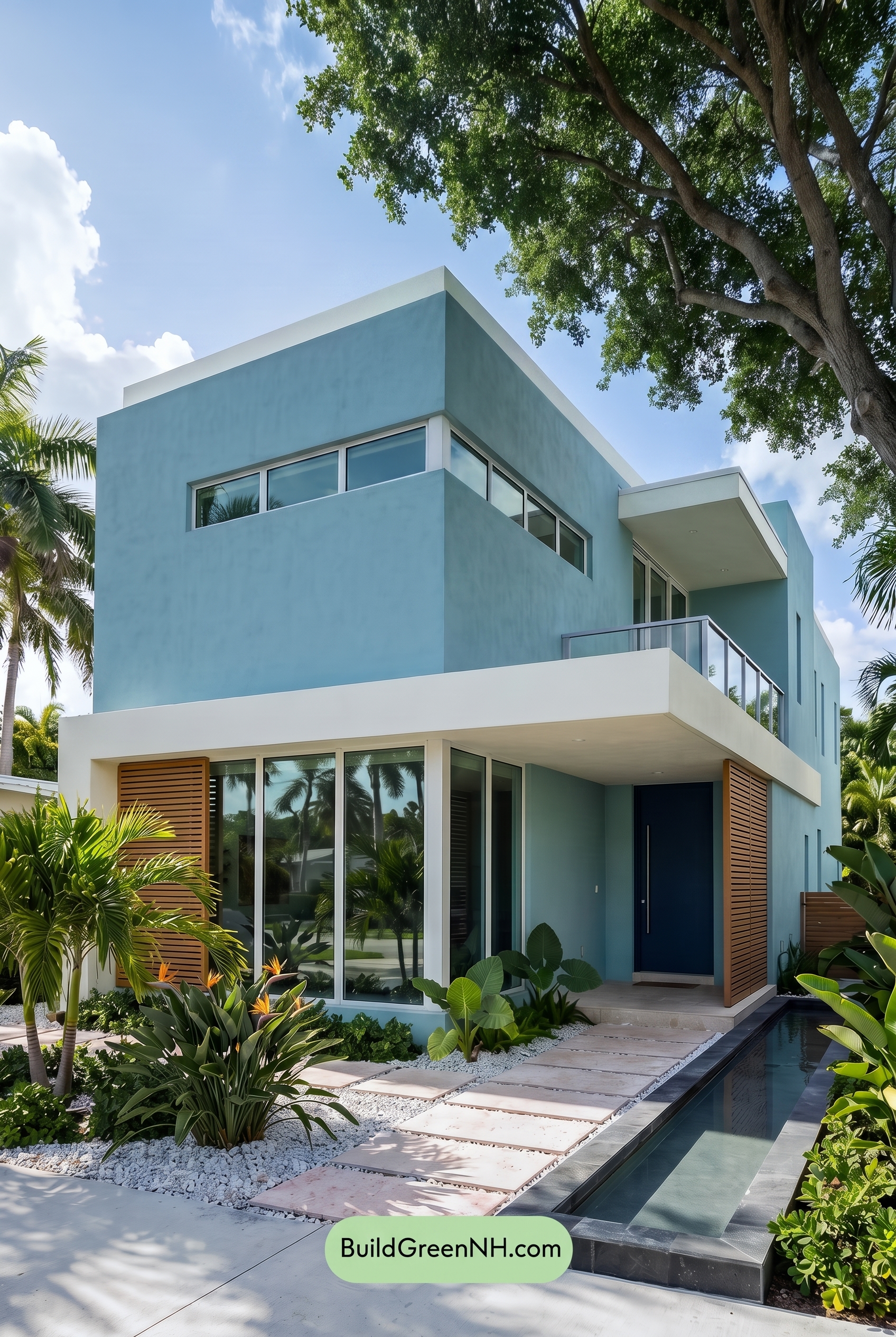
In shade, the blue family on the main walls reads cooler and slightly deeper than it would in neutral daylight, with saturation softening just enough to feel calm rather than bright. The white family trim and railings lose some crispness in the shadows, taking on a gentler, muted quality that reduces glare and makes the architecture feel more relaxed.
The deeper blue shade at the entry gains richness under shade, creating stronger contrast against the softened whites. The brown family shutters feel less warm and golden than in daylight, shifting toward a quieter, earthier mood while the tree shadows add depth and a breezy, resort-like softness to the whole exterior.
Nighttime
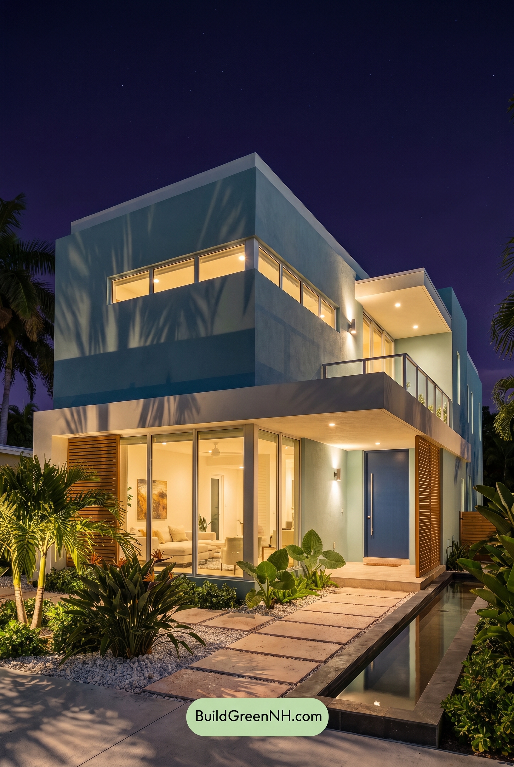
At nighttime, the blue family on the main walls appears deeper and slightly more saturated than it would in neutral daylight, shifting from airy and crisp to richer and more atmospheric. Warm light from the windows and exterior fixtures softens the white family on the trim, columns, railings, and window frames, giving those shades a gentle glow instead of a bright daylight sharpness.
Shadows add bold contrast across the flat surfaces, making the blue door feel moodier and more grounded, while the brown family on the shutters looks warmer and more dimensional. Compared to neutral daylight, the whole palette feels less casual and more dramatic, with cool blue shades balancing beautifully against the cozy warmth of the illuminated whites and browns.
Pin these for later:
Want More?
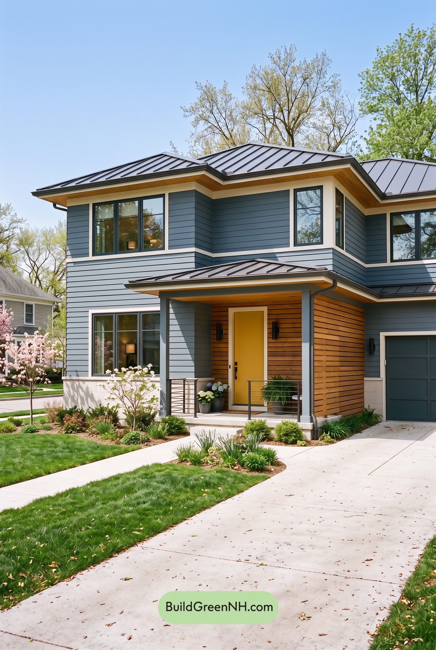 Blue House Front Door Color Scheme: Harbor Saffron
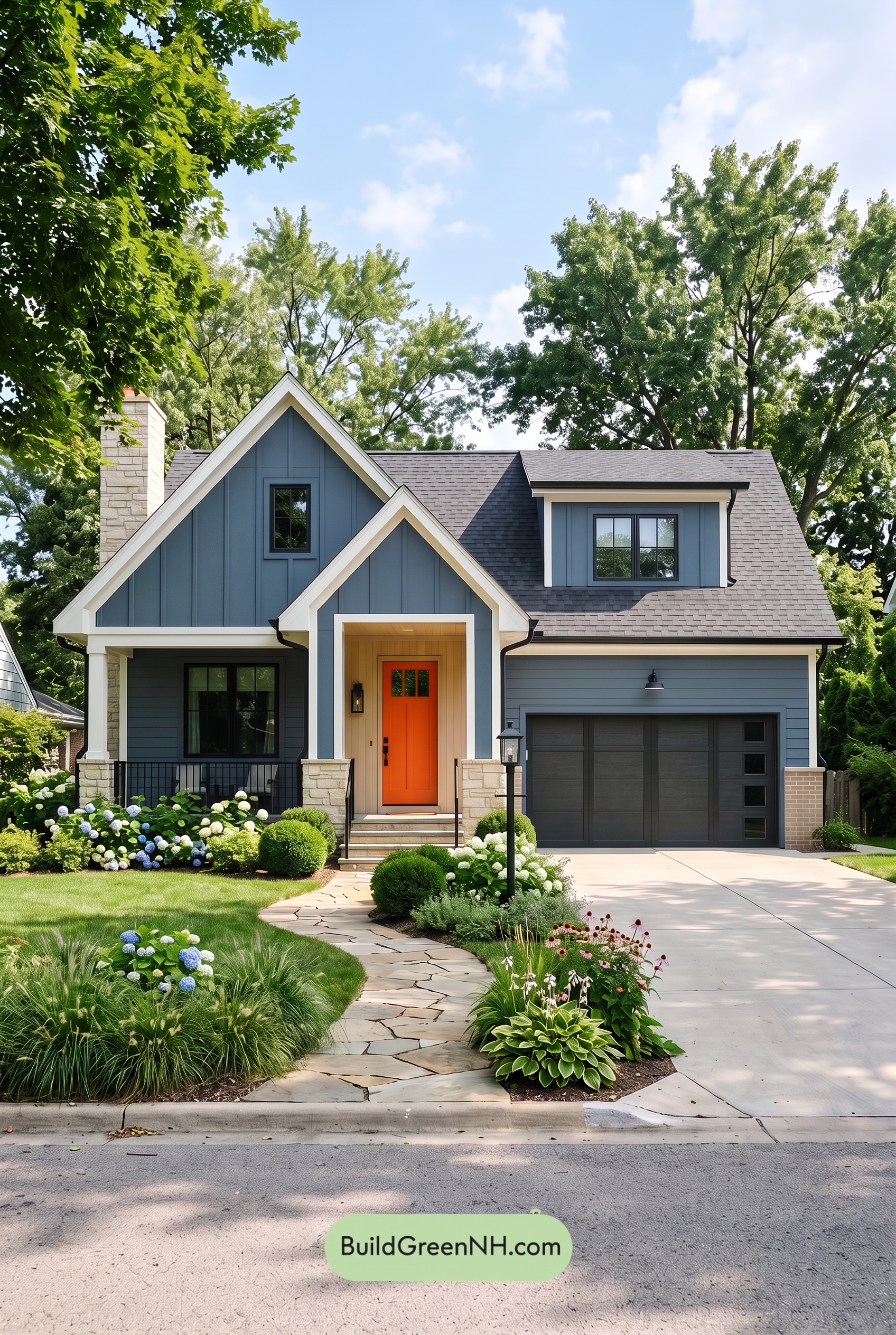 Blue House Front Door Color Scheme: Cobalt Persimmon
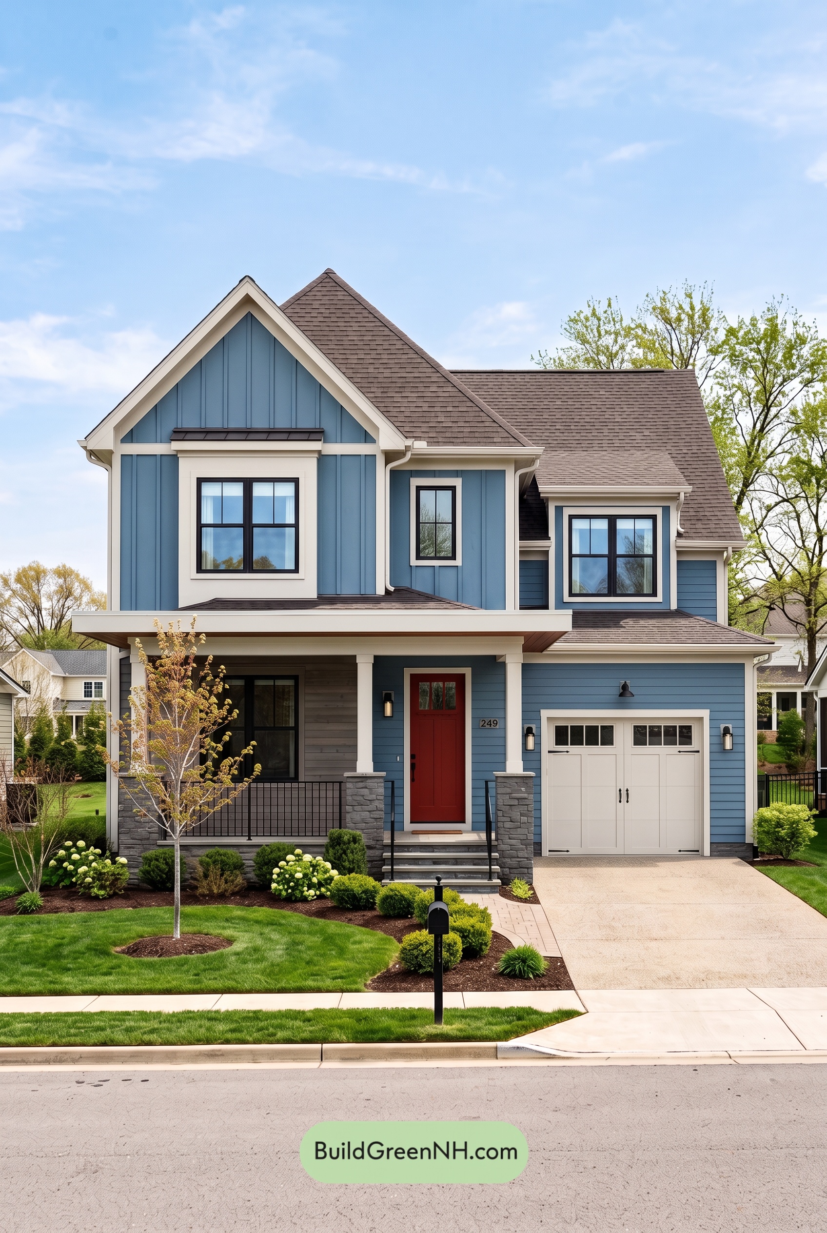 Blue House Front Door Color Scheme: Denim Poppy
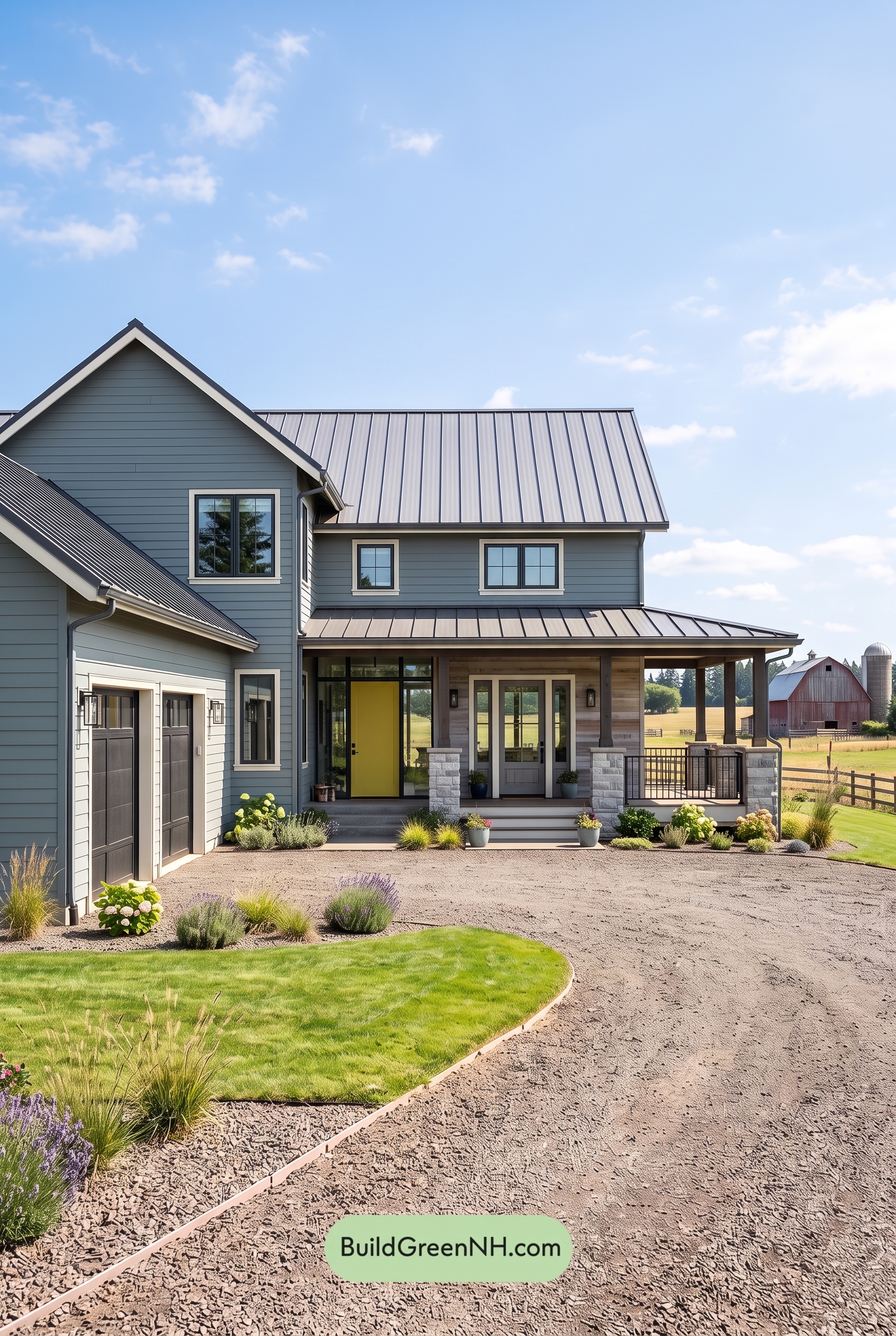 Blue House Front Door Color Scheme: Slate Citron
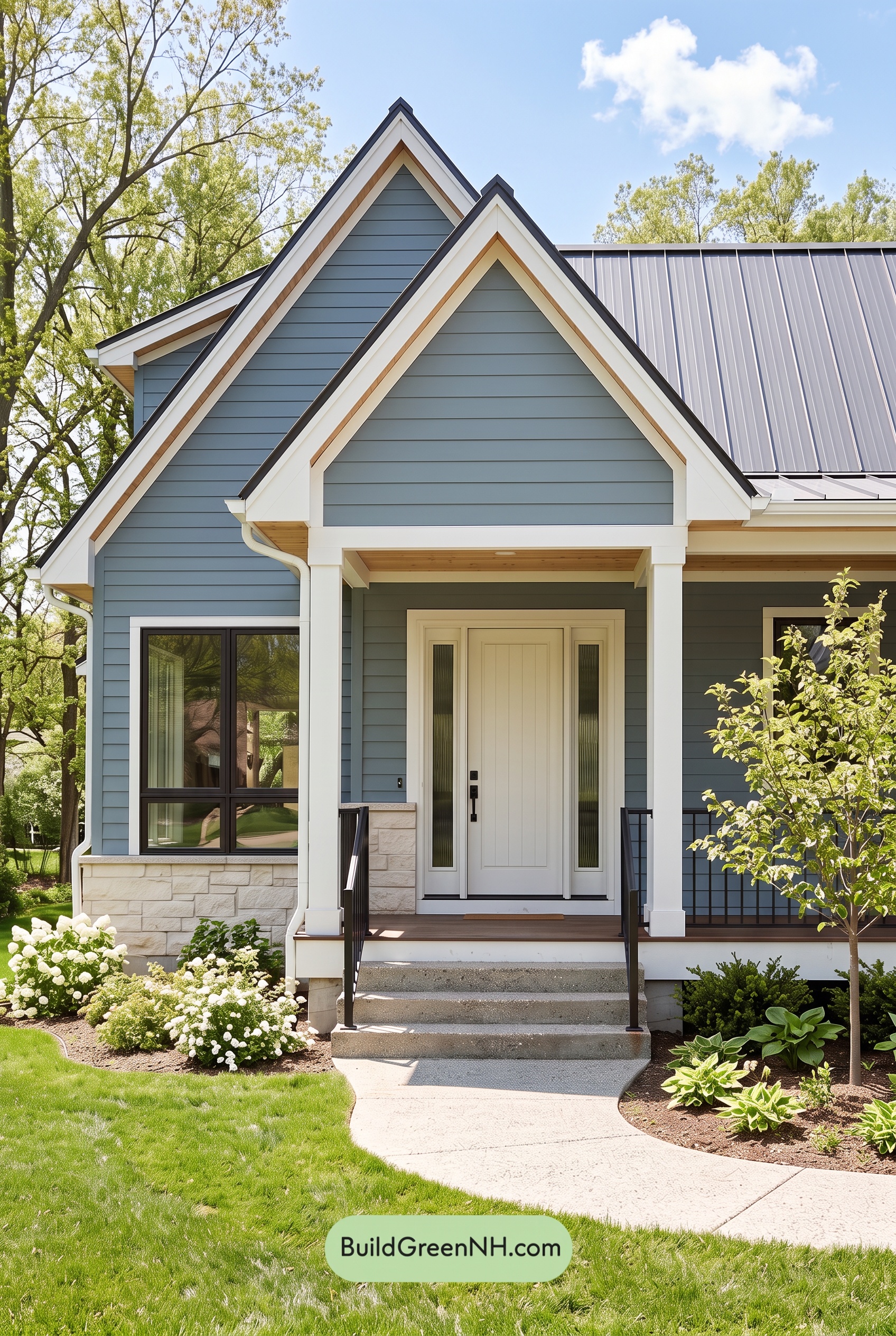 Blue House Front Door Color Scheme: Mist Blue Haven
Table of Contents