Last updated on
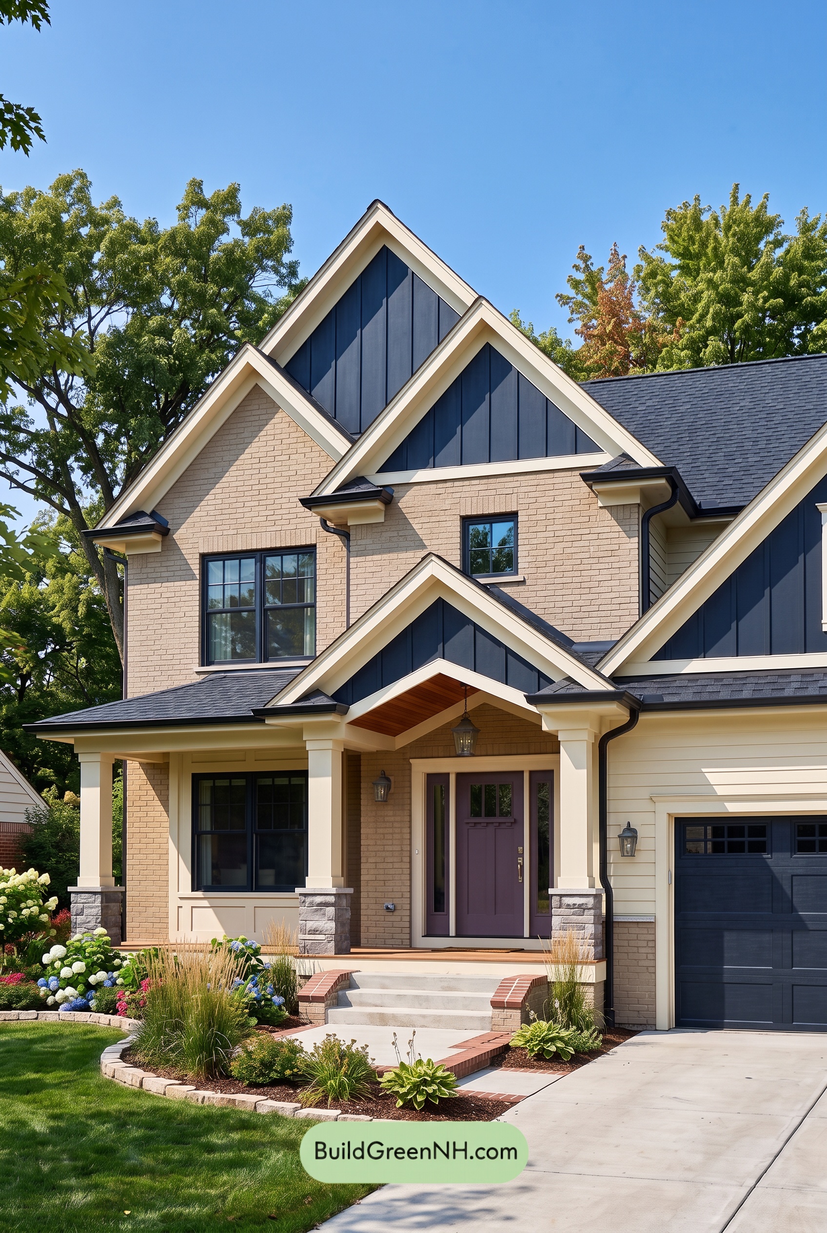

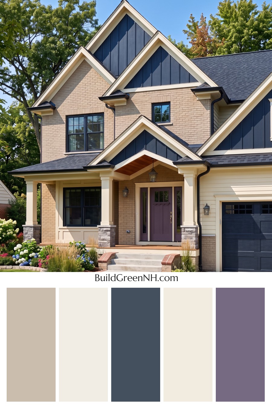
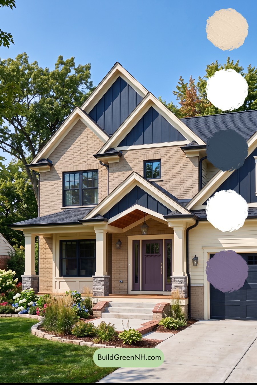
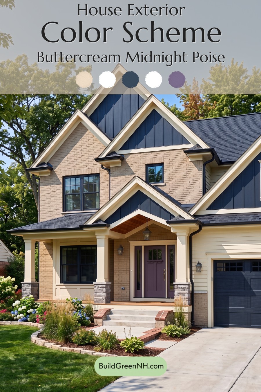
This inviting exterior succeeds because its warm neutrals, rich blue accents, and unexpected muted purple entry create a polished look with real personality.
A Warm, Grounding Foundation
Soft beige tones anchor the exterior, appearing across the main wall surfaces, brick sections, porch columns, and light trim. This warm neutral family keeps the home approachable and bright while giving its many rooflines and architectural layers a calm, cohesive backdrop.
The pale beige trim is especially effective around the gables, porch structure, and garage surround. It crisply outlines the home’s shape without feeling stark, adding definition that feels tailored rather than severe.
Deep Blue for Architectural Drama
Dark blue siding in the gable peaks brings handsome contrast to the lighter body of the home. The shade adds depth to the upper façade and draws the eye upward, making the layered rooflines feel even more dramatic.
That same deep blue family carries through the window frames and garage door, creating a thoughtful visual rhythm from one side of the façade to the other. Repeating this darker shade gives the design a grounded, intentional finish and prevents the lighter exterior from appearing too delicate.
A charcoal-gray roof complements the blue accents beautifully. Its cool, nearly black appearance adds another layer of contrast while bridging the deep architectural details with the soft neutral walls.
A Front Door with Character
The muted purple front door is the charming surprise in this scheme. Set within a sheltered entry framed by creamy beige details, the soft, dusky shade feels welcoming and refined rather than overly bold. It introduces a gentle touch of color that distinguishes the entrance from the surrounding blue and neutral elements.
Because the purple sits in a similarly deep, softened range as the blue accents, it feels connected to the rest of the palette while still giving guests a clear focal point. The result is a front entry that feels personal, memorable, and elegantly composed.
The Overall Effect
This exterior balances classic warmth with modern contrast. Beige surfaces provide softness, dark blue architectural elements contribute structure, and the muted purple door adds a note of individuality. Together, these shades create a home that feels polished, welcoming, and substantial from the curb.
Next, see how this color scheme looks under different lighting simulations throughout the day.
Overcast
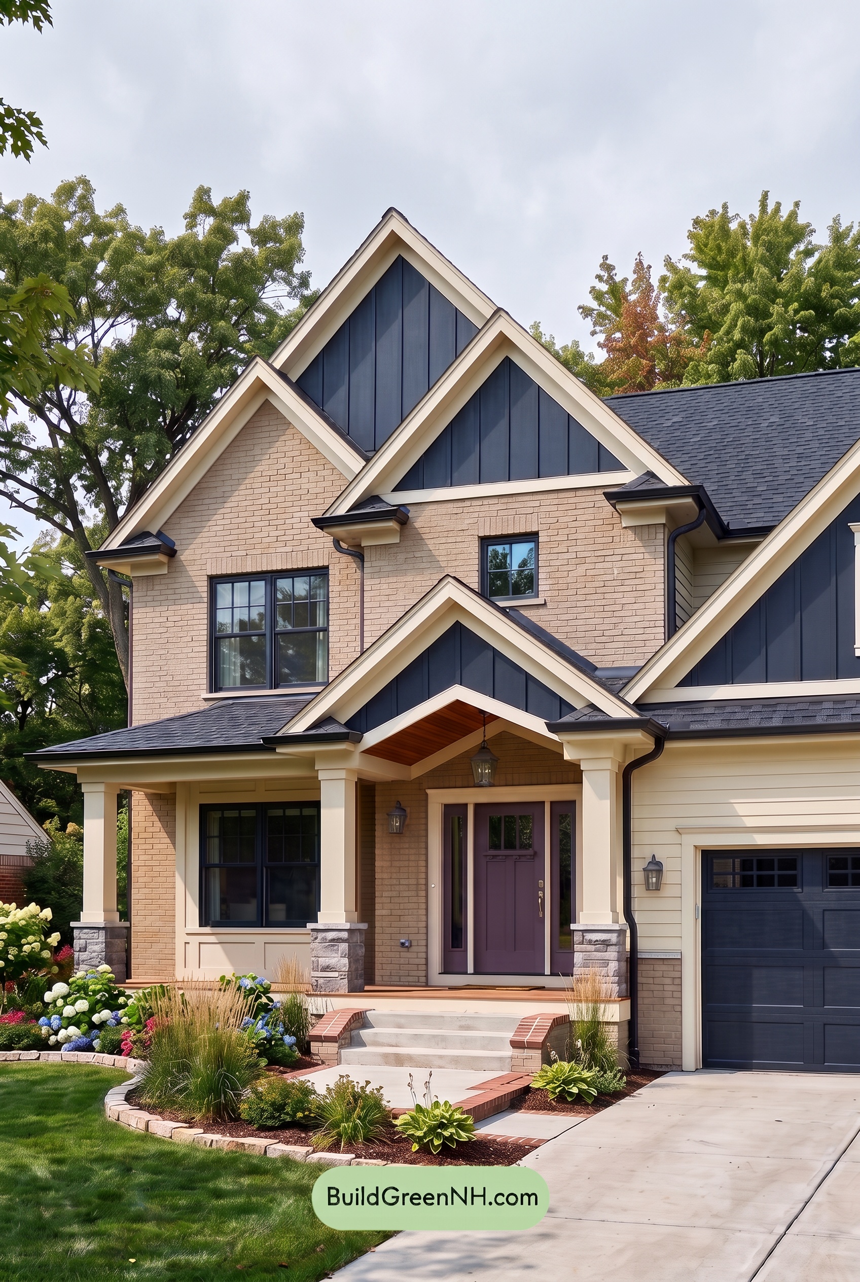
Under overcast skies, the beige brick and light beige trim lose some of the sunny glow they show in neutral daylight, reading softer, calmer, and slightly less warm. Diffused light smooths the strong roofline shadows, so the layered gables and columns appear more evenly toned while their texture becomes the focus.
The deep blue siding, window frames, and garage door take on a richer, more muted depth, with less sparkle but a more tailored presence. The purple front door may look slightly cooler and gentler, creating a refined contrast against the softened neutrals. Overall, the palette shifts from crisp and sunlit to quietly dramatic, with lower contrast and an inviting, composed mood.
Golden Hour
Under neutral daylight, the beige exterior reads balanced and clean, while the blue gables, frames, and garage provide crisp, cool contrast. As Golden Hour arrives, the beige shades become richer and more honeyed, with trim and columns taking on a softer glow that makes the façade feel especially welcoming.
The blue elements deepen into moodier, less saturated shadows, sharpening their contrast against the sunlit warm neutrals. The purple front door gains a subtle warmth and presence, while long shadows across the rooflines and brickwork add depth, texture, and a relaxed evening character.
Shade
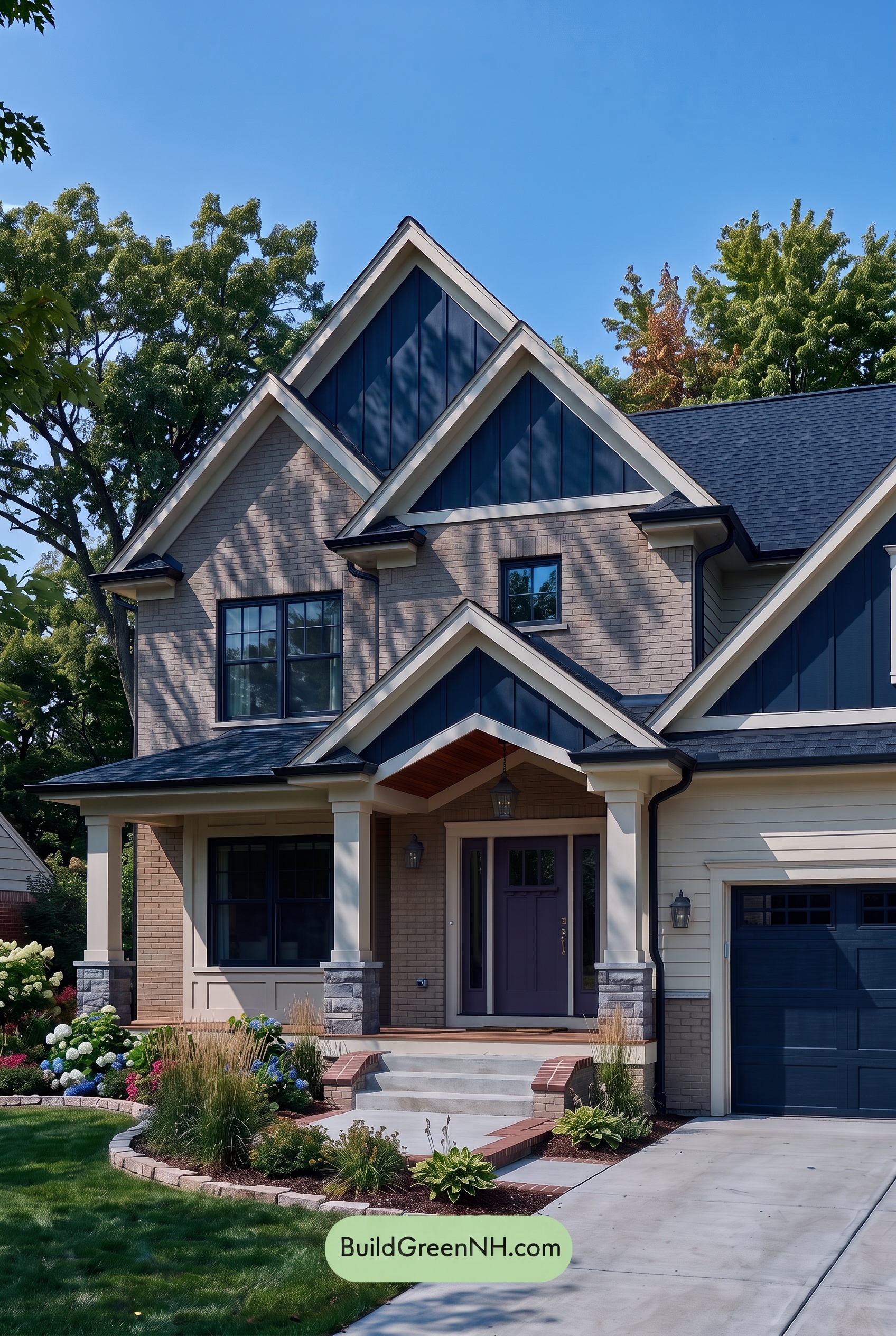
In shade, the beige walls and trim lose some of their sunlit warmth, settling into softer, quieter neutral shades. The blue gables, window frames, and garage door deepen noticeably, appearing more saturated and inky than they do in neutral daylight. Shadows across the brick and porch create added texture, making the facade feel more layered and architectural.
The purple front door takes on a richer, more subdued character under this cooler light, while the pale trim remains a crisp outline against the darkened blue elements. Compared with neutral daylight, contrast feels stronger but less sharp, giving the home a calm, polished mood with a slightly dramatic sense of depth.
Nighttime
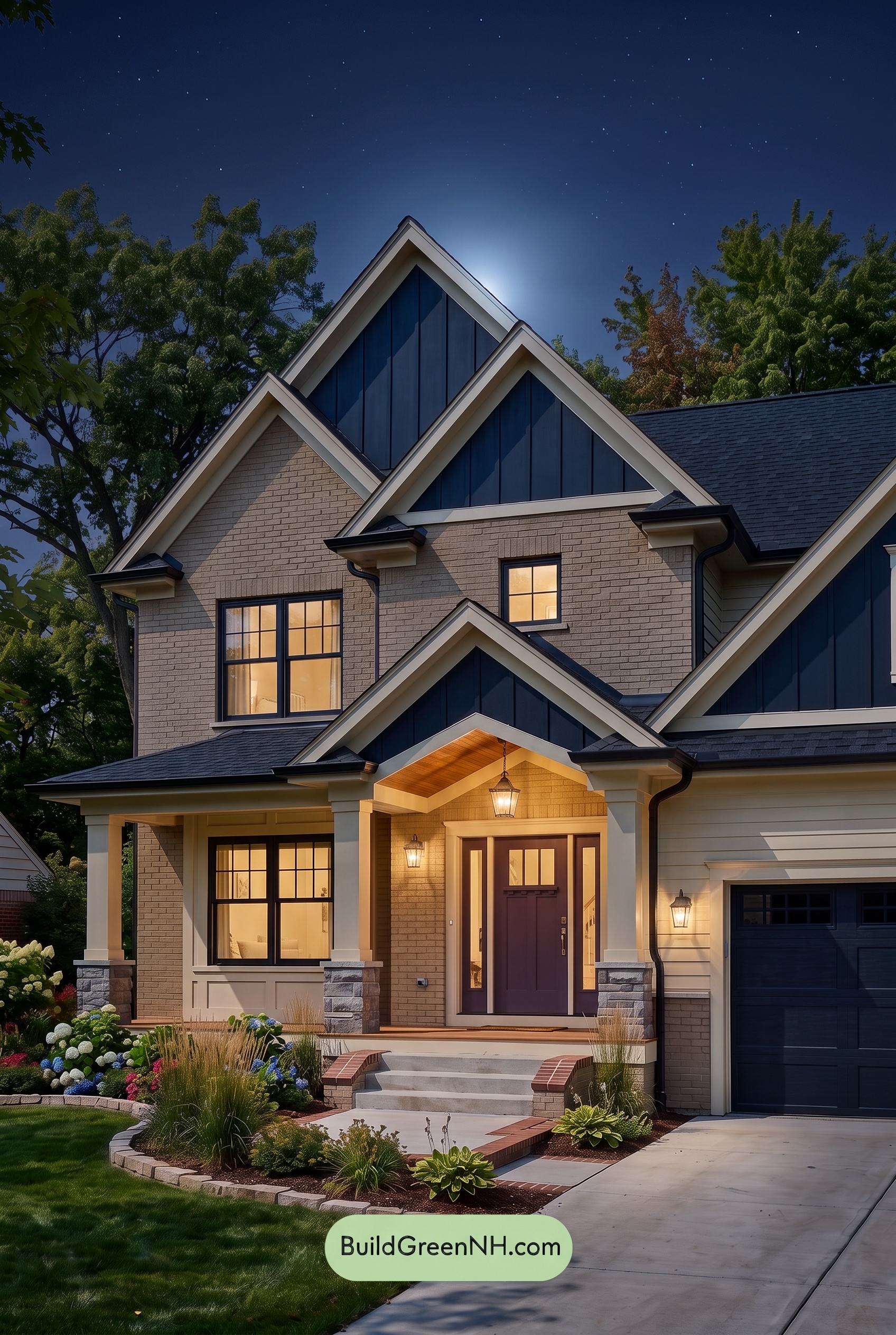
At night, the beige exterior shifts from a balanced neutral in daylight to a softer, warmer shade around the porch lighting, while areas beyond the fixtures settle into gentle shadow. The blue accents deepen toward an inky, lower-saturation expression, creating crisp contrast against the illuminated trim and columns.
Warm light draws out the richness of the purple entry door, making it feel more welcoming and dramatic than it does under neutral daylight. Together, the darkened blue surfaces, glowing warm neutrals, and layered shadows give the façade a polished, cozy nighttime mood.
Pin these for later:
Want More?
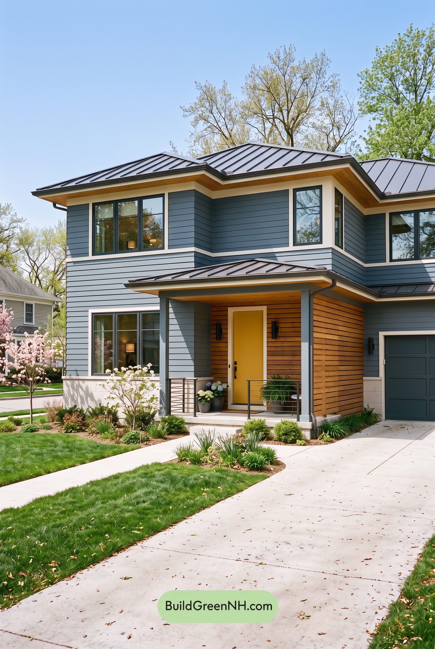 Blue House Front Door Color Scheme: Harbor Saffron
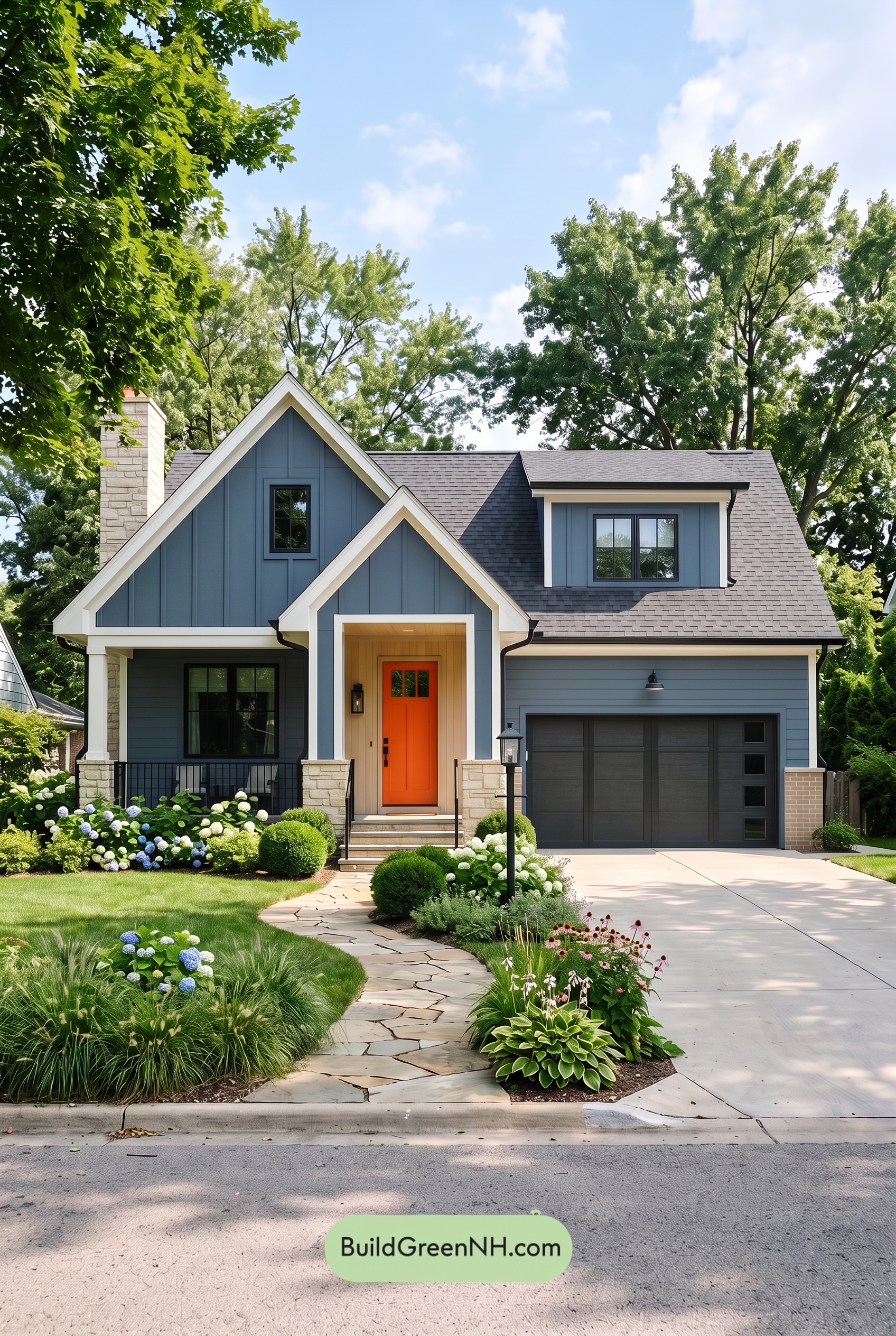 Blue House Front Door Color Scheme: Cobalt Persimmon
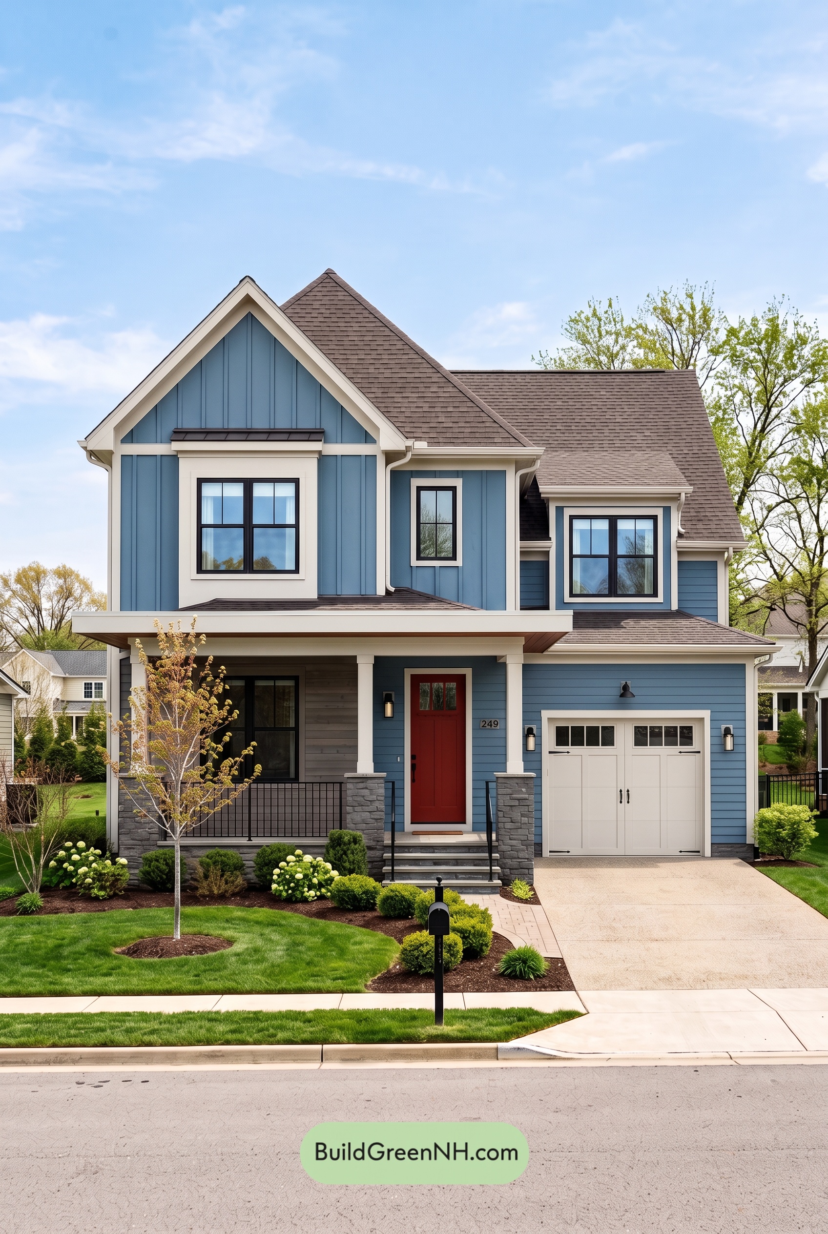 Blue House Front Door Color Scheme: Denim Poppy
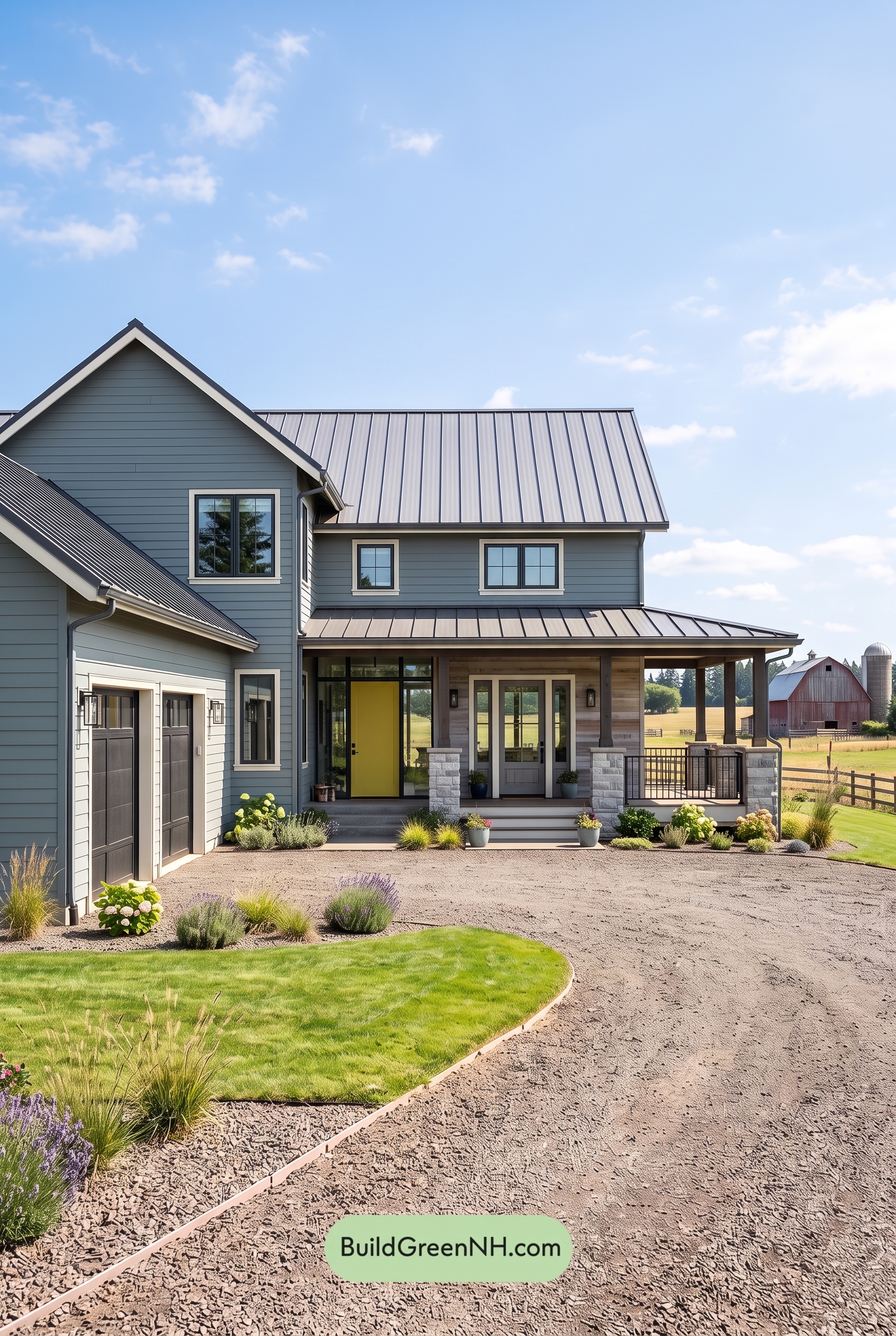 Blue House Front Door Color Scheme: Slate Citron
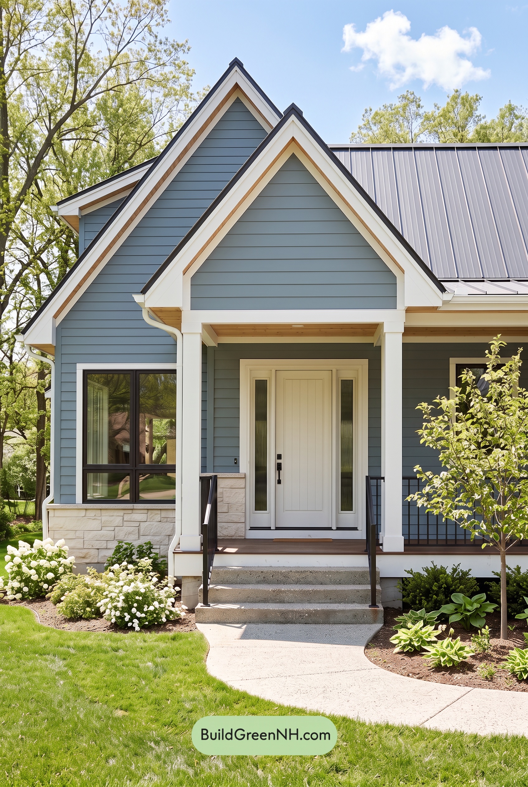 Blue House Front Door Color Scheme: Mist Blue Haven
Table of Contents