Last updated on
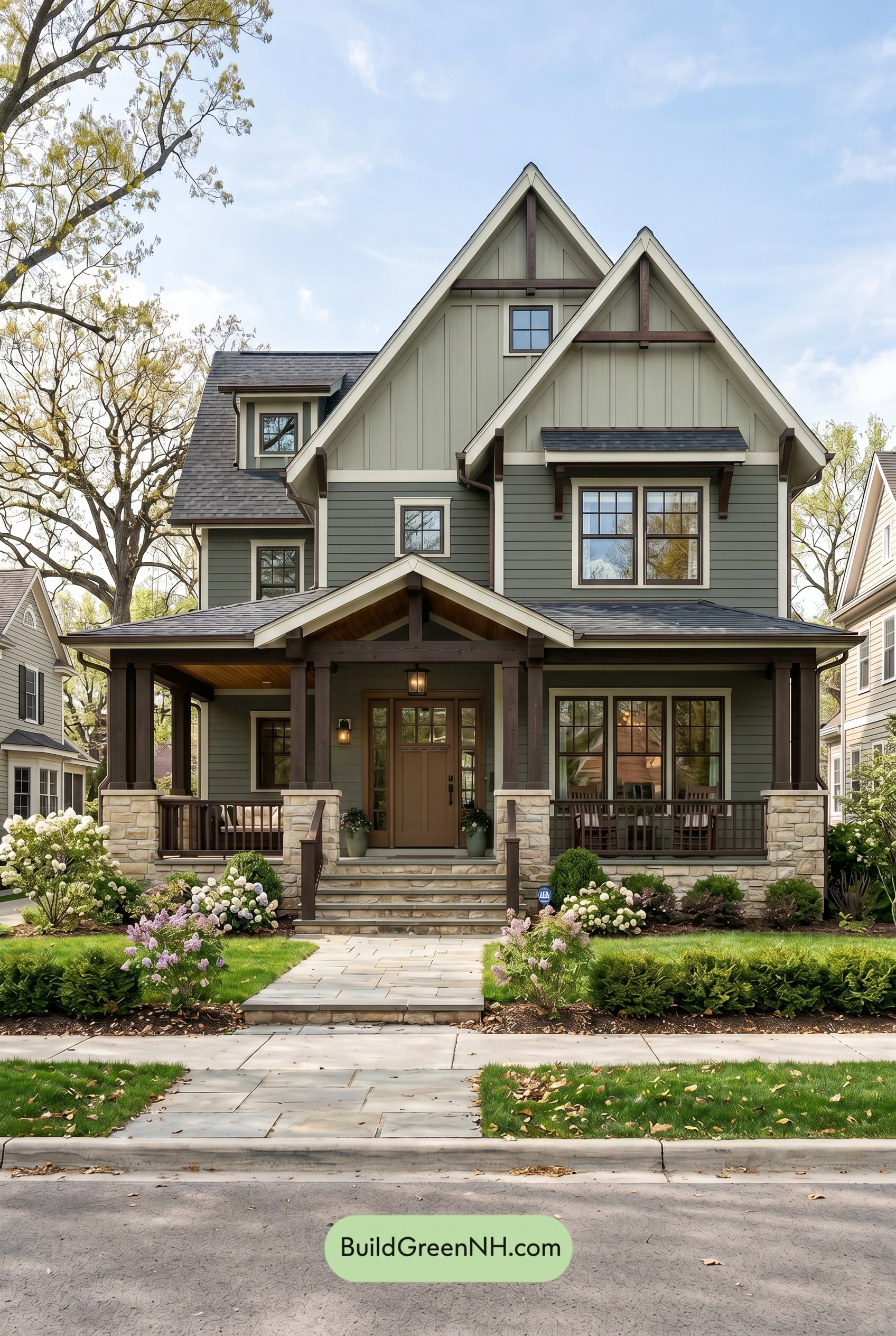

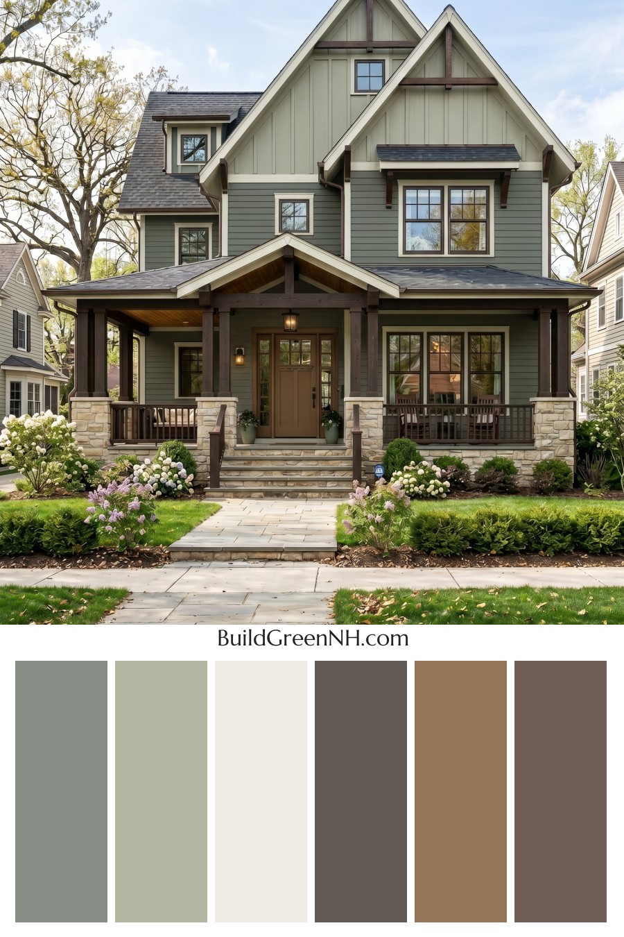
This exterior color scheme works beautifully because its layered grays, soft greens, crisp whites, and rich browns give the home both storybook charm and grounded curb appeal.
A Balanced Blend of Gray and Green
The main body of the house is wrapped in a muted gray shade that feels calm, established, and timeless. On the lower levels, the horizontal siding gives this gray family a steady presence, helping the tall home feel anchored rather than overly vertical.
Above, the gables shift into a soft green shade, adding a gentle natural quality to the upper portion of the exterior. This green family works especially well with the steep rooflines and vertical siding, giving the peaks a lighter, more airy feel. It also connects beautifully with the surrounding trees, lawn, and landscaping.
Crisp White Trim That Sharpens the Architecture
The white trim is one of the most important parts of this palette. It outlines the roof edges, windows, porch details, and gable lines with clean definition. Against the gray and green siding, this warm white shade keeps the home feeling fresh without becoming stark.
Because the architecture has so many beautiful angles, brackets, and layered rooflines, the trim acts almost like a frame. It highlights the craftsmanship and helps each section of the facade stand out clearly. The result is polished, classic, and very welcoming.
Rich Brown Accents Add Warmth and Character
The brown family brings depth to the scheme through the window frames, front door, porch columns, railings, and decorative gable accents. These warm brown shades add a handcrafted quality that suits the home’s traditional character.
The front door is especially inviting in its medium brown tone. It feels substantial and friendly, creating a natural focal point beneath the covered porch. The matching brown columns and railings extend that warmth across the front of the home, making the porch feel cozy and grounded.
A Dark Gray Roof Grounds the Whole Look
The roof uses a deep gray shade that pairs naturally with the main siding while adding contrast to the lighter upper gables. Its darker tone gives the tall structure a strong cap and keeps the overall palette from feeling too soft.
This roof color also works well with the brown accents. Together, the dark gray and rich brown shades create a sturdy, handsome base for the lighter trim and green upper walls.
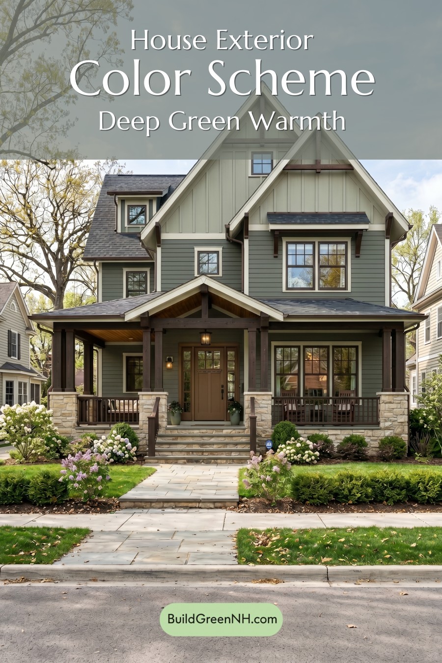
Why the Palette Feels So Inviting
This exterior succeeds because every color has a clear role. The gray siding provides calm structure. The soft green upper walls bring in a nature-inspired lift. The white trim adds crispness and contrast. The brown accents create warmth, texture, and a sense of craftsmanship.
Nothing feels too loud or too flat. Instead, the palette has a layered, organic quality that suits the home’s tall gables, deep porch, stone base, and lush landscaping. It feels classic, comfortable, and quietly elegant.
A Great Lesson in Natural Contrast
For a home with strong architectural lines, this kind of color scheme is a smart choice. The contrast is noticeable but not harsh, and the warmer accents keep the cooler gray and green shades from feeling cold.
The overall mood is refined yet approachable. It has the charm of a traditional neighborhood home, the warmth of a craftsman-inspired porch, and the freshness of a nature-friendly palette. It is a color combination that feels settled, sophisticated, and easy to love.
Next, see how this color scheme looks under different lighting simulations throughout the day.
Overcast
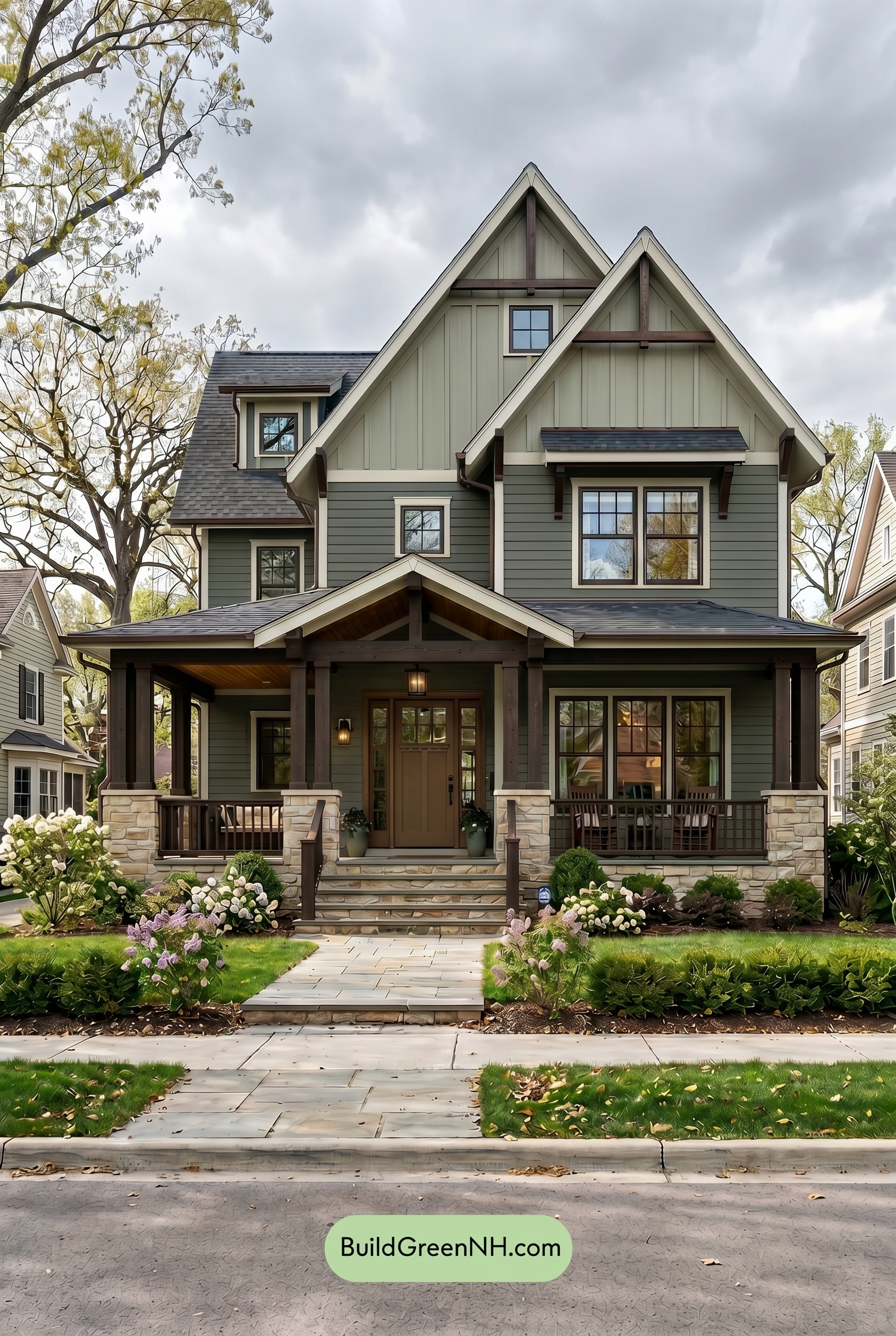
In overcast light, the home’s gray shades feel deeper and more grounded, while the green upper areas lose a bit of saturation and lean softer, almost misty compared to neutral daylight. The white trim appears less crisp and bright, taking on a gentler, cooler cast as the cloud cover diffuses the light.
The brown shades on the door, columns, railings, and window frames feel less warm and golden than they would in clearer daylight, shifting toward a richer, quieter depth. Shadows soften, contrast drops, and the whole exterior takes on a calm, cozy mood with a more subdued, layered character.
Golden Hour
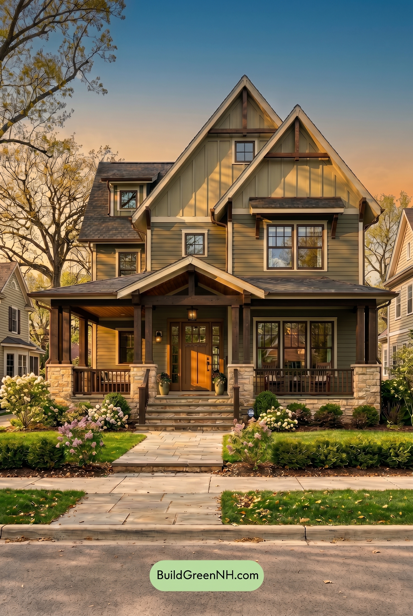
Under Golden Hour lighting, the gray siding feels warmer and more saturated than it would in neutral daylight, while the green upper walls shift into a softer, earthier shade. The white trim loses some of its crispness and takes on a gentle warmth, helping the rooflines and gables feel more inviting.
The brown window frames, door, columns, and railings deepen noticeably, gaining richness as long shadows gather under the porch and eaves. Compared with neutral daylight, the contrast becomes stronger, the edges feel more dimensional, and the overall mood turns cozy, layered, and welcoming.
Shade
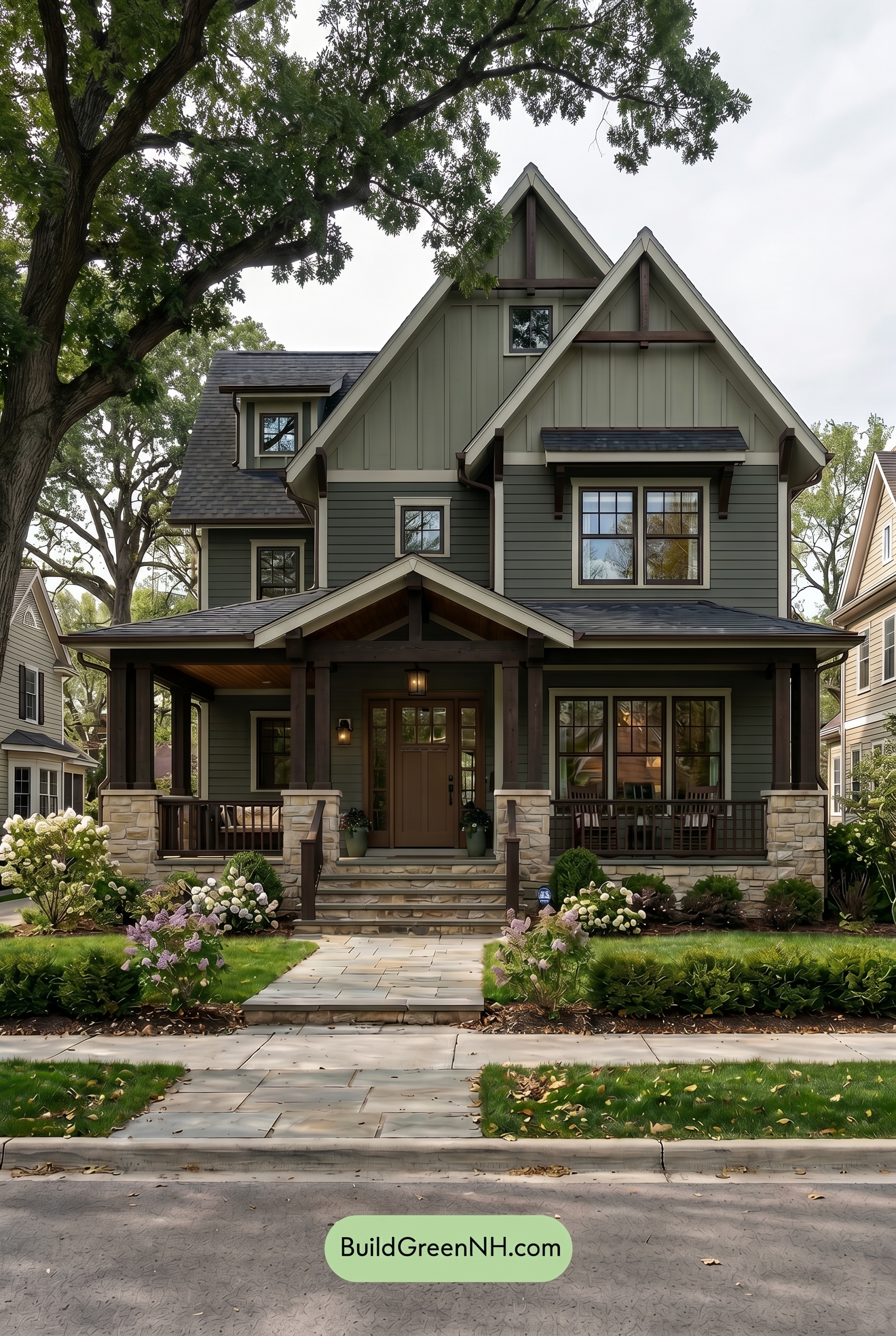
In shade, the gray family on the main walls reads deeper and more muted than it would in neutral daylight, with a cooler, softer cast that lowers its saturation. The green family on the upper gables feels more grounded and woodsy, blending gently with the surrounding foliage rather than standing out sharply.
The white family trim loses a bit of its bright snap in shade, becoming creamier and quieter, while the brown family details on the door, columns, railings, and window frames look richer and more shadowed. Overall, contrast softens in broad areas but deepens under the porch and eaves, giving the home a calm, sheltered, inviting mood.
Nighttime
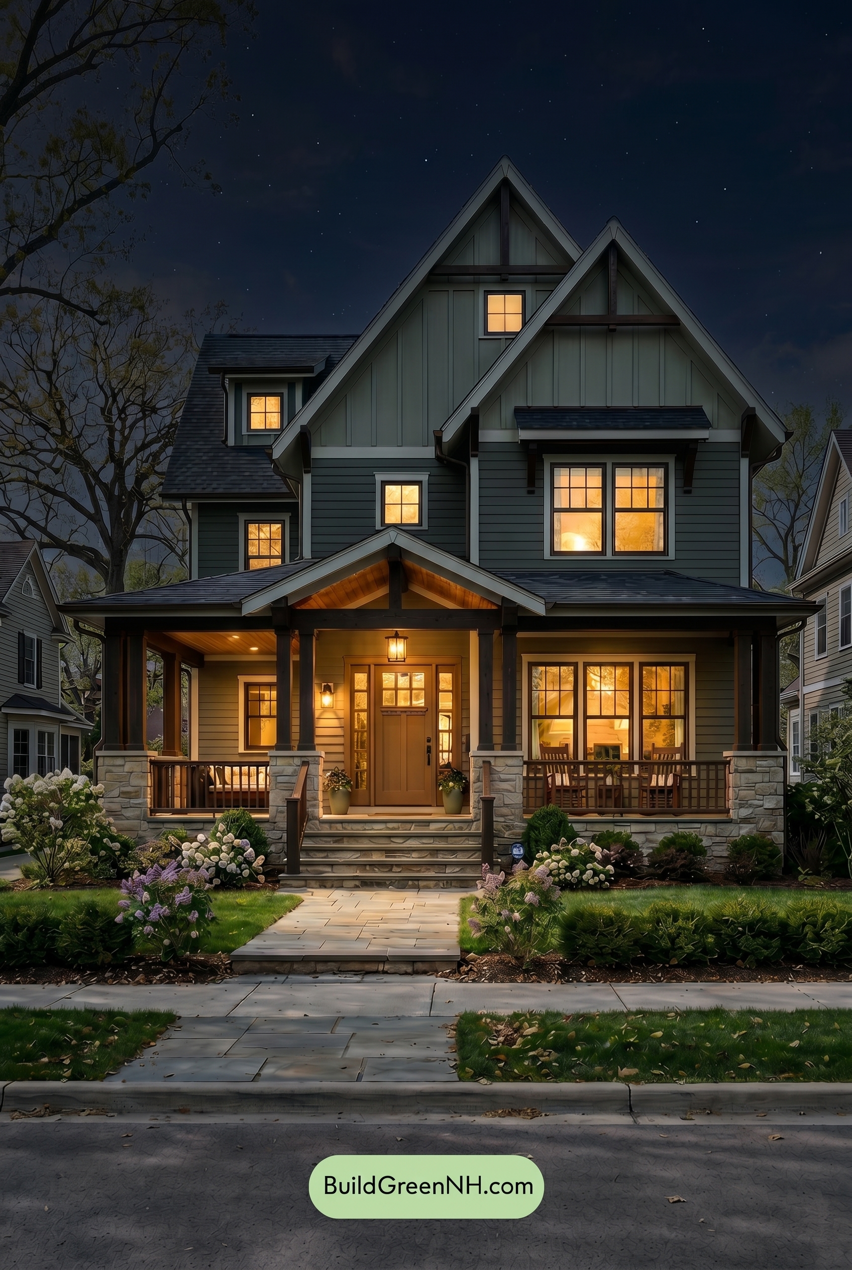
Under nighttime lighting, the gray walls deepen and feel more saturated, while the upper green shade turns quieter and more shadowed than it would in neutral daylight. The white trim gains stronger contrast against the darker siding, creating crisp rooflines and window edges without feeling as bright or stark.
Warm light from the windows and porch softens the brown shades on the door, columns, railings, and frames, bringing out a cozier warmth. Shadows collect under the gables and porch roof, adding depth and drama, so the overall mood shifts from clean and balanced in daylight to inviting, layered, and intimate at night.
Pin these for later
Want More?
 Green Farmhouse Exterior Color Scheme: Fern White Hearth
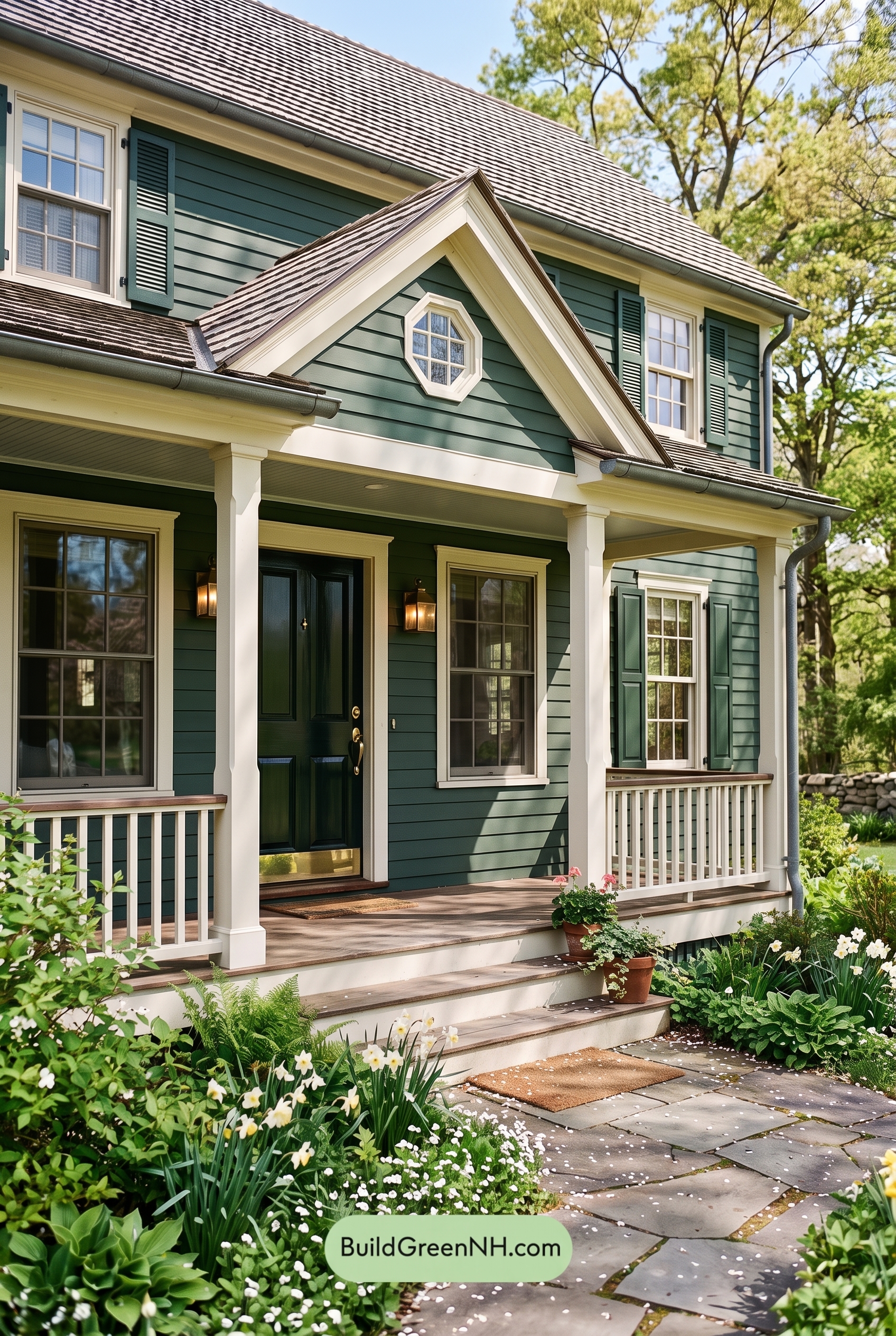 Green Farmhouse Exterior Color Scheme: Pine White Gleam
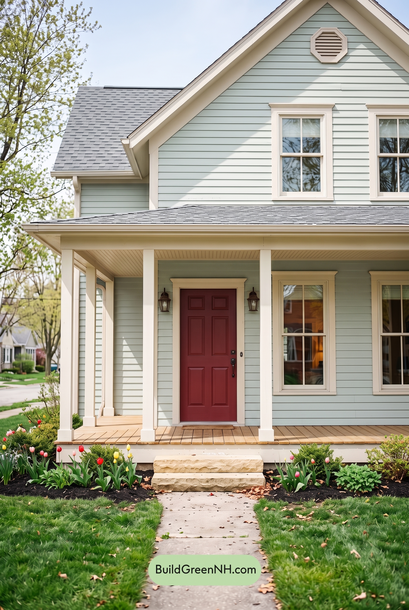 Green Farmhouse Exterior Color Scheme: Mint Cream Welcome
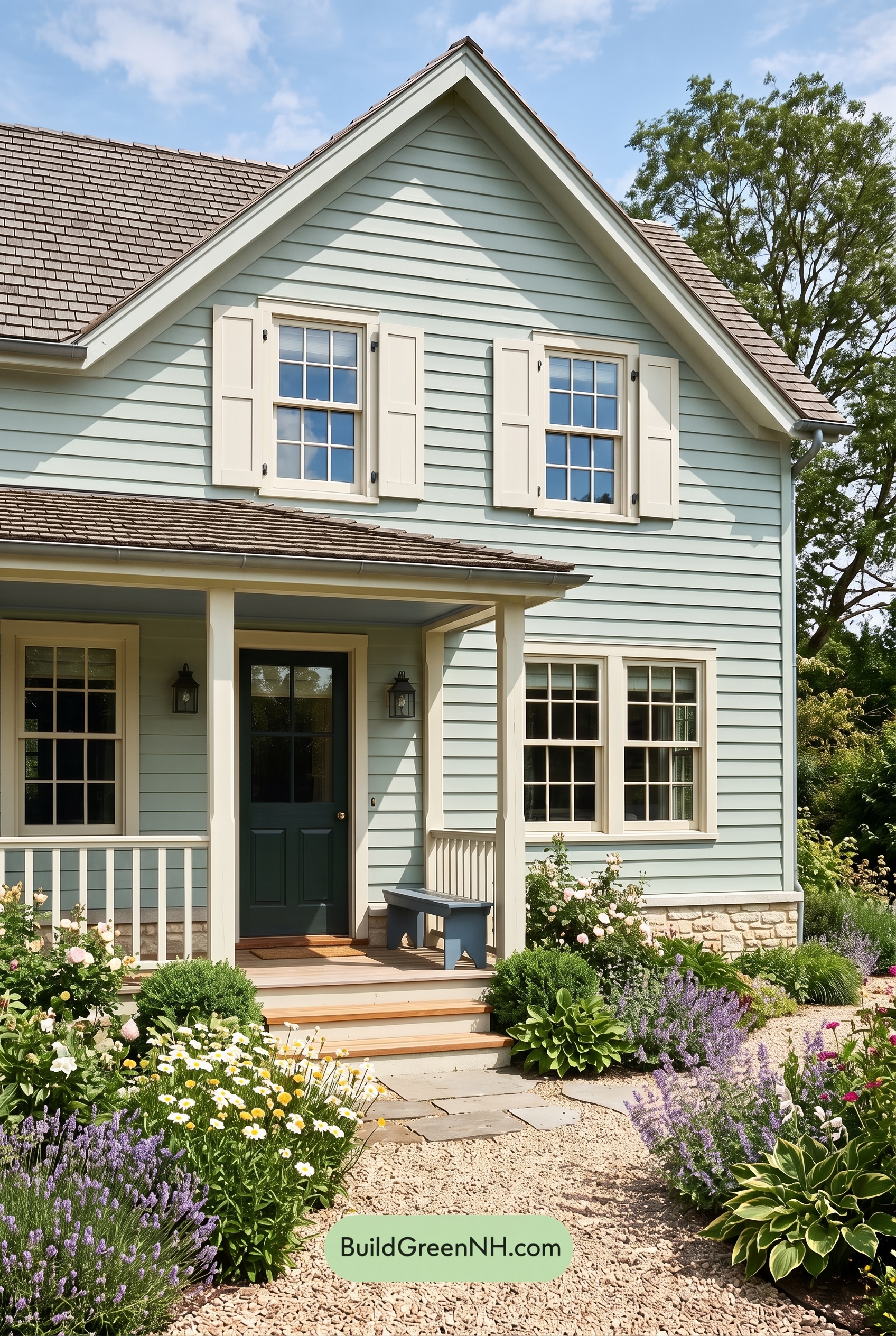 Green Farmhouse Exterior Color Scheme: Celadon Ivory Calm
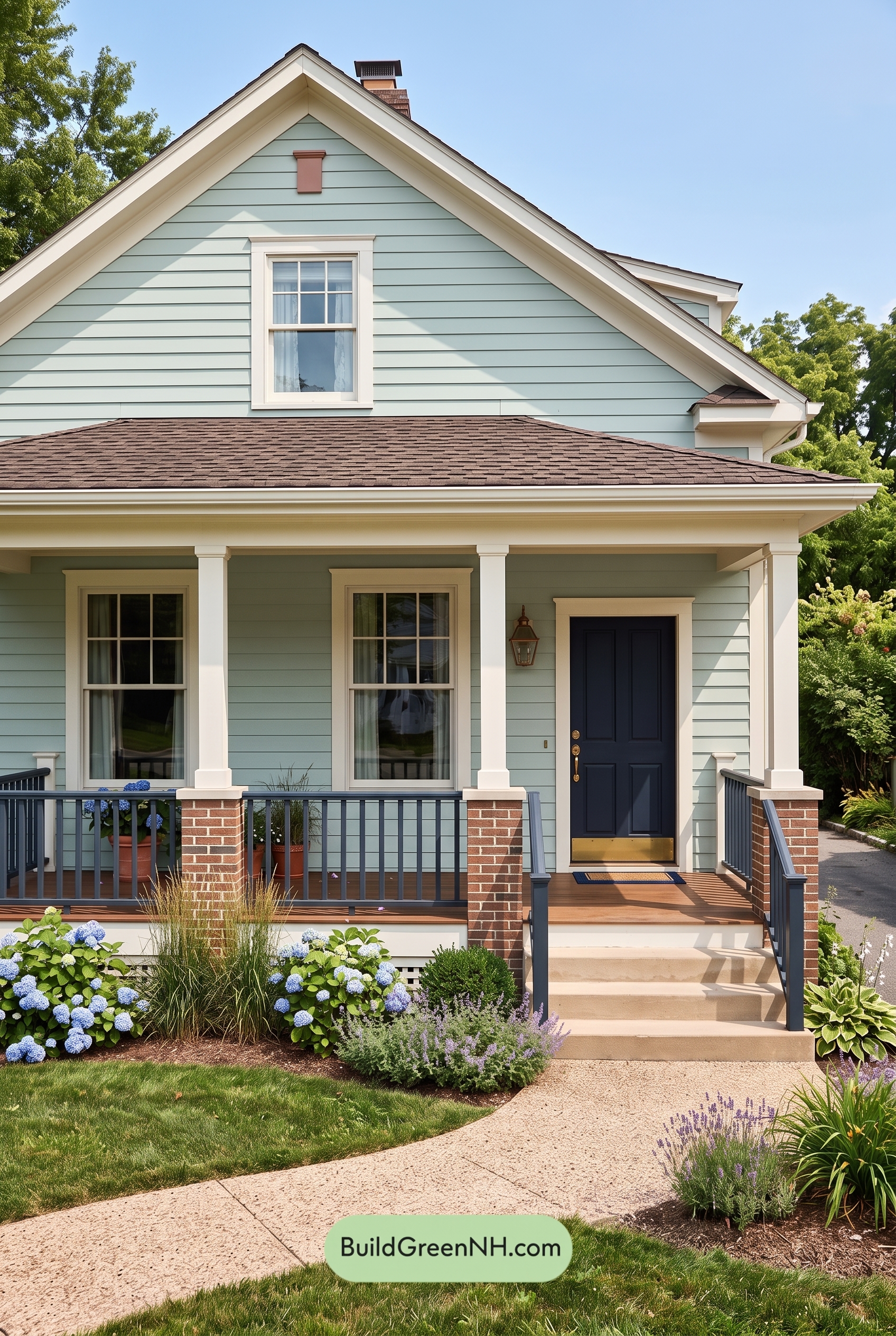 Green Farmhouse Exterior Color Scheme: Seafoam Linen Porch
Table of Contents