Last updated on
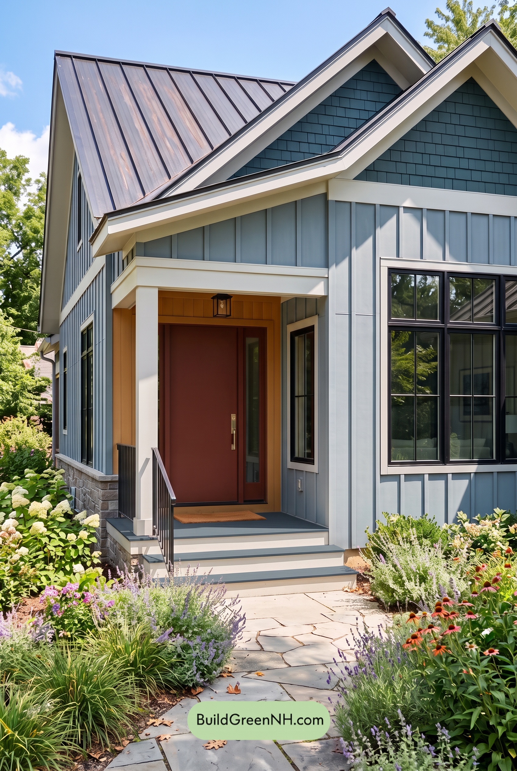

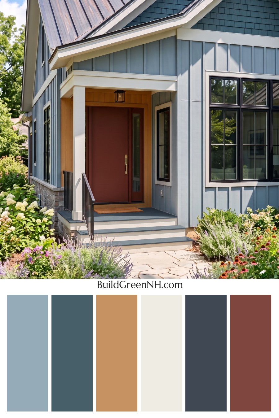
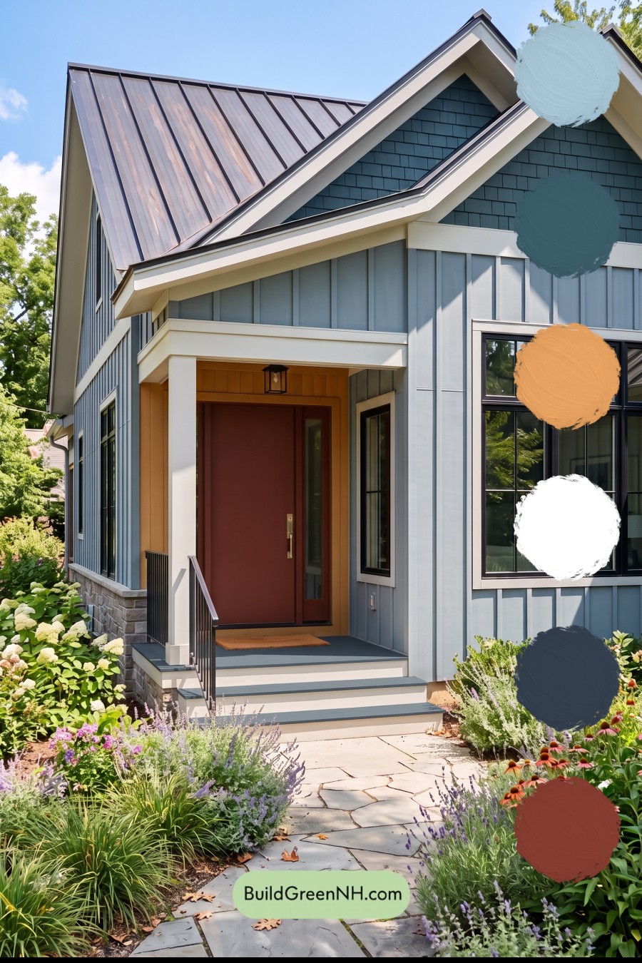
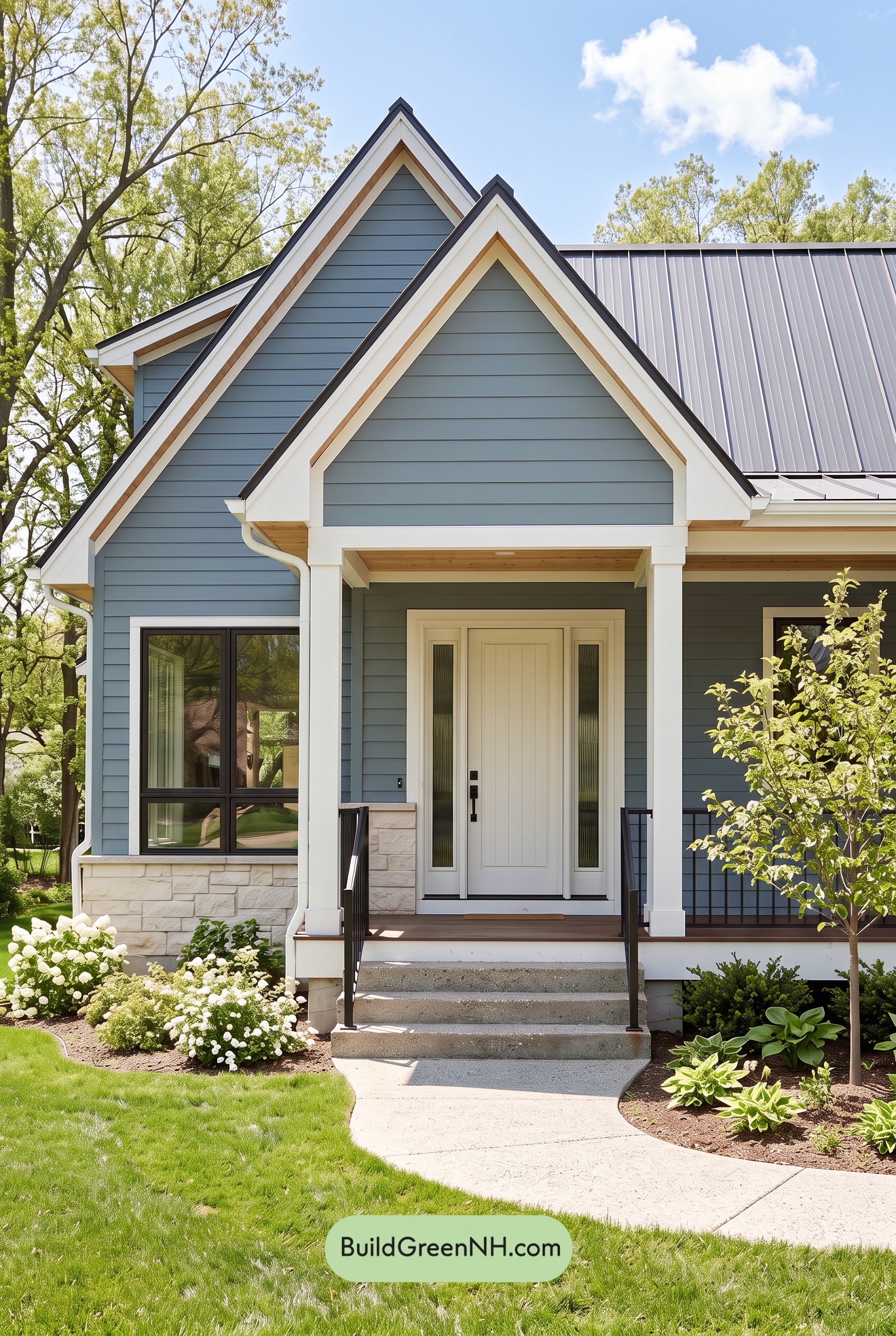
This layered blue, warm earth, and crisp light-neutral palette gives the home a polished presence that feels both welcoming and architecturally bold.
A Calm Blue Foundation
A soft, muted blue-gray covers the main vertical siding, creating a serene foundation for the exterior. This cool shade feels refined rather than overly coastal, especially when repeated across the taller wall planes and porch details. The gable areas shift into a deeper blue-green shade, adding visual depth beneath the dramatic rooflines and making the upper architecture feel beautifully defined.
Bright Trim and Dark Definition
Crisp white trim outlines the roof edges, windows, columns, and porch framework with precision. The light trim creates a clean contrast against the blue siding, emphasizing the home’s strong lines without making the design feel stark. Deep blue-black window frames, railings, and roof edging introduce a tailored note that grounds the lighter colors and brings a subtle modern edge to the facade.
The dark roof carries that same moody character overhead, with a charcoal-brown cast that complements the cooler blue walls. Its deep shade gives the home visual weight while allowing the pale trim to stand out along every peak and eave.
A Warm, Inviting Entry
The entry is where the palette becomes especially memorable. A rich golden-orange accent wraps the recessed porch, bringing warmth forward and creating a sunny transition between the cool exterior siding and the front door. The deep reddish-brown door adds another earthy layer, making the entrance feel grounded, inviting, and easy to spot from the walkway.
Together, these shades strike an appealing balance: cool blue tones lend calm and sophistication, white trim keeps everything fresh, and the warm orange and brown accents provide a genuine sense of welcome. It is a color scheme with contrast, character, and lasting curb appeal.
Next, see how this color scheme looks under different lighting simulations throughout the day.
Overcast
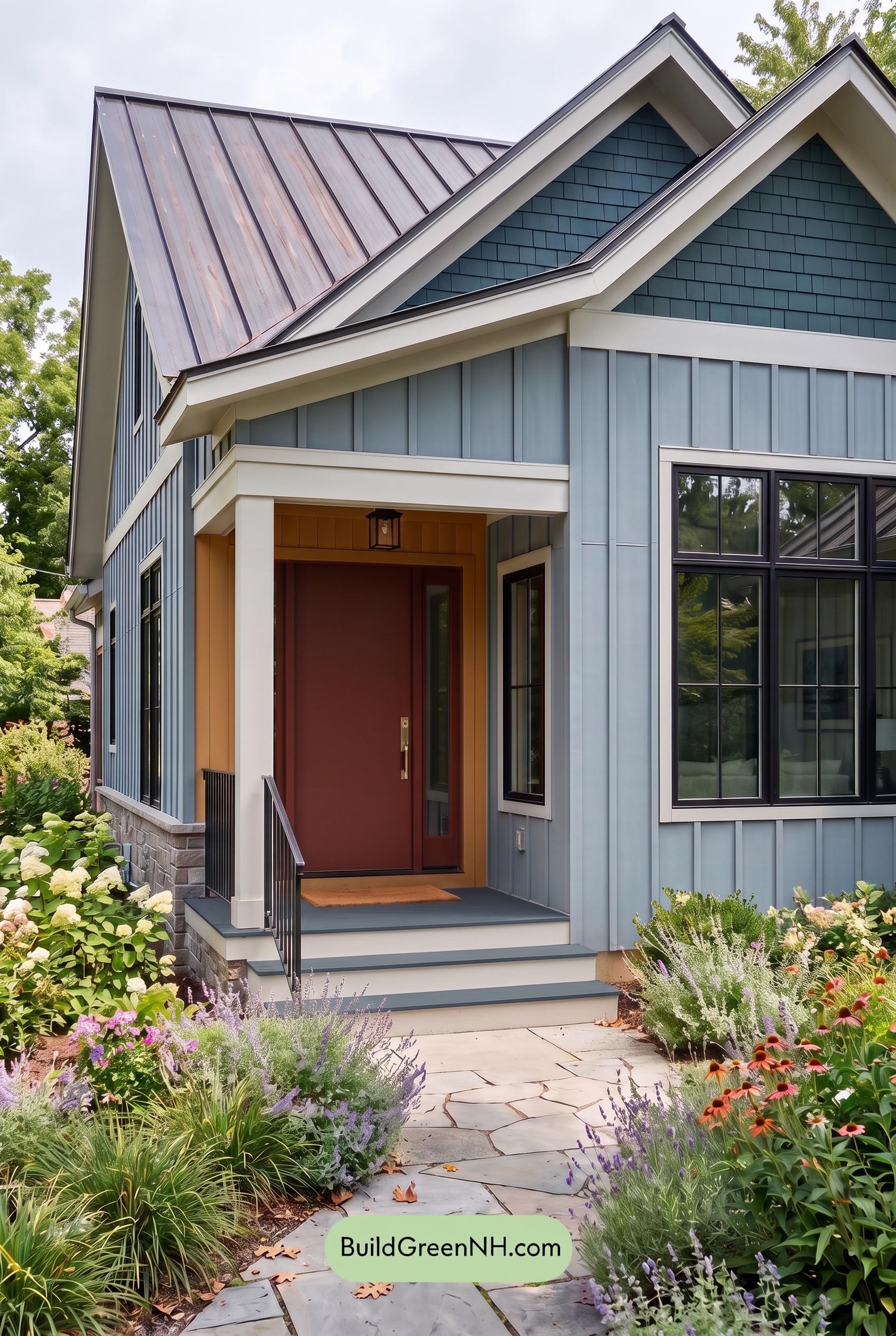
Under overcast skies, the blue siding and blue-gray details appear a touch deeper and quieter than they do in neutral daylight, with their saturation softened by the diffused light. The white trim and columns lose some of their crisp brightness, reading as gentler pale neutrals while still outlining the rooflines and windows with clean definition.
Without sharp sun-driven shadows, the facade feels more evenly composed and relaxed. The orange-toned entry surround and rich brown door retain their welcoming warmth, though both become less vivid against the softened blue exterior; the reduced contrast creates a calm, polished mood with subtler architectural depth.
Golden Hour
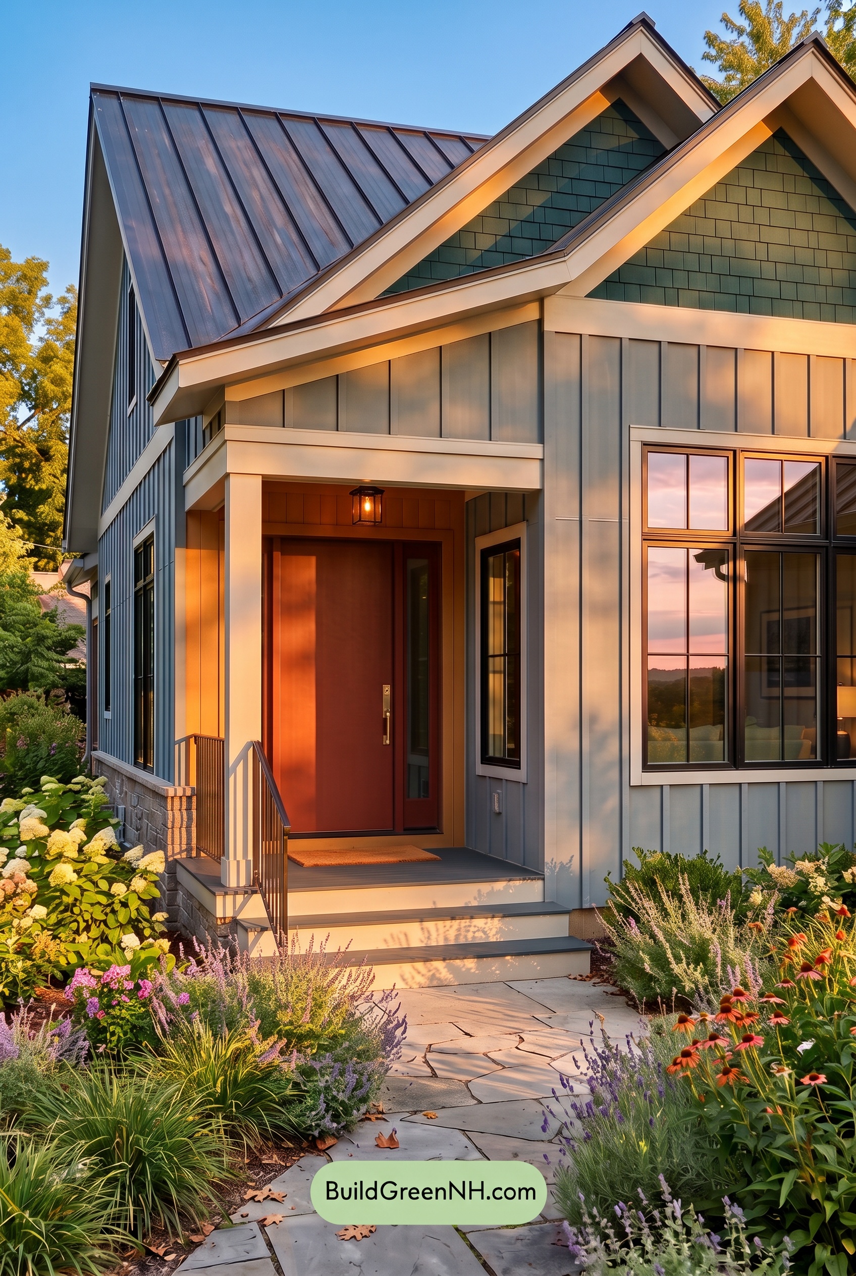
Under neutral daylight, the blue siding reads crisp and composed, while the white trim provides clean, bright definition. At Golden Hour, the low sun layers a honeyed glow across those same surfaces: the blue shades deepen and feel more muted in shadow, while sunlit planes take on a softer, warmer cast. The orange accent and brown entry become noticeably richer and more saturated, creating an especially welcoming focal point.
Longer shadows beneath the eaves, around the columns, and along the railings sharpen the home’s architectural depth. The contrast between warm illuminated trim and the cooler blue shaded areas becomes more dramatic, yet the overall mood feels gentler and more inviting than it does in balanced daylight—an evening palette with warmth, dimension, and quiet curb appeal.
Shade
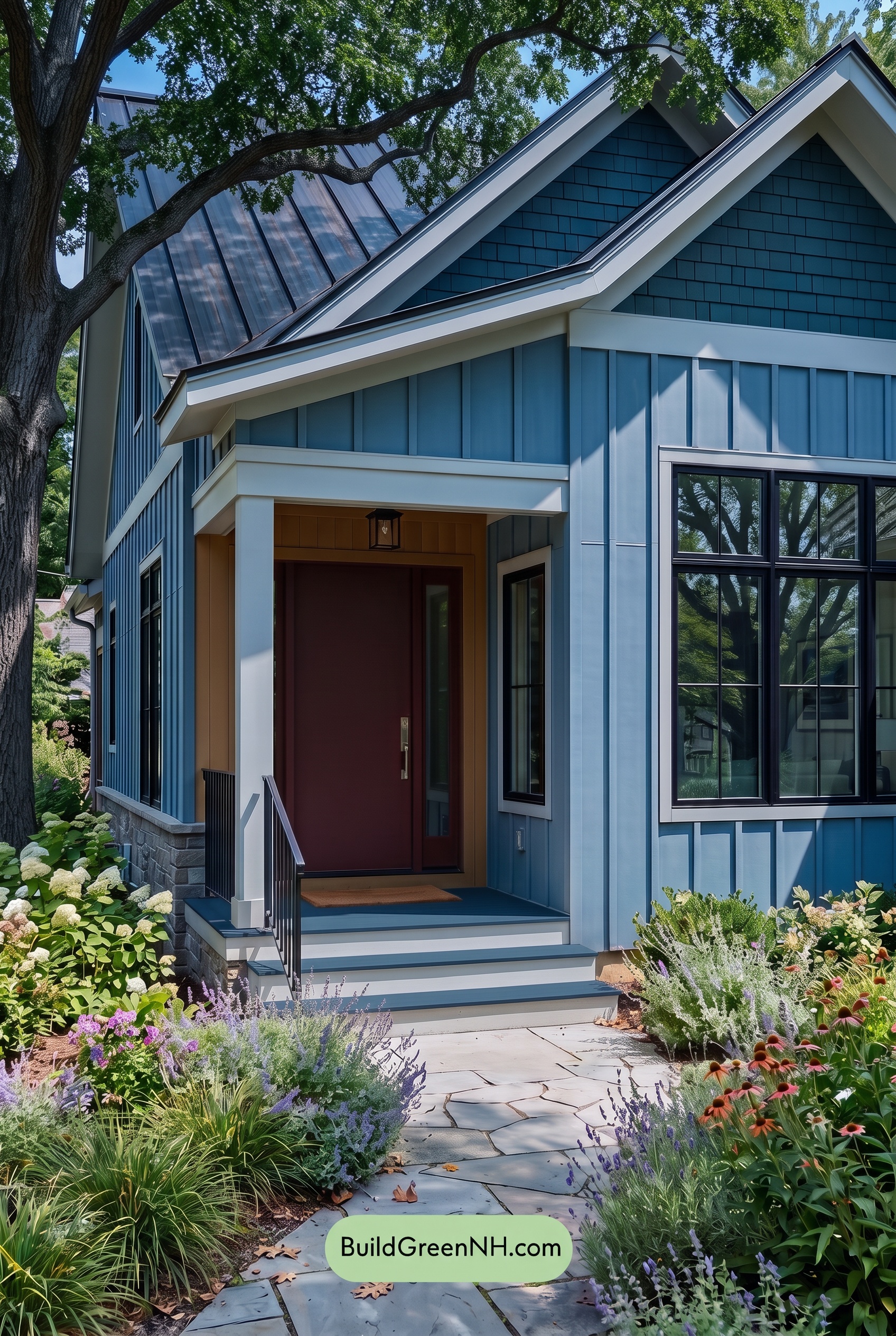
In shade, the blue exterior settles into a deeper, quieter version of itself, with less visible saturation than it shows in neutral daylight. Cooler shadows collect along the siding, window frames, and railings, making the blue shades feel more layered and architectural. The white trim and columns soften from crisp brightness to a gentler, slightly cooler neutral, while still outlining the rooflines and entry with clean contrast.
The sheltered orange accent wall and brown door gain a richer, more muted warmth in comparison, creating a welcoming focal point against the cool blue surroundings. With the contrast between light trim, deep blue details, and shadowed warm accents reduced slightly, the overall mood becomes calm, refined, and inviting rather than bright and energetic.
Nighttime
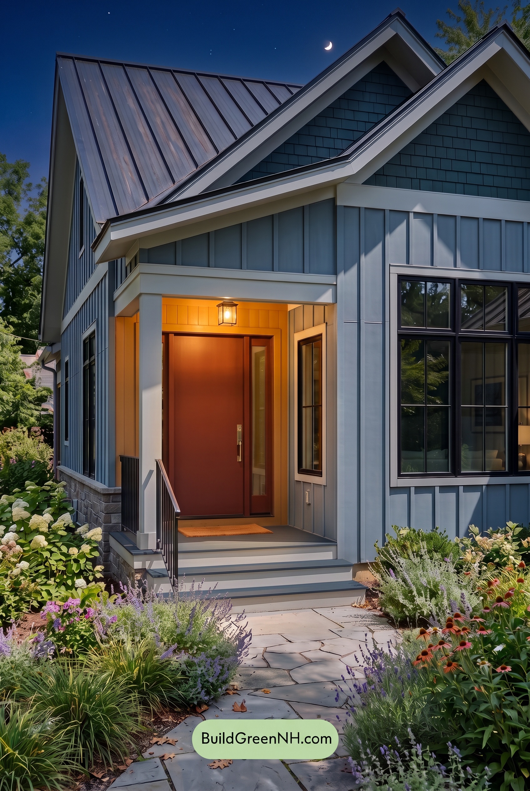
At night, the blue exterior shifts deeper and less saturated than it appears in neutral daylight, giving the façade a calmer, more tailored presence. Shadows settle into the siding, railings, and window surrounds, strengthening the dark-and-light contrast and making the pale trim feel crisper around the rooflines and entry.
Warm entry lighting transforms the orange accent area and brown door into a welcoming focal point, enriching their warmth against the cool blue surroundings. This mix of cool, shadowed blue and softly illuminated warm shades creates an inviting, intimate mood that feels more dramatic after dark.
Pin these for later:
Want More?
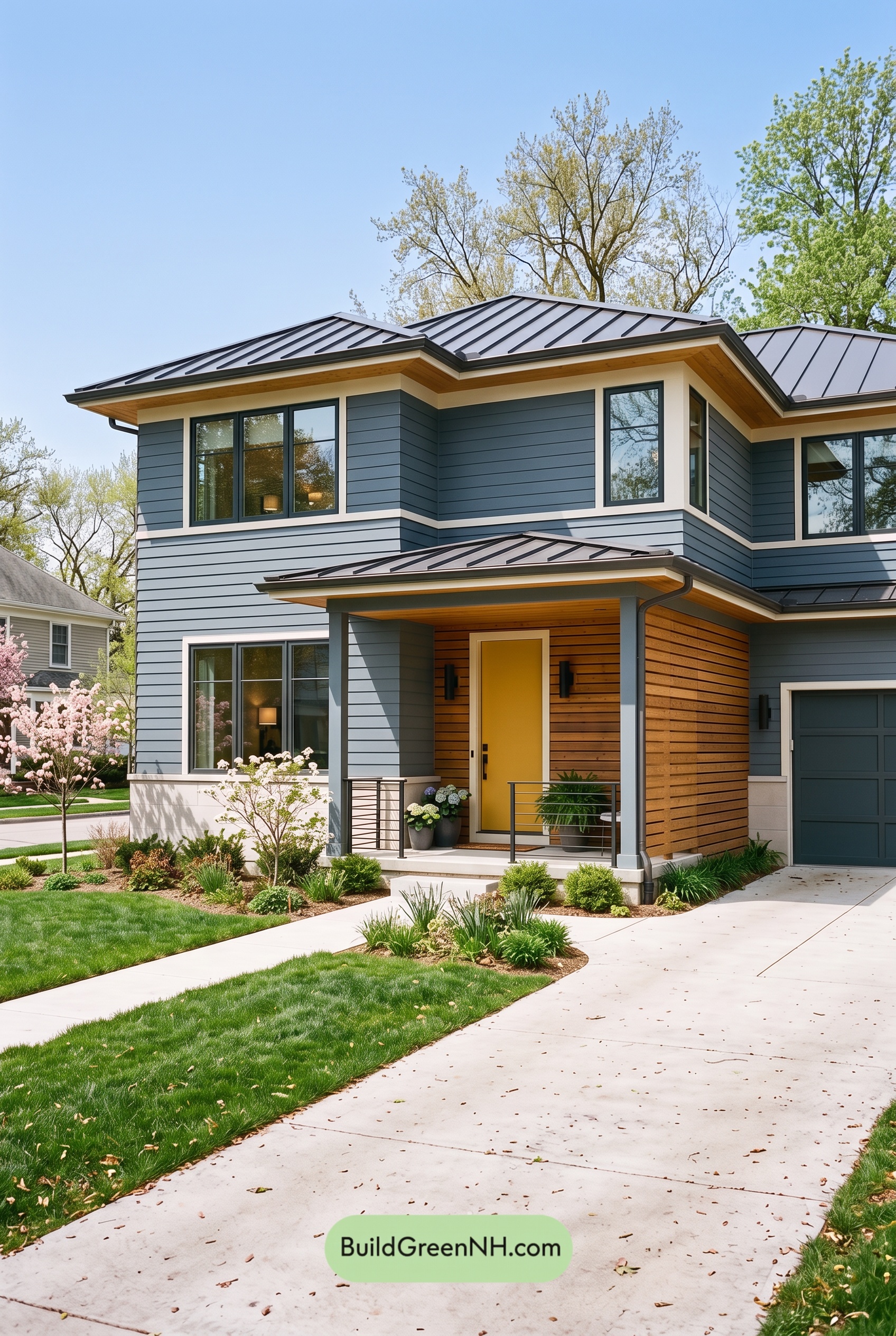 Blue House Front Door Color Scheme: Harbor Saffron
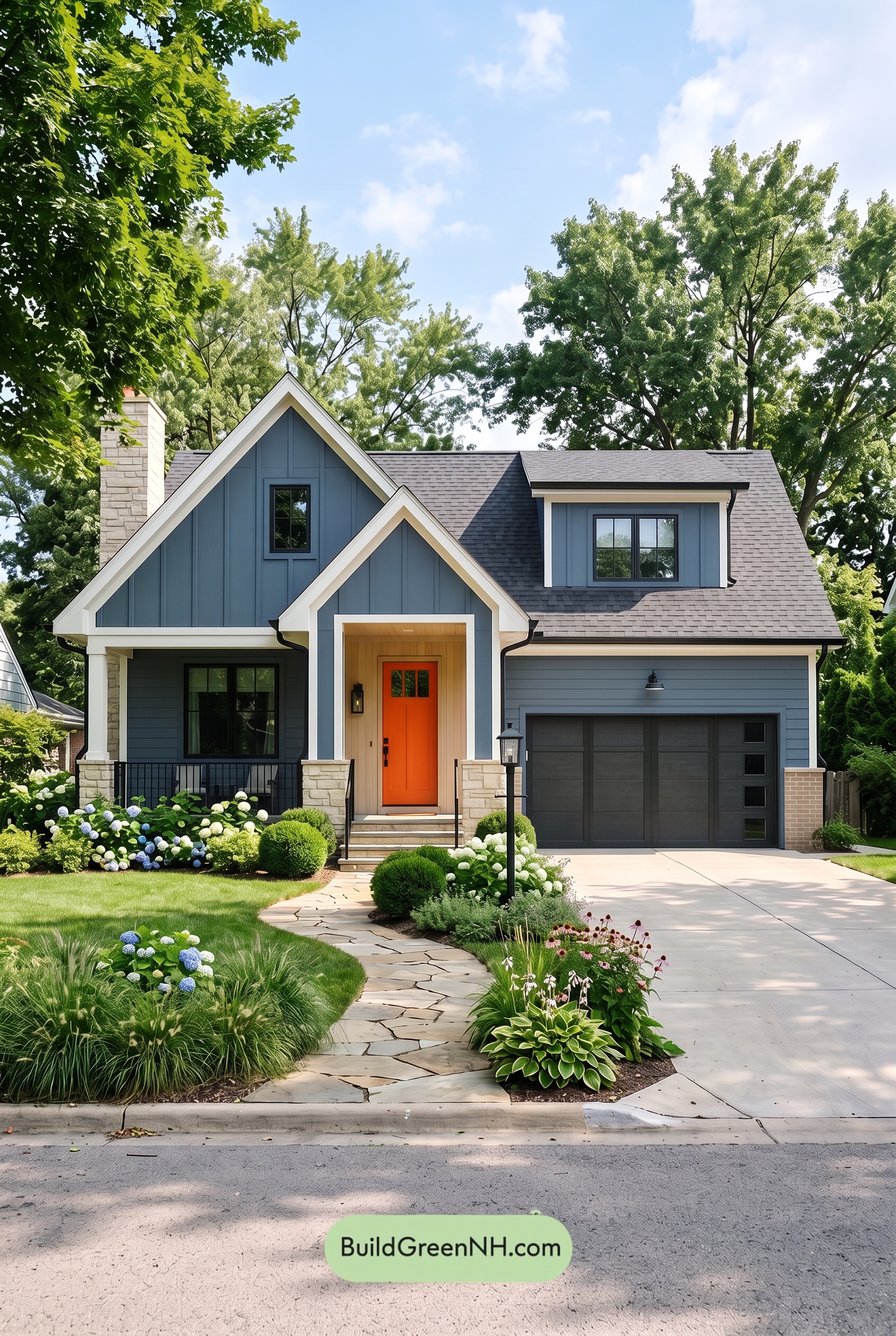 Blue House Front Door Color Scheme: Cobalt Persimmon
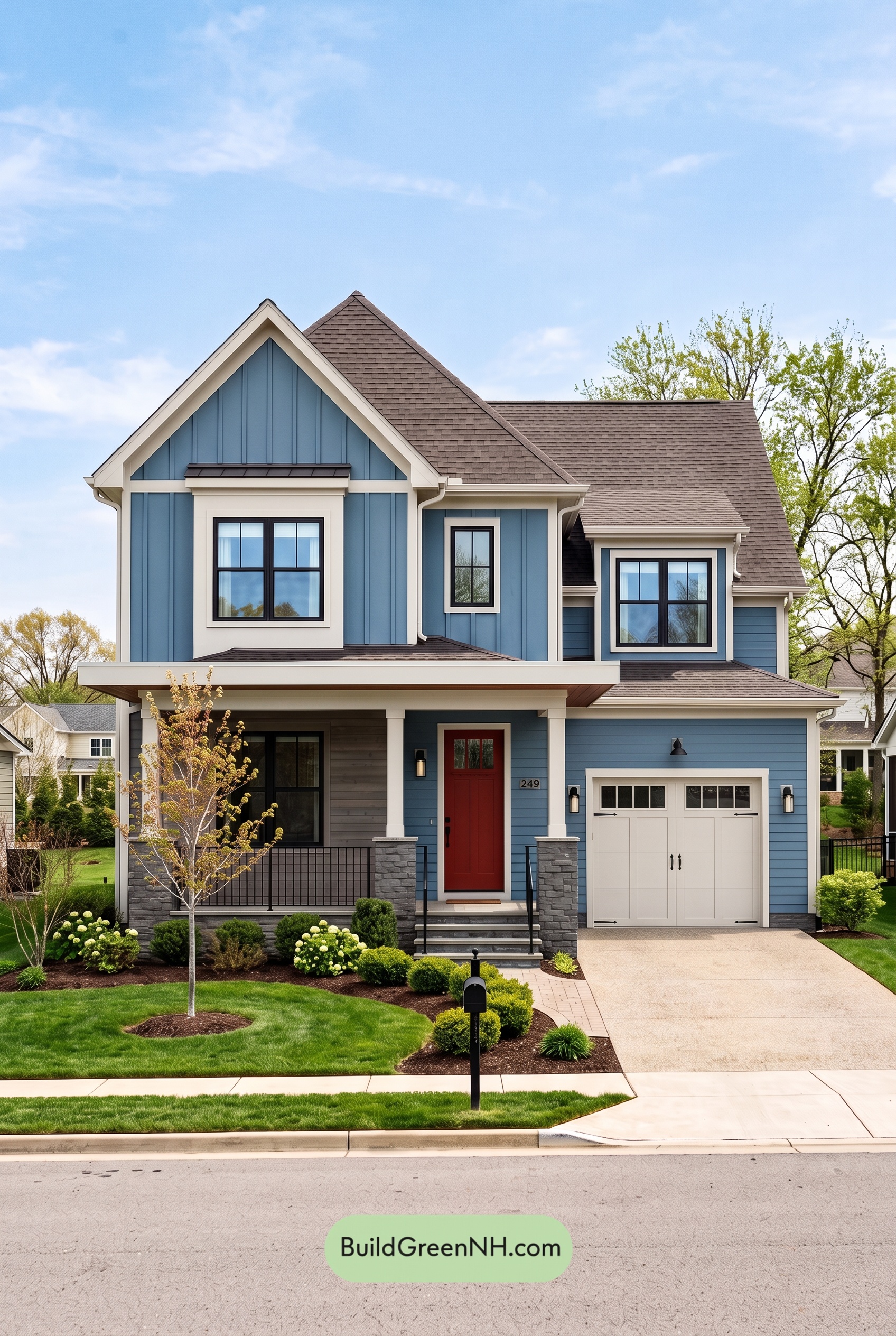 Blue House Front Door Color Scheme: Denim Poppy
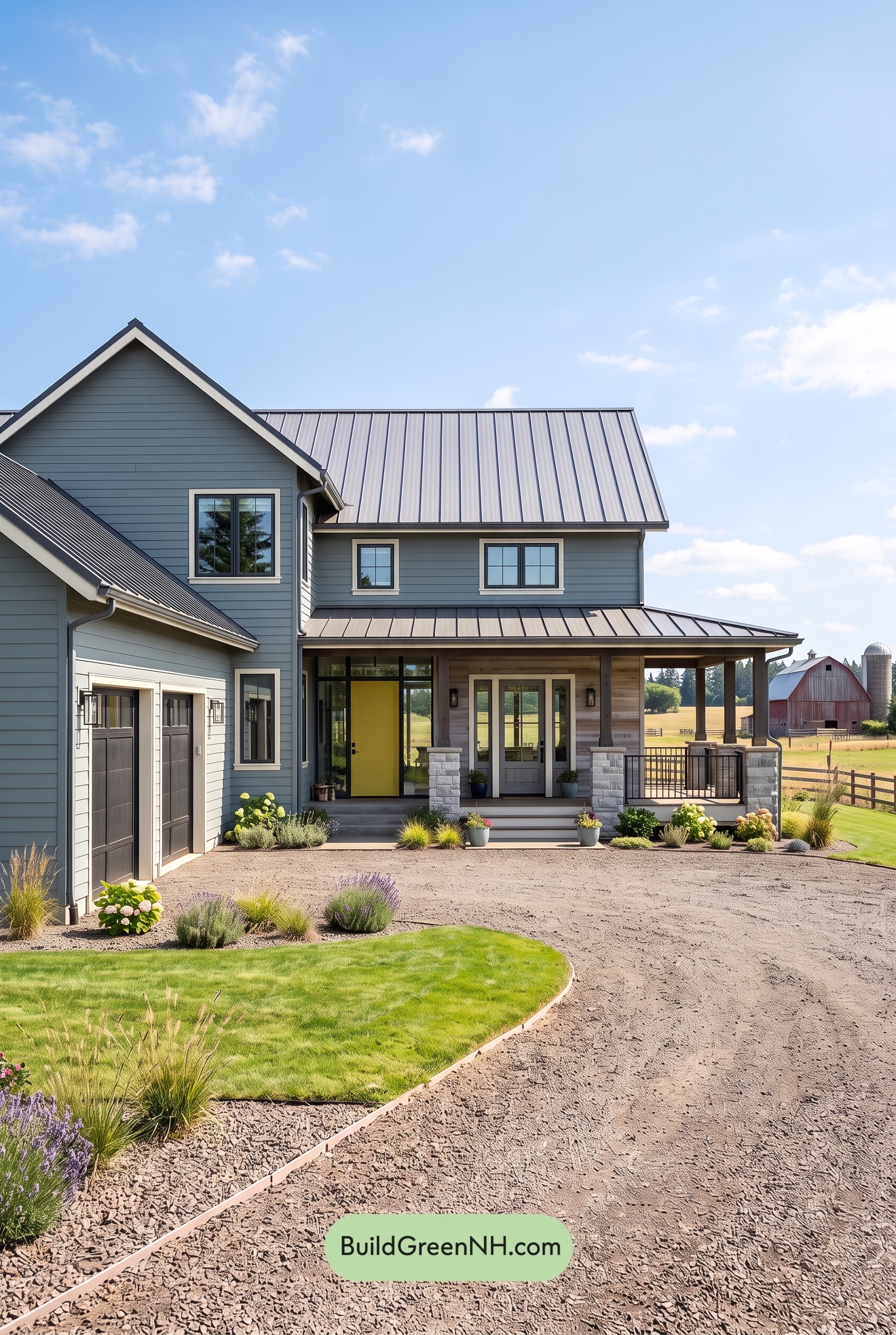 Blue House Front Door Color Scheme: Slate Citron
 Blue House Front Door Color Scheme: Mist Blue Haven
Table of Contents