Last updated on
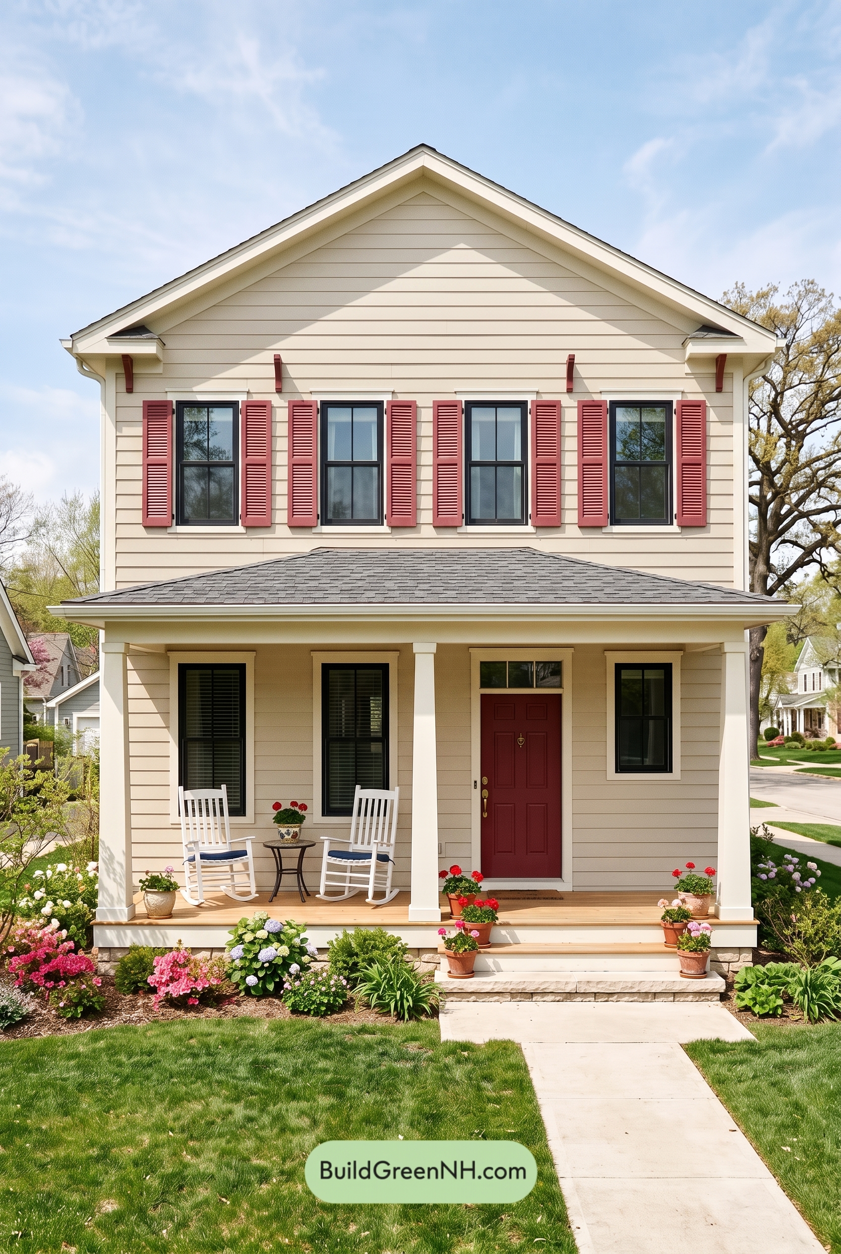

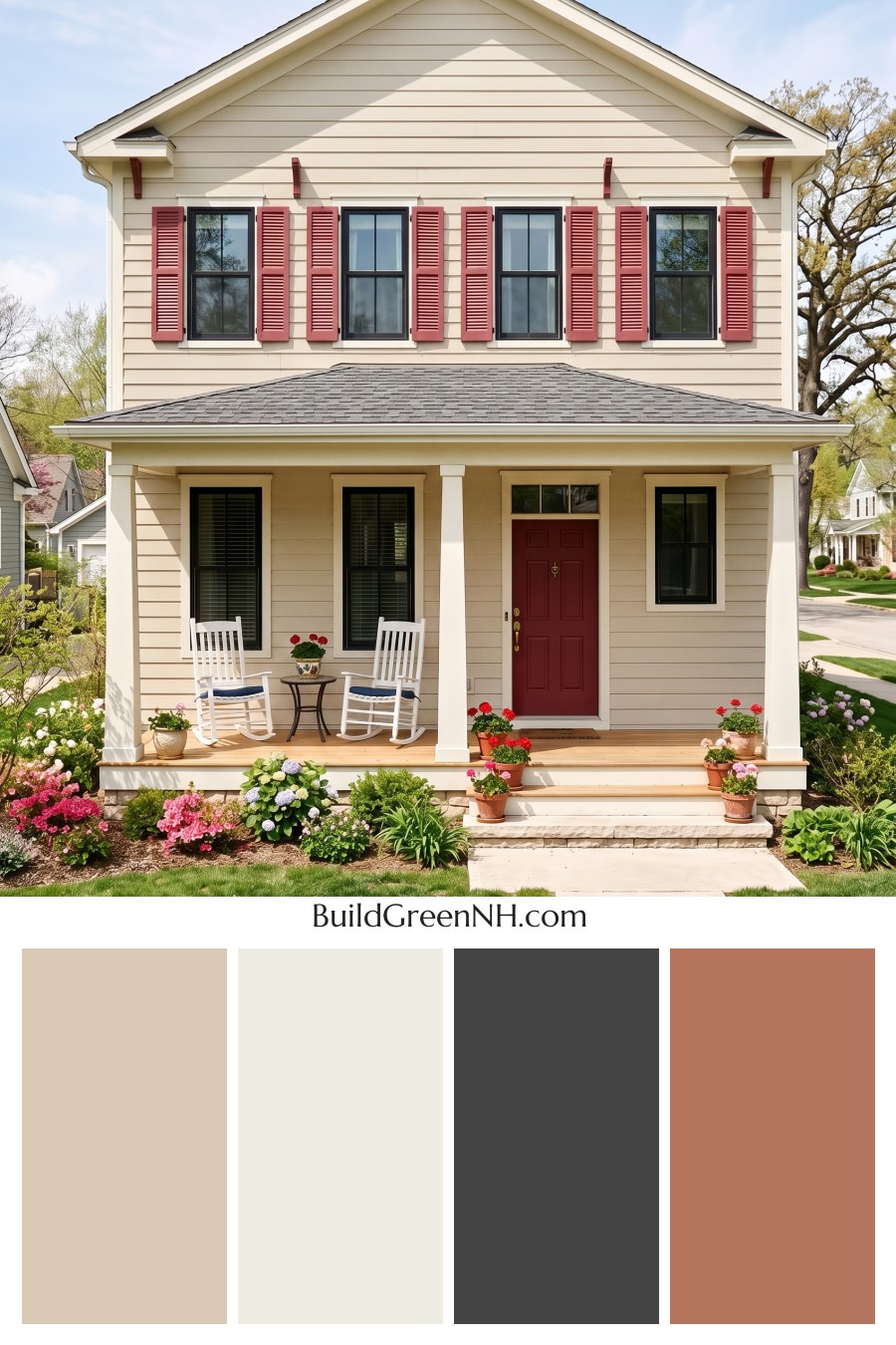
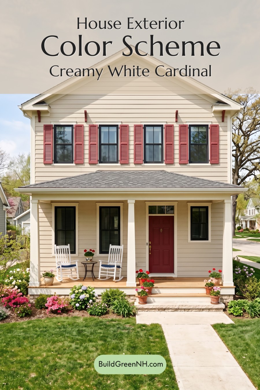
This exterior color scheme shines because it pairs a soft beige backdrop with crisp white structure, charcoal gray definition, and warm red accents for a look that feels both classic and genuinely cheerful.
A Warm Beige Foundation
The main siding is wrapped in a gentle beige shade that gives the home an easy, welcoming presence. Because the color sits in a warm neutral family, it softens the height of the two-story facade and keeps the horizontal siding feeling calm rather than busy.
This beige also works beautifully with the sunny setting and lush landscaping. It feels bright in daylight, but not stark, making the house look comfortable, settled, and approachable from the street.
Crisp White Trim and Porch Details
The white trim is a major reason the exterior feels so polished. It outlines the roofline, frames the windows, highlights the gable, and gives the porch columns a clean architectural presence. Against the beige siding, the white reads fresh and classic without overpowering the softer body color.
The white columns make the front porch feel open and inviting. They also create a pleasing rhythm across the entry, balancing the taller upper story with a grounded, friendly lower level.
Charcoal Gray Framing and Roof Balance
The window frames bring in a deep charcoal gray shade that adds definition and a touch of sophistication. This darker gray family creates crisp contrast around the glass, giving each window a tailored, graphic edge.
The roof continues the gray story in a more weathered, medium-to-deep shade. It anchors the lighter siding and trim, helping the whole palette feel balanced from top to bottom.
Warm Red Accents with Personality
The shutters and front door introduce a warm red family accent that gives the home its most memorable character. On the upper windows, the red shutters add charm and symmetry, while the matching entry shade draws the eye right to the front door.
Because the red is rich rather than overly bright, it pairs naturally with the beige siding and white trim. It brings energy, but still feels traditional and neighborly.
The Overall Mood
Altogether, this palette feels cheerful, classic, and well-balanced. The beige keeps everything warm, the white adds crispness, the gray provides structure, and the red accents offer just the right amount of personality. It is a color scheme that feels timeless without being plain, making the home look cared for, welcoming, and full of curb appeal.
Next, see how this color scheme looks under different lighting simulations throughout the day.
Overcast
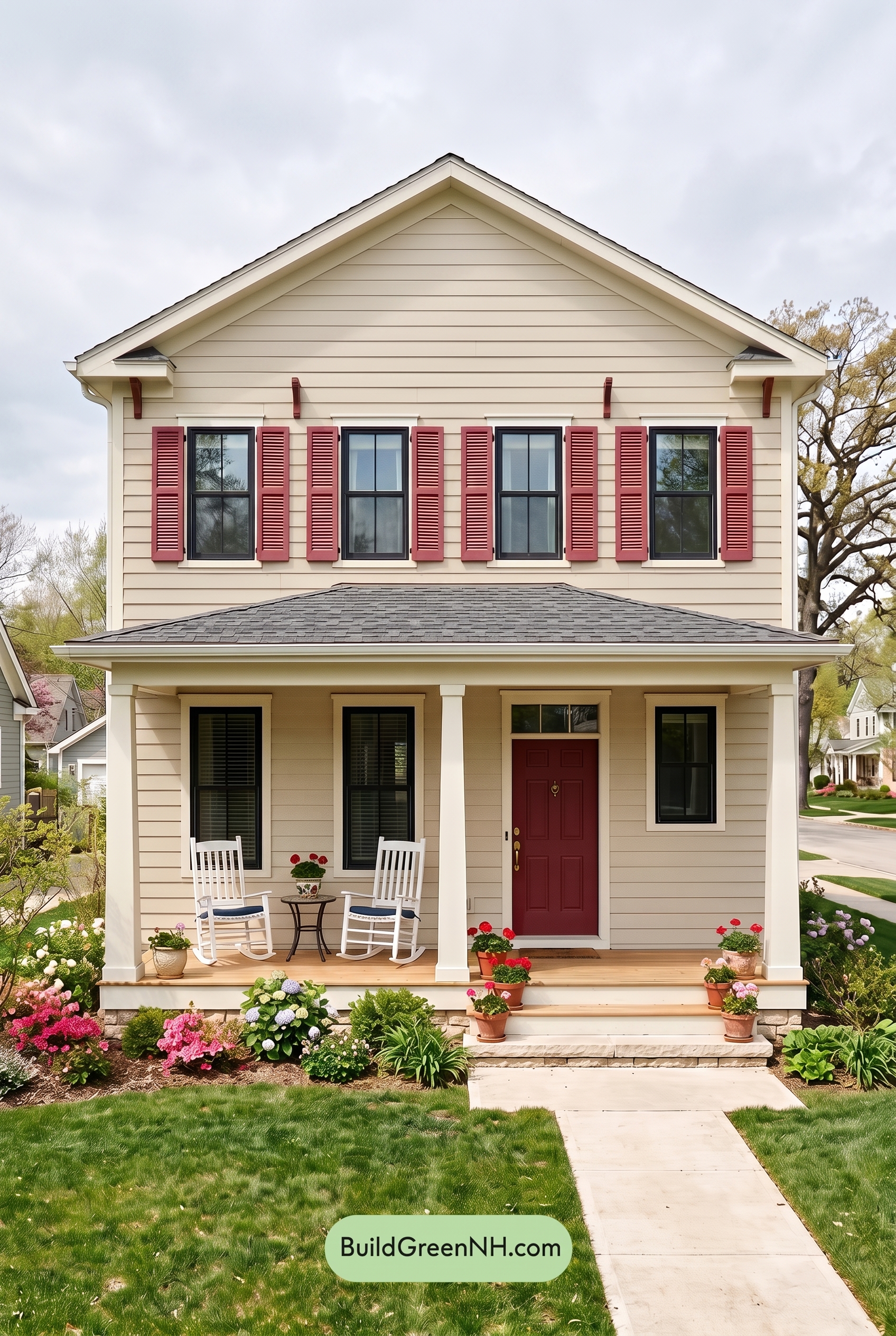
Under overcast light, the warm beige siding loses some of the golden lift it would have in neutral daylight, becoming softer, quieter, and slightly more muted. The white trim and columns appear less bright and crisp, taking on a gentler tone, while the gray window frames feel a bit deeper against the subdued wall color.
Because the clouds diffuse the sunlight, shadows soften under the eaves and porch, reducing sharp contrast across the facade. The overall mood shifts from fresh and sunny to calm and cozy, with the beige family feeling more relaxed and the darker gray details providing just enough definition without feeling stark.
Golden Hour
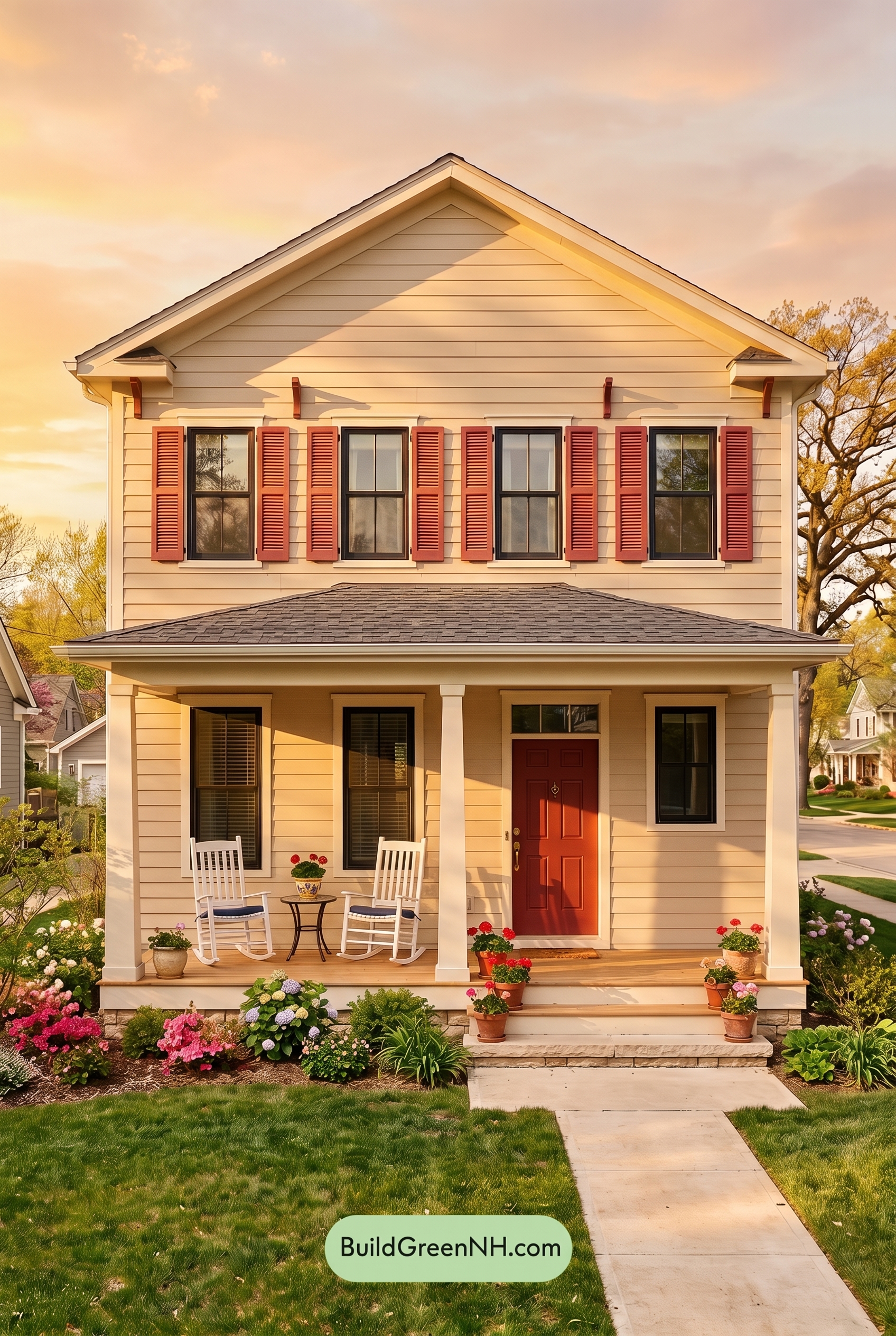
Golden Hour pushes the beige siding from a straightforward neutral into a richer, sun-warmed shade, boosting saturation and making its warm undertones feel more pronounced than they would in neutral daylight. The white trim and columns read softer and creamier, while the gray window frames look deeper and more defined against the glowing wall color.
Longer shadows under the eaves, porch roof, and window details create stronger contrast, turning shaded beige areas slightly moodier and more layered. Compared with the cleaner, flatter balance of neutral daylight, this light gives the whole exterior a cozy, welcoming feel with a gently polished warmth.
Shade
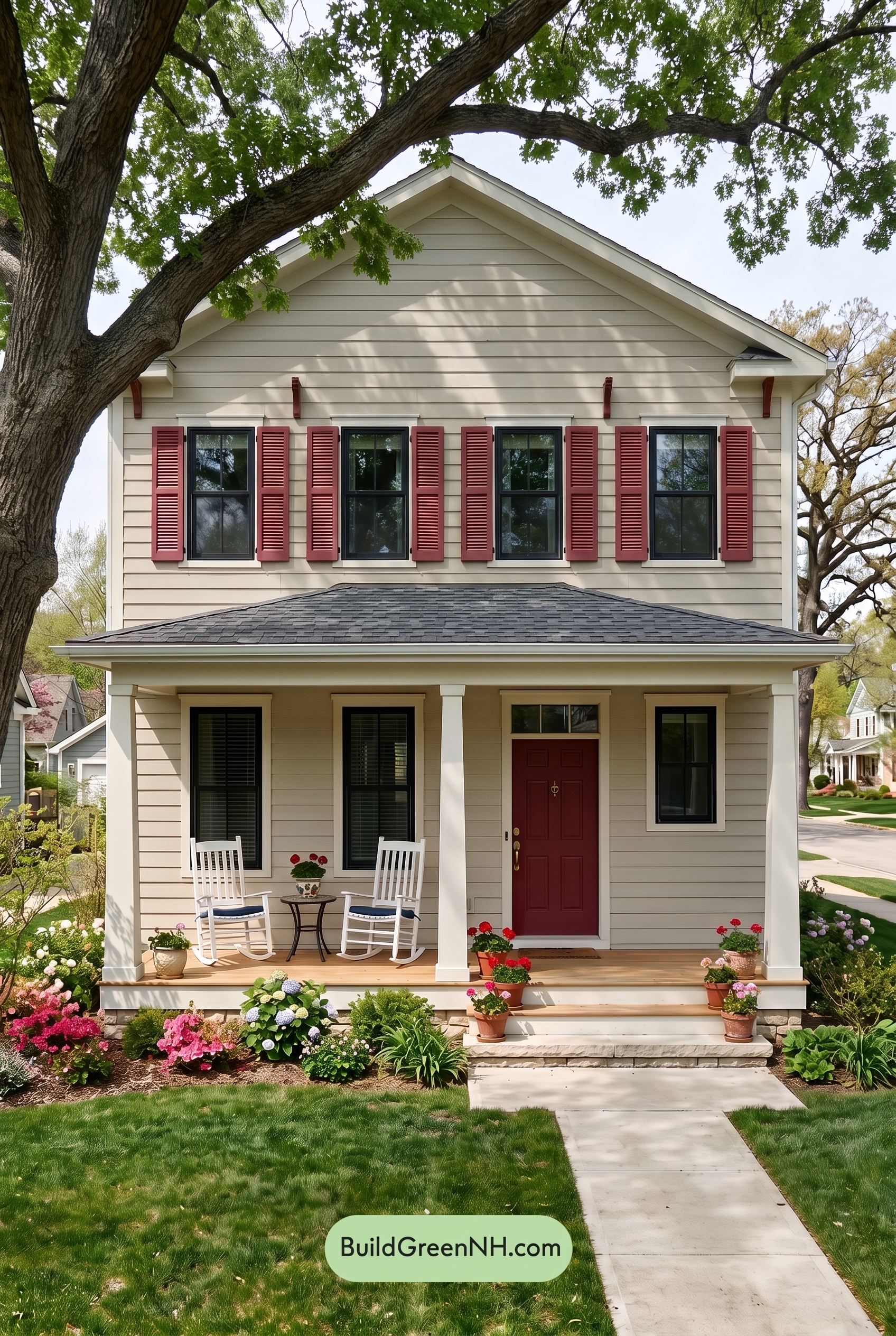
In shade lighting, the beige family on the main walls loses a bit of its sunlit warmth and saturation, shifting softer and slightly grayer than it would in neutral daylight. The white trim and columns feel less crisp and bright, taking on a gentler, muted quality that blends more calmly with the siding.
Shadows from the trees add depth across the façade, making the gray window frames read darker and more defined while reducing the overall contrast between the warm neutral shades. The mood becomes quieter and more relaxed, with the house feeling cooler, softer, and more tucked into the landscape.
Nighttime
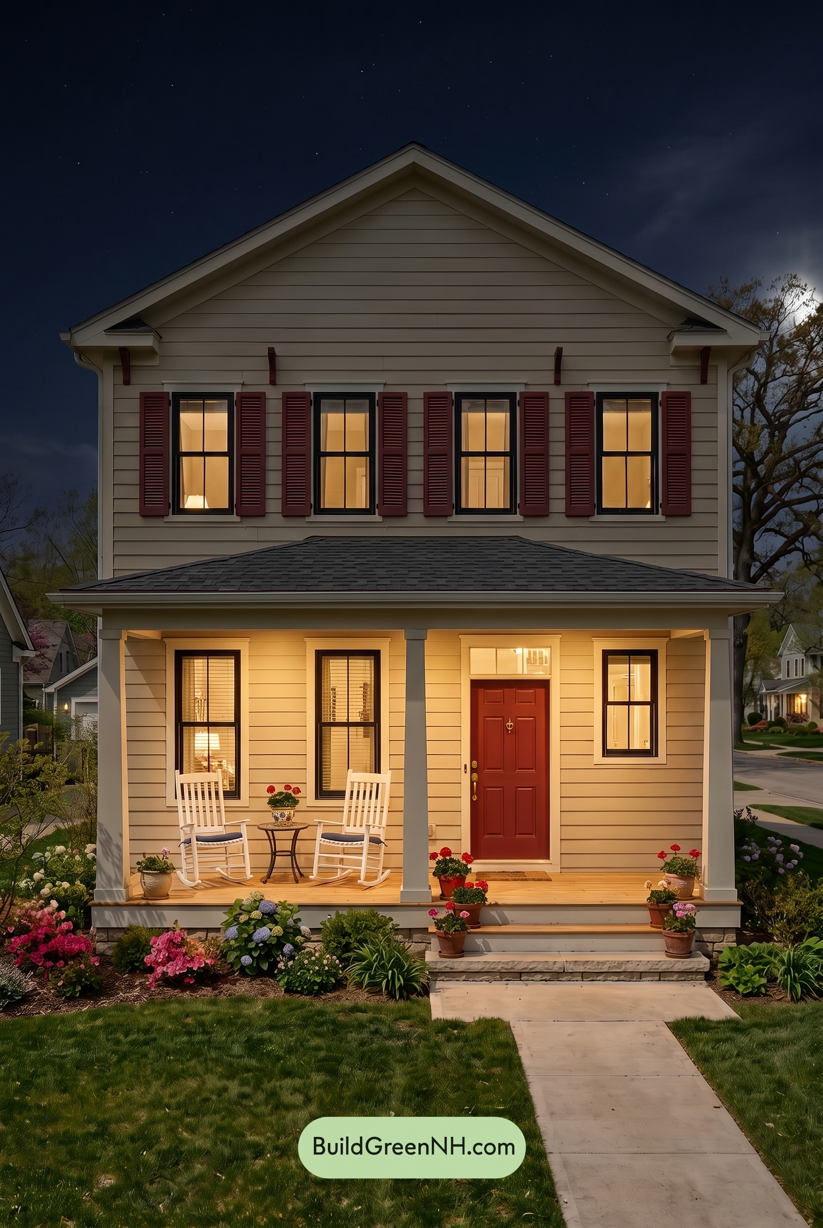
At night, the beige family shifts warmer where porch and window light spill across the siding, giving the lower facade a softer, more saturated glow than it would have in neutral daylight. Higher up, the same beige shades recede into deeper shadow, looking muted and slightly cooler, which adds depth to the horizontal siding.
The white trim and columns pick up a creamy warmth near the lights, while shaded edges turn grayer and more defined. The gray window frames appear darker and crisper after sunset, increasing contrast and giving the home a cozier, more dramatic mood compared with its calmer daylight appearance.
Pin these for later:
Want More?
 Off White Farmhouse Exterior Color Scheme: Vanilla Black Copper
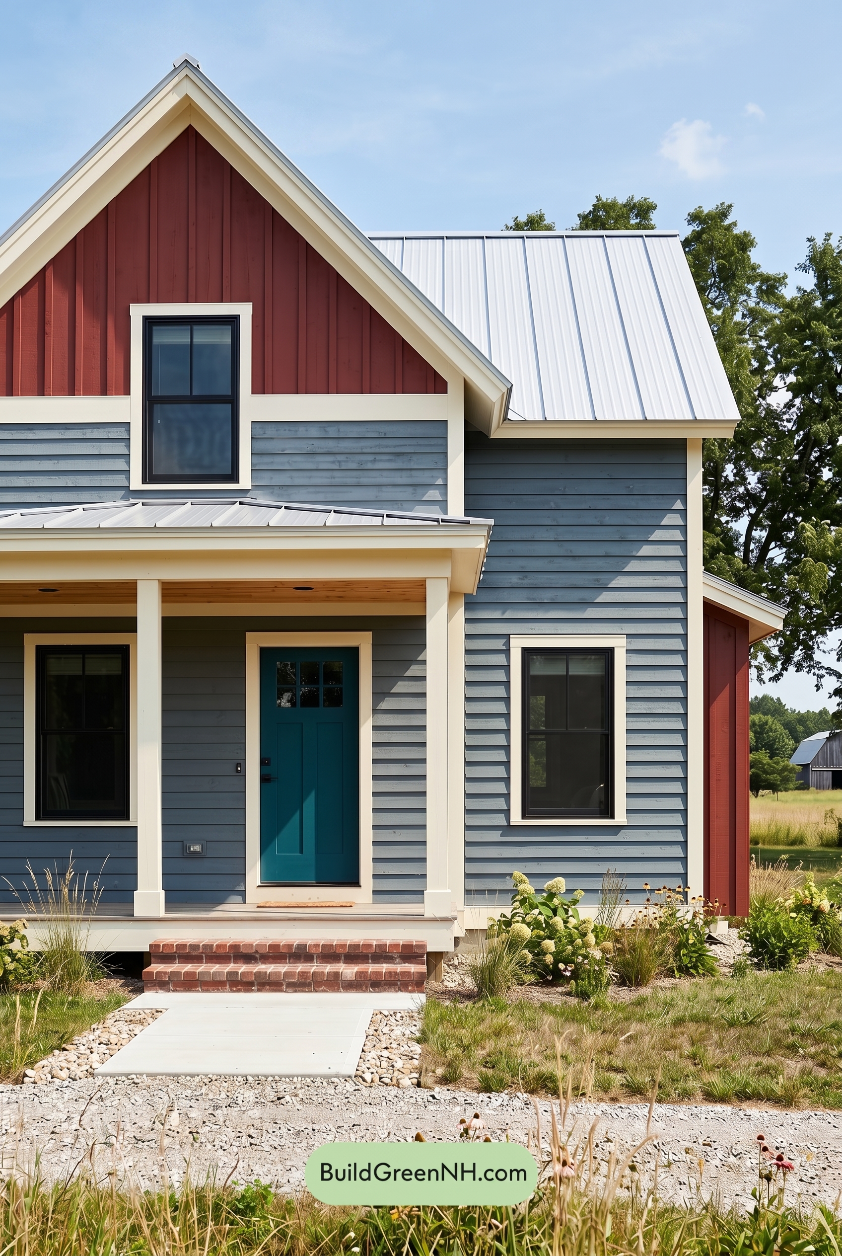 Modern Grey House Exterior Color Scheme: Denim Red Hearth
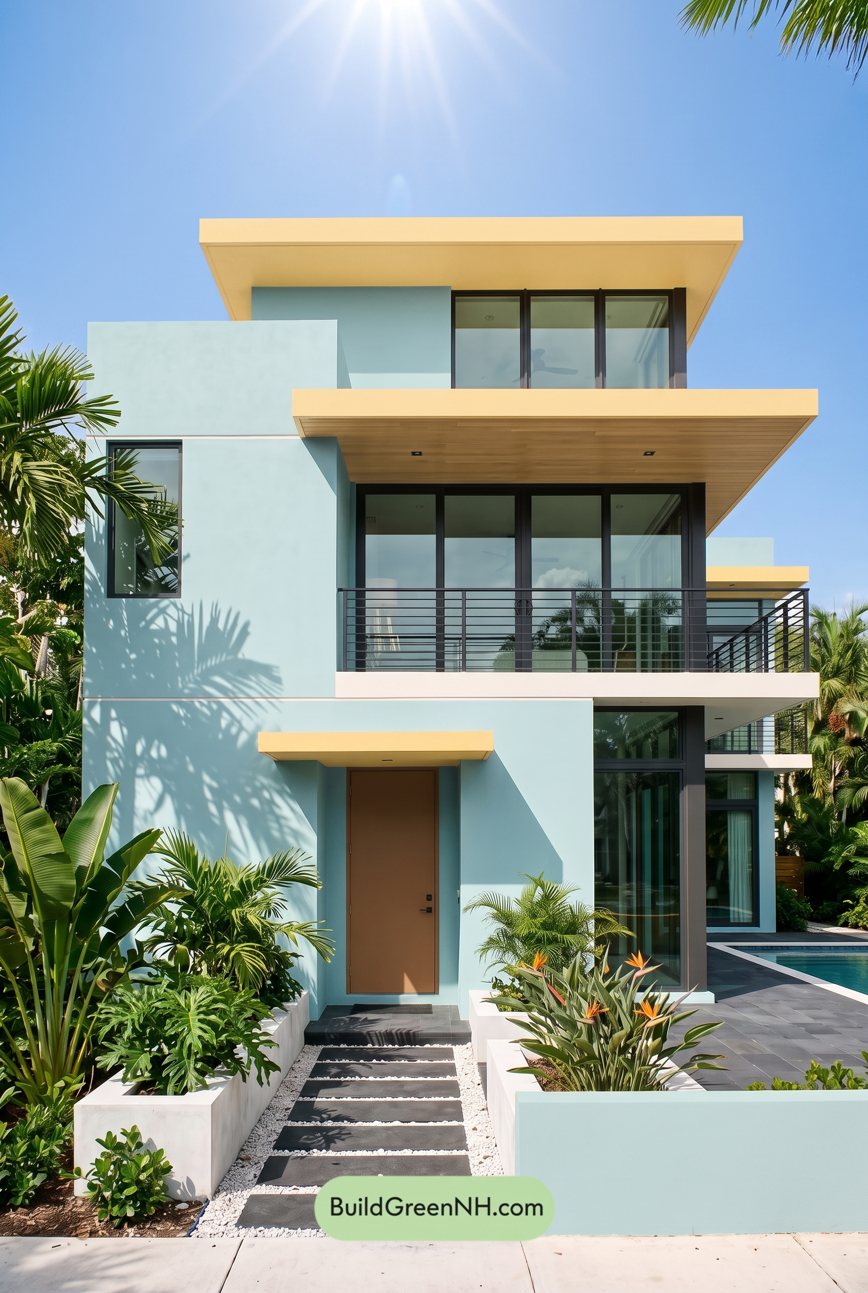 Blue Modern Villa Exterior Color Scheme: Aqua Marigold Drift
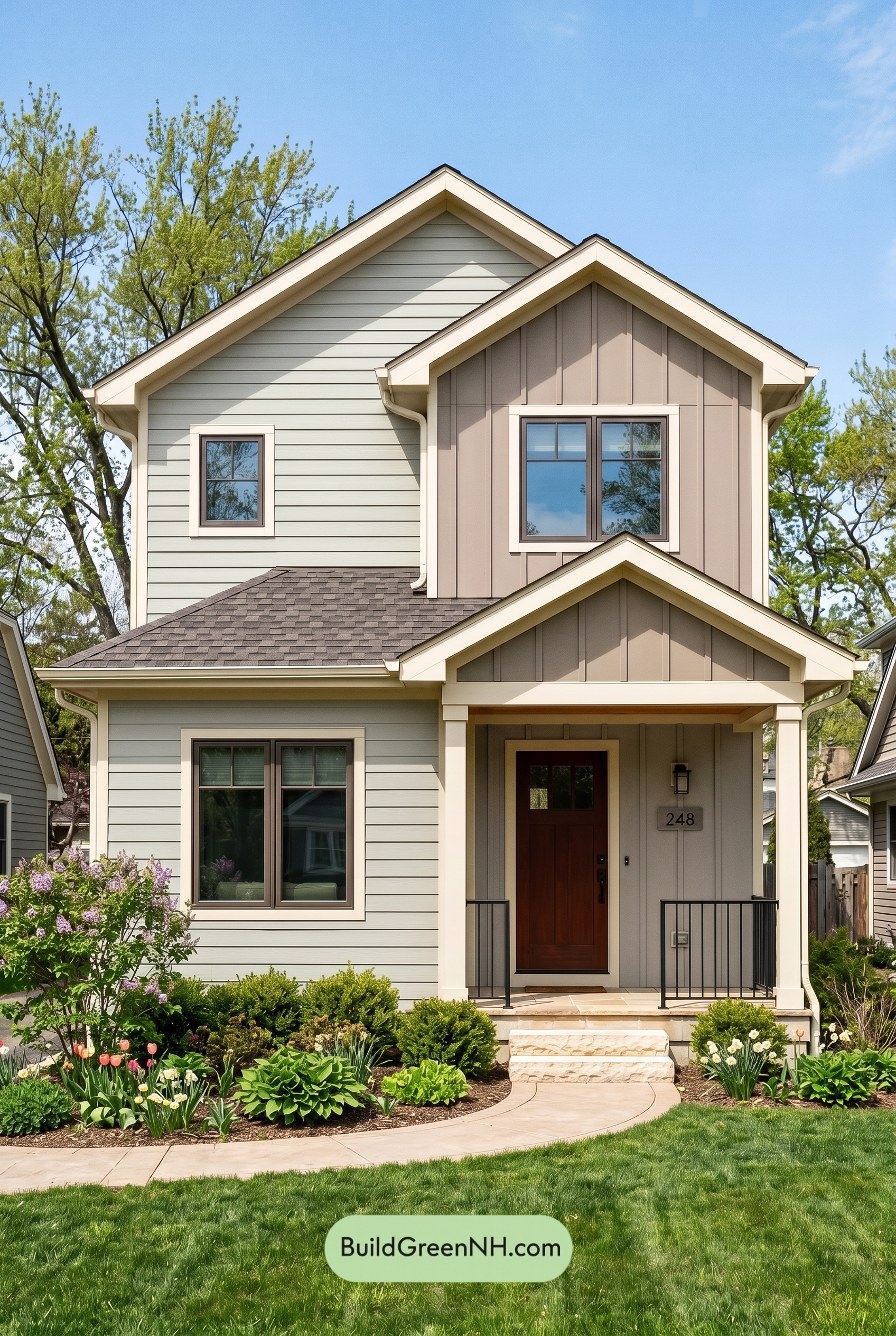 Modern Grey House Exterior Color Scheme: Muted Warm Contrast
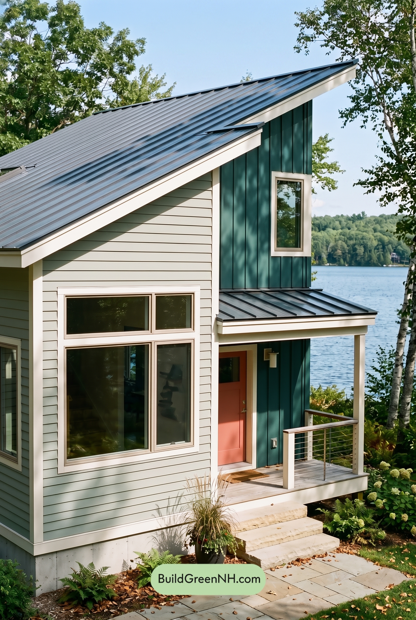 Modern Grey House Exterior Color Scheme: Pale Bright Signal
Table of Contents