Last updated on
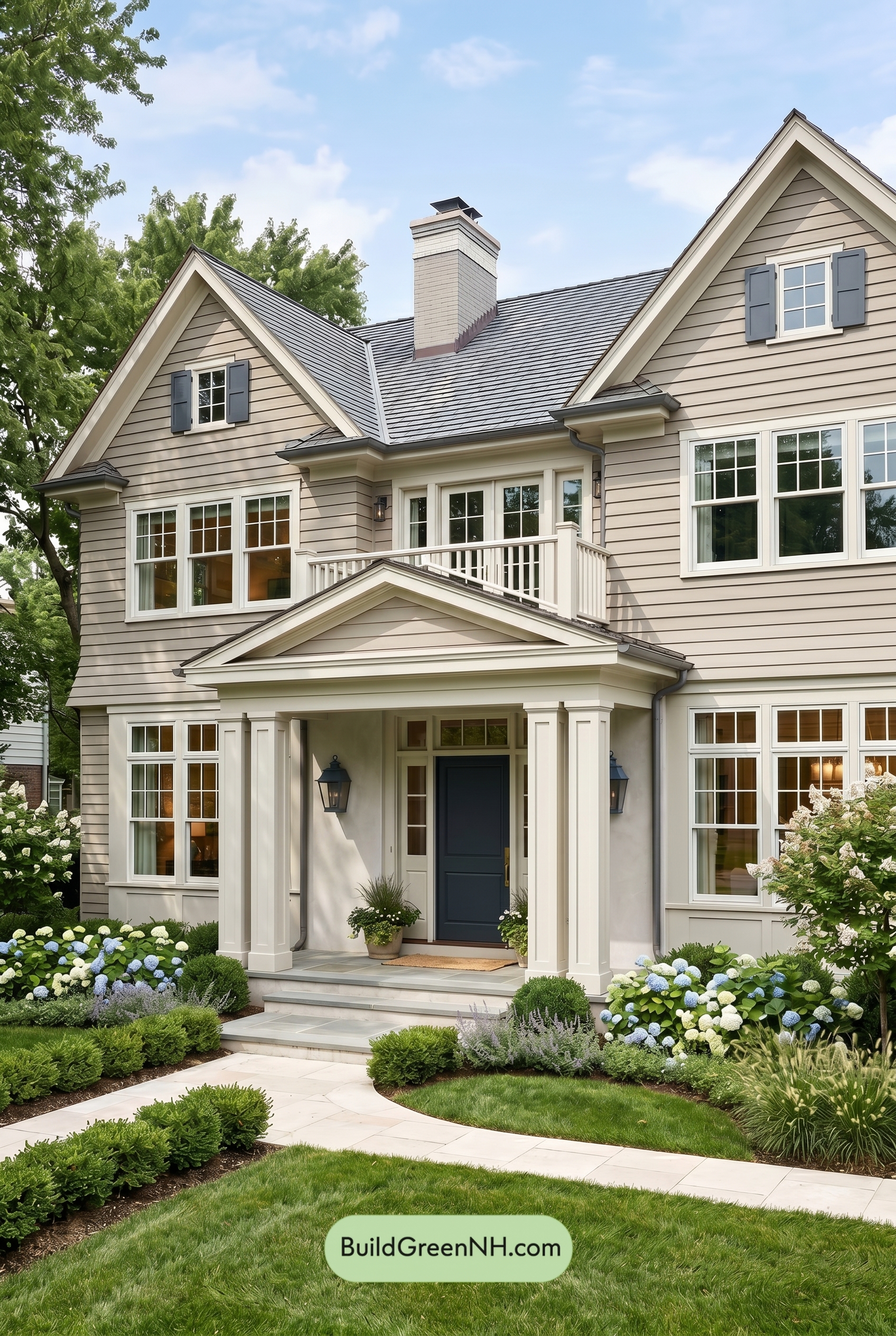

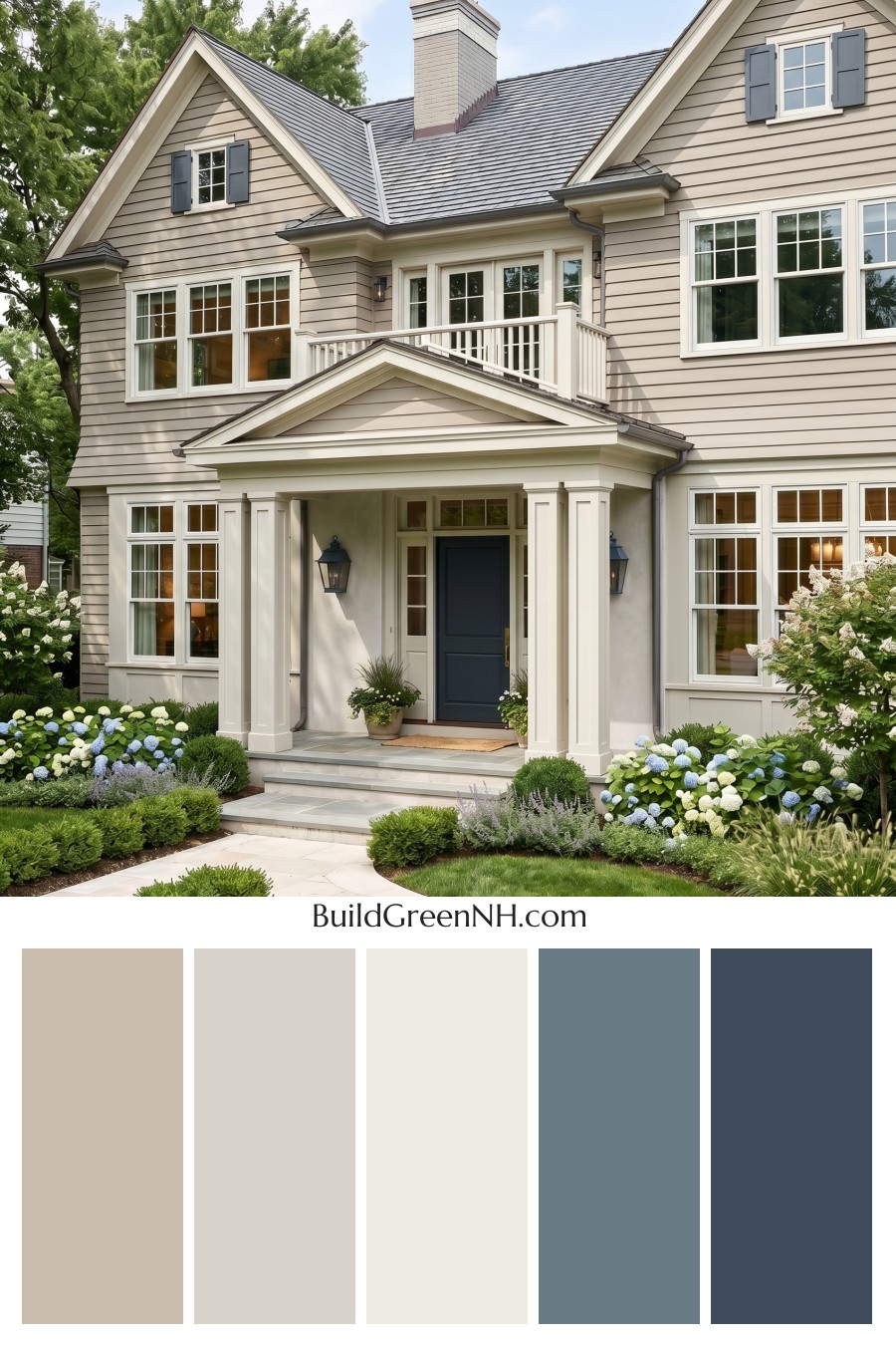
This exterior shines because its warm beige siding, crisp white detailing, and deep blue accents create a polished look that feels both timeless and inviting.
A Warm, Classic Base
The main siding is wrapped in a soft beige shade that gives the home a calm, welcoming presence. It works beautifully across the broad wall surfaces and gabled sections, adding warmth without feeling heavy. Because the beige sits in a neutral family, it lets the home’s architecture stand out while still blending naturally with the surrounding greenery.
Subtle variation in the beige tones across the wall sections adds depth to the exterior. The horizontal siding catches light and shadow nicely, making the color feel layered rather than flat.
Crisp White Details That Define the Architecture
The white trim is a major reason this scheme feels so fresh. Around the windows, rooflines, porch, columns, and railings, the bright white shade creates clean outlines that sharpen the home’s traditional features. It frames the beige siding beautifully and gives every edge a tailored, well-kept look.
The white window frames also bring balance to the design. With so many windows across the façade, the repeated use of white creates rhythm and symmetry, helping the exterior feel cohesive from top to bottom.
Blue Accents with Just the Right Amount of Character
The shutters introduce a muted blue shade that adds personality without overpowering the home. Placed high on the gables, they draw the eye upward and give the upper windows a charming, finished feel.
The front door uses a deeper blue shade, creating a stronger focal point at the entry. It feels grounded, elegant, and slightly dramatic against the surrounding white trim and porch columns. That contrast makes the entrance feel intentional and inviting.
A Roof That Grounds the Palette
The dark gray roof adds structure to the softer exterior colors. Its cool tone balances the warmth of the beige siding and connects nicely with the blue accents. It also gives the home a refined cap, making the overall palette feel more sophisticated.
The Overall Mood
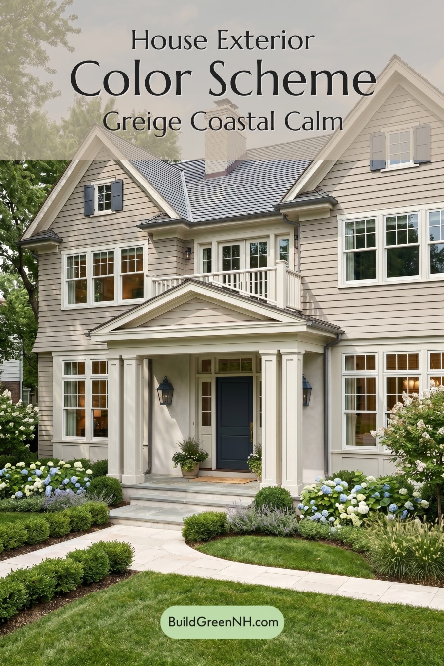
This color scheme feels graceful, fresh, and comfortably traditional. The beige keeps things warm and approachable, the white brings crispness, and the blue accents add a confident touch of color. Together, they create a home exterior that feels classic but not plain, elegant but still friendly.
It is a beautifully balanced palette for a house with strong architectural details, especially one surrounded by lush landscaping. The soft neutrals let the greenery shine, while the blue accents add just enough contrast to make the exterior memorable.
Next, see how this color scheme looks under different lighting simulations throughout the day.
Overcast
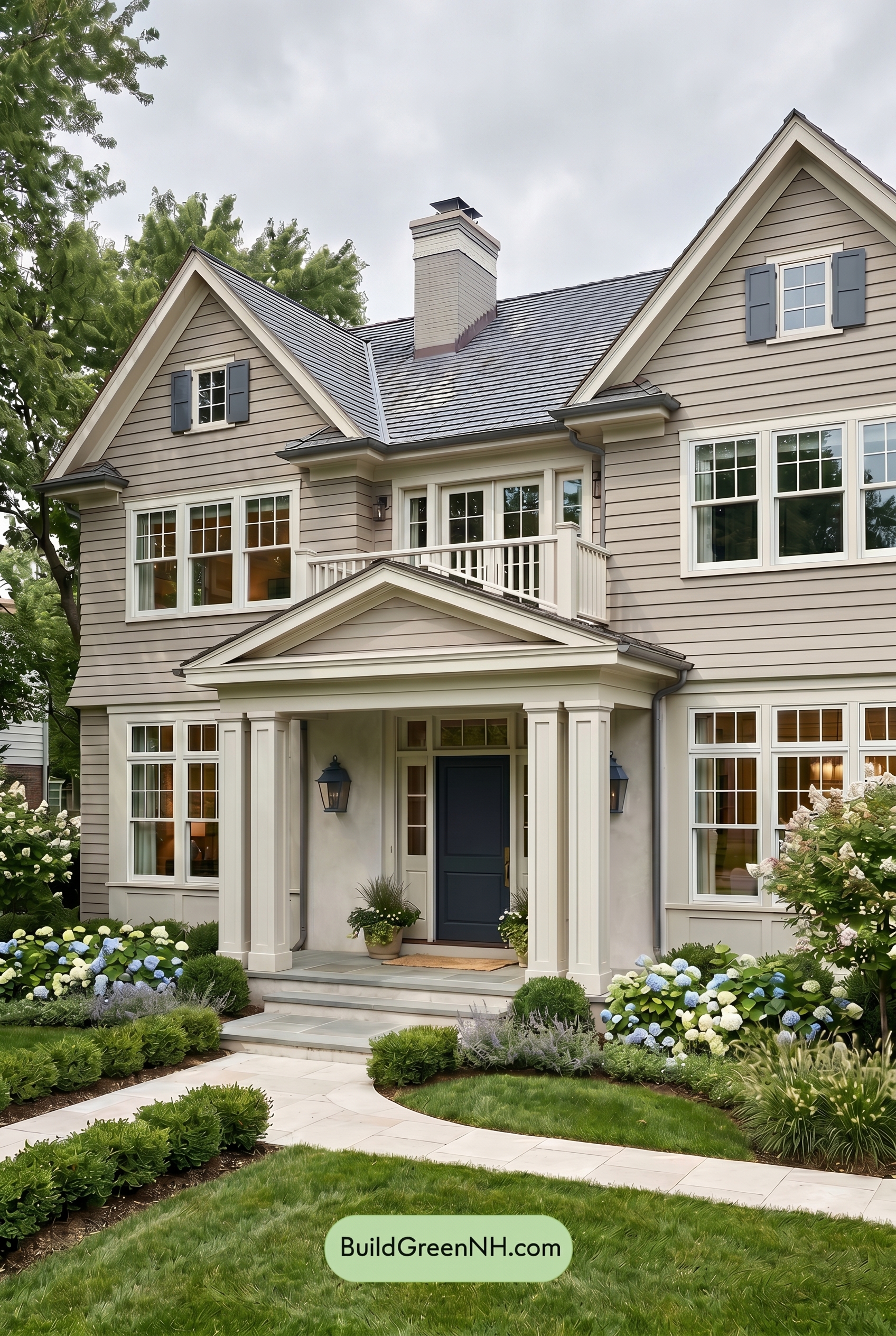
Under overcast light, the beige family on the main walls reads softer and a touch cooler than it would in neutral daylight, with some of its warmth gently muted. The white family on the trim, columns, railings, and window frames loses a bit of brightness, appearing more creamy and subdued rather than sharply crisp.
The blue family on the shutters and front door deepens slightly against the softened neutrals, while the overall contrast drops because shadows are broad and diffused. Instead of the clearer dimension of neutral daylight, the palette takes on a calm, cozy mood with smoother transitions between shades.
Golden Hour
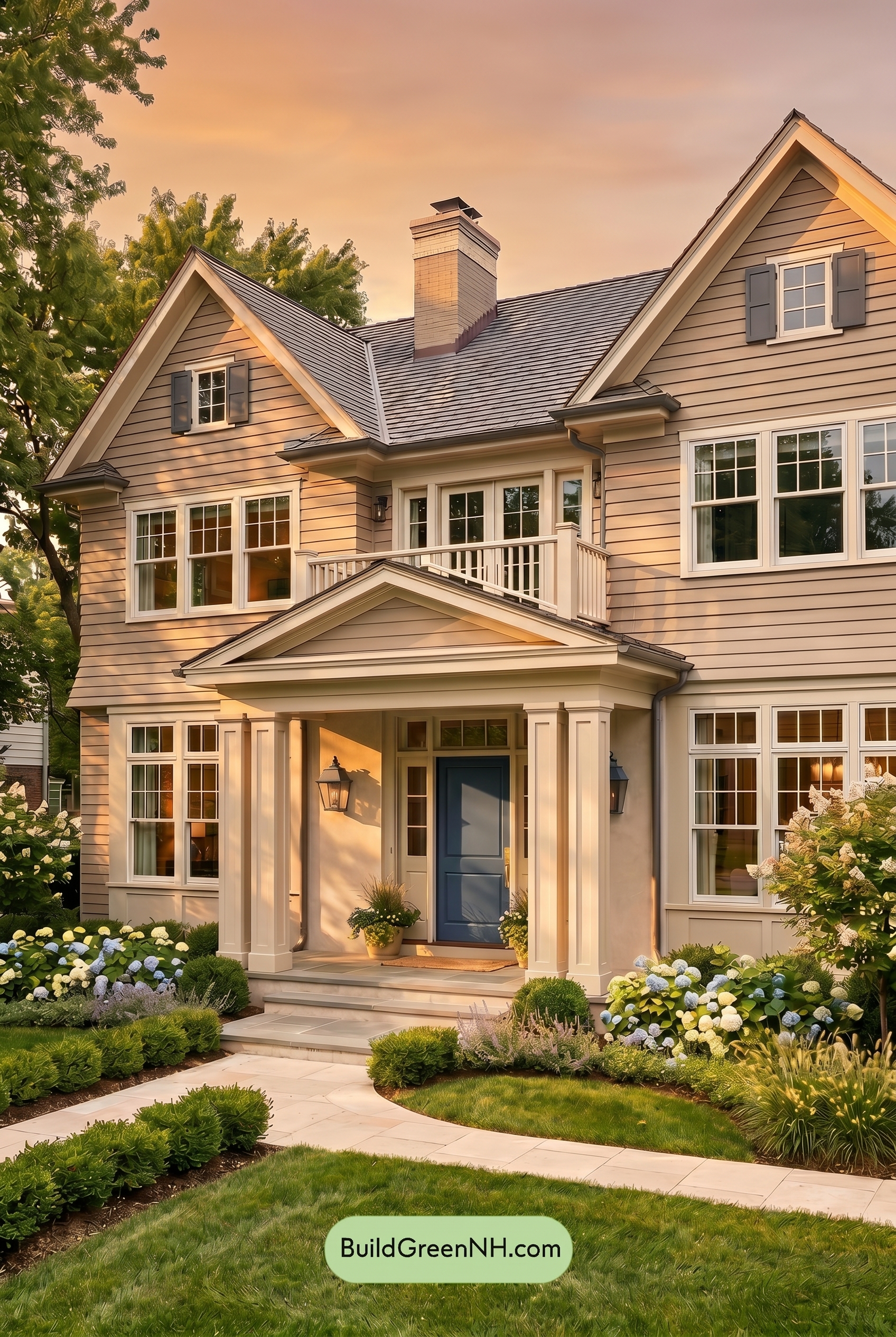
Under Golden Hour, the beige siding shifts from a clean neutral into a richer, honeyed shade, with more warmth and gentle saturation than it would show in neutral daylight. The white trim, columns, railings, and window frames take on a creamy glow, softening the contrast while still outlining the architecture beautifully.
The blue shutters and front door appear deeper and slightly more muted in the warm light, creating a calm contrast against the sunlit neutrals. Longer shadows add dimension across the siding and porch, making the whole exterior feel cozier, more layered, and more inviting than it would under flatter daylight.
Shade
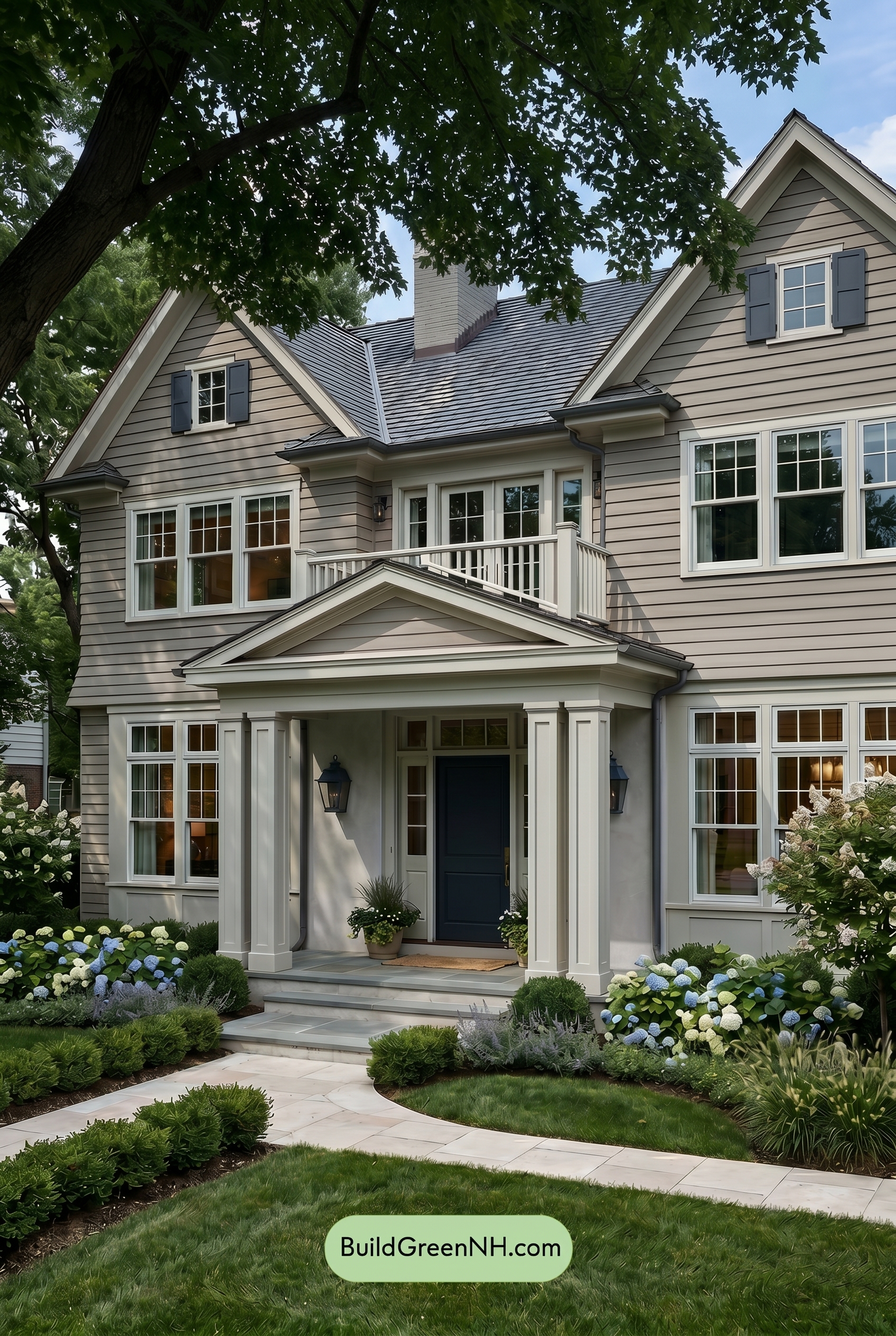
In shade, the beige family siding loses some of its sunlit warmth and saturation, shifting toward a softer, cooler neutral. The white family trim and railings appear less bright than they would in neutral daylight, creating a gentler contrast that feels refined rather than crisp.
The blue family shutters and front door deepen noticeably under the tree cover, taking on a richer, more grounded look. Layered shadows add dimension across the siding and trim, giving the exterior a calm, sheltered mood with a slightly more dramatic contrast than neutral daylight would provide.
Nighttime
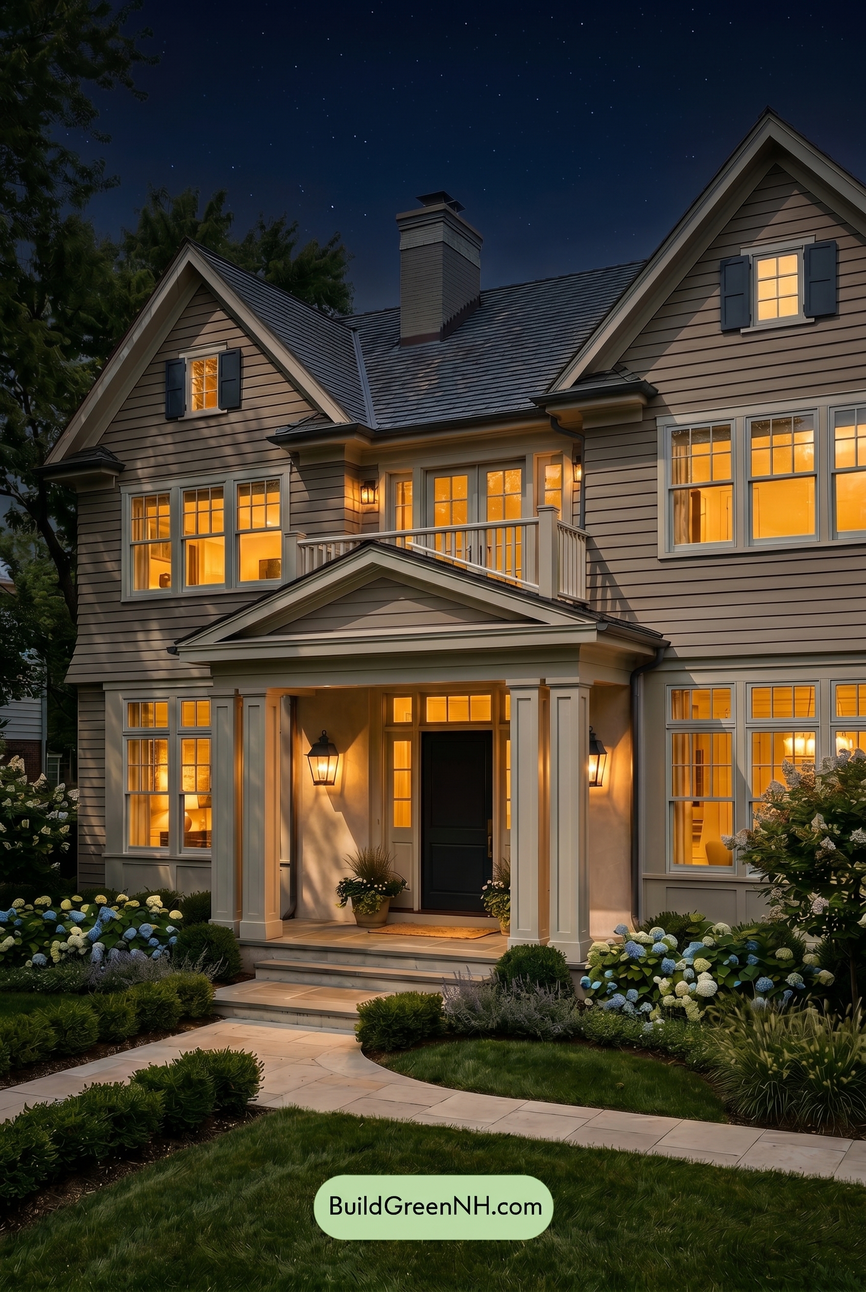
At nighttime, the beige siding takes on a deeper, warmer cast than it would in neutral daylight, especially where porch and window light spill across the walls. Shadows from the rooflines and siding grooves increase contrast, making the wall color feel richer and more saturated while the white trim shifts from crisp and bright to softly creamy in the lit areas.
The blue shutters and front door darken noticeably after sunset, reading moodier and more dramatic against the glowing windows. Cooler shadowed areas make the whites and beiges feel quieter, while the warm interior light adds a welcoming, cozy mood that daylight would make feel more balanced and subdued.
Pin these for later
Want More?
 American Craftsman Green Exterior Color Schemes: Pale Green Grace
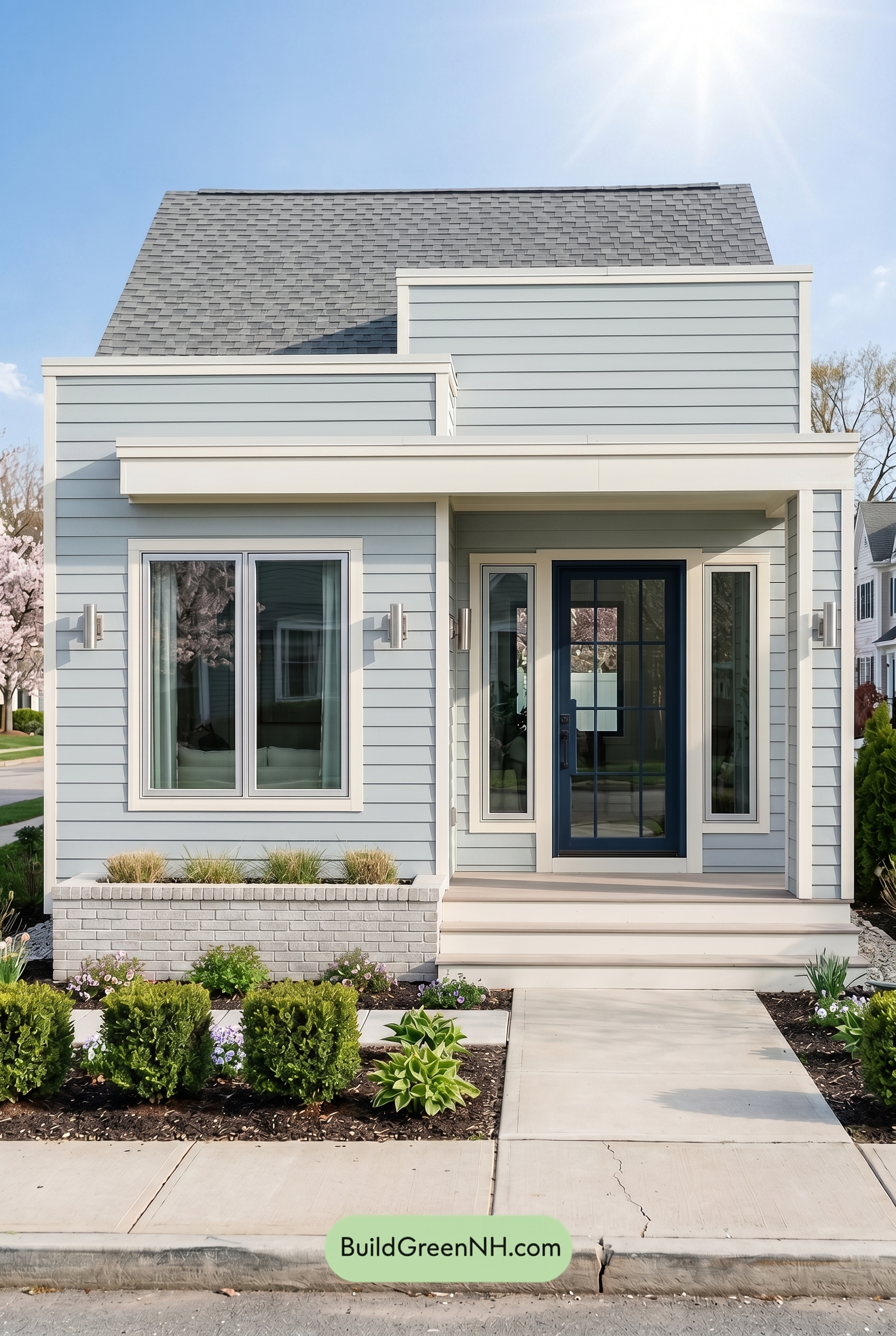 Small Modern Light Grey Exterior Color Scheme: Silver Grey Navy
 American Craftsman Green Exterior Color Schemes: Deep Green Warmth
 Light Grey Exterior Color Scheme: Cool Gray Heritage
 Small Modern Light Grey Exterior Color Scheme: Ash Grey Sage
Table of Contents