Last updated on
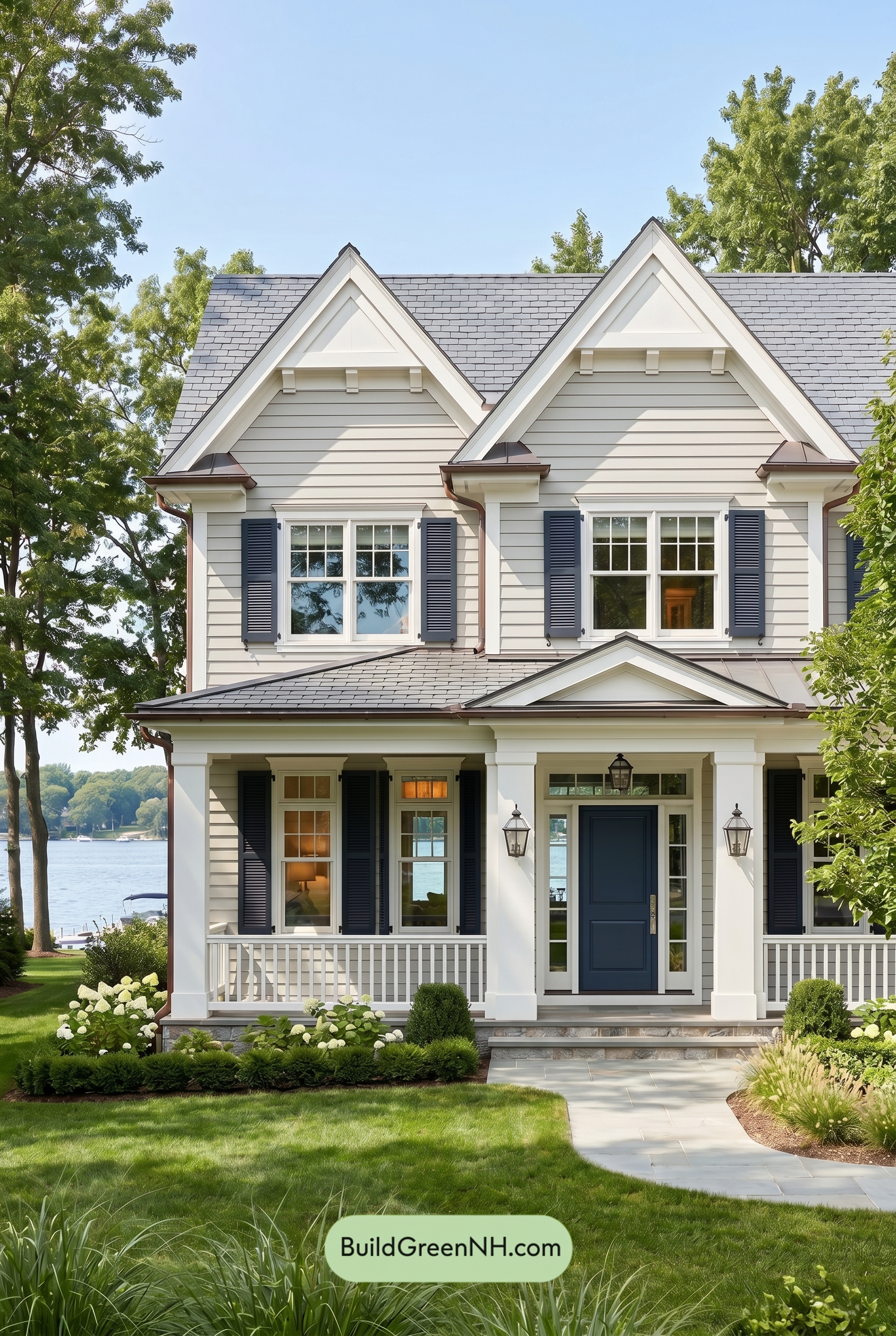

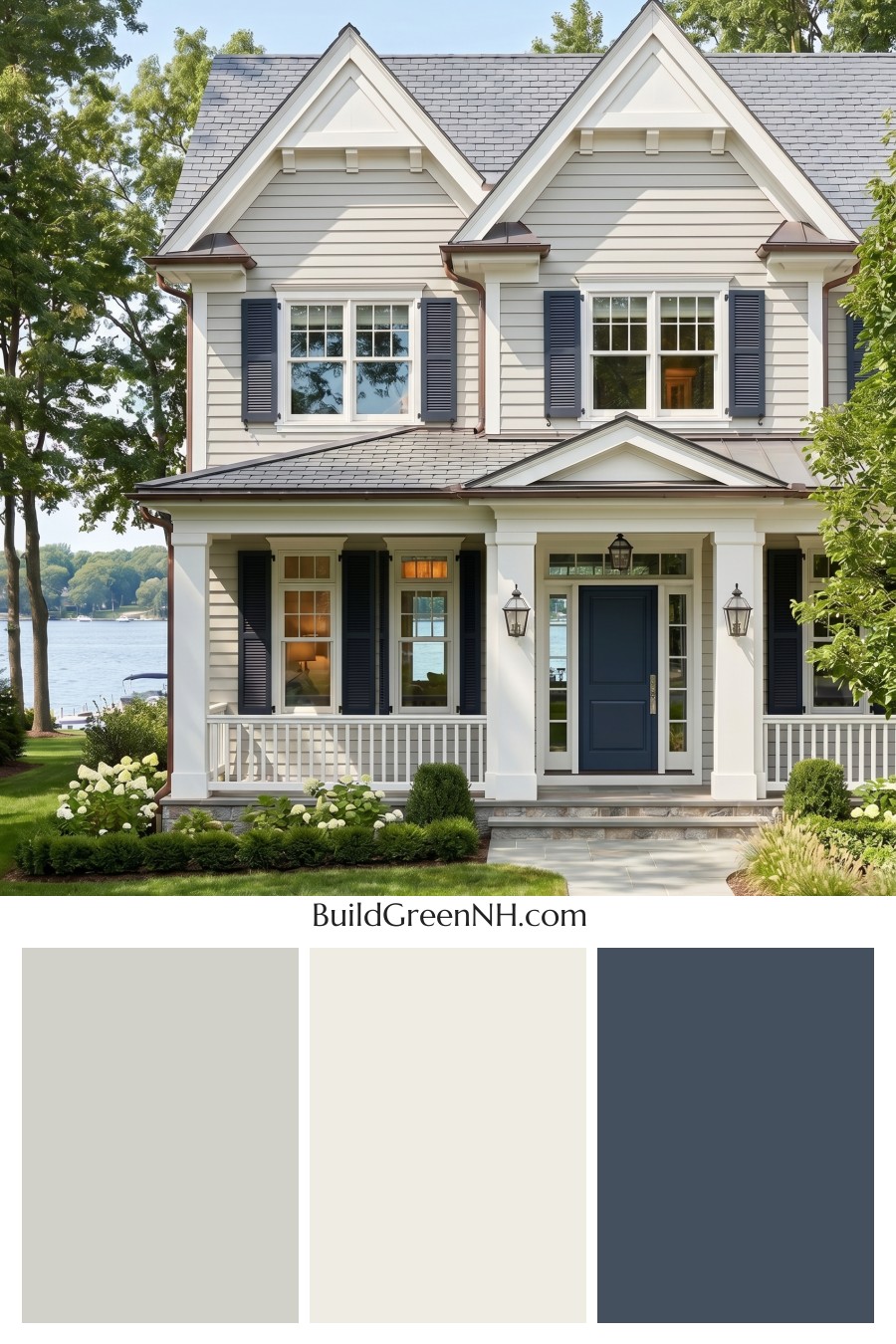
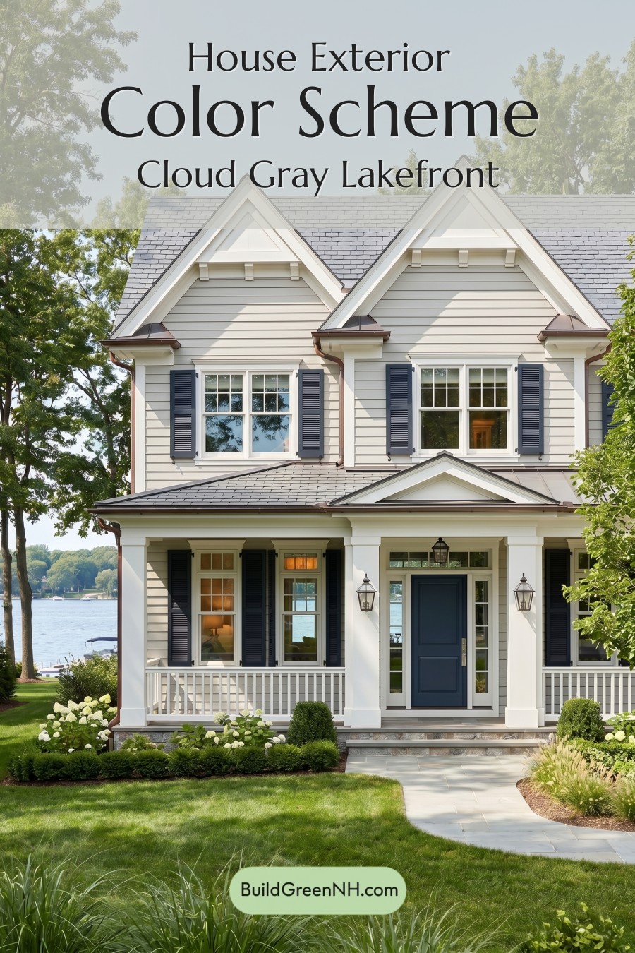
This exterior color scheme works beautifully because its soft gray body, crisp white detailing, and deep blue accents feel classic, fresh, and perfectly at home by the water.
A Fresh Take on Traditional Charm
The main siding is wrapped in a soft, warm shade of gray, giving the house a calm and welcoming foundation. It has enough depth to define the horizontal lines of the siding, but it stays light enough to feel airy and relaxed. This is a smart choice for a home with strong architectural features because it lets the structure shine without looking busy.
Above, the gable areas shift into a clean white shade, creating a bright lift near the roofline. That contrast makes the peaks feel crisp and architectural, while also keeping the upper portion of the home from feeling heavy.
Crisp White Details That Frame Everything
The white trim is one of the strongest parts of this palette. It outlines the windows, roof edges, porch columns, railings, and gable details with a polished, tailored look. Because the white is used consistently, it ties the entire exterior together from top to bottom.
The white window frames add another layer of freshness. Against the soft gray siding, they feel clean and classic. On the porch, the white columns and railings brighten the shaded areas and make the entrance feel open, gracious, and inviting.
Deep Blue Accents with Personality
The shutters bring in a deep blue shade that adds confidence and contrast. This darker accent gives the exterior definition, especially around the windows, and it keeps the light gray and white palette from feeling too quiet.
The front door repeats the same blue family in a rich, welcoming shade. It anchors the entry beautifully and creates a clear focal point. The result is refined but not stiff, coastal but not overly themed.
The Roof and Finishing Touches
The roof stays within the gray family, which is ideal for this scheme. Its medium gray tone complements the siding while adding subtle texture above the bright white gables. The slightly darker roofline also helps ground the home visually.
Small metal accents in a muted warm brown shade add a gentle note of contrast. They bring warmth to the cooler gray, white, and blue combination without competing with the main palette.
Why the Palette Works So Well
This color scheme succeeds because it balances softness, contrast, and clarity. The light gray siding feels relaxed and timeless. The white trim sharpens every architectural detail. The deep blue shutters and door add depth, character, and a sense of arrival.
Altogether, the house feels elegant, breezy, and beautifully maintained. It is a classic exterior palette with just enough color to feel memorable, making the home look both sophisticated and wonderfully livable.
Next, see how this color scheme looks under different lighting simulations throughout the day.
Overcast
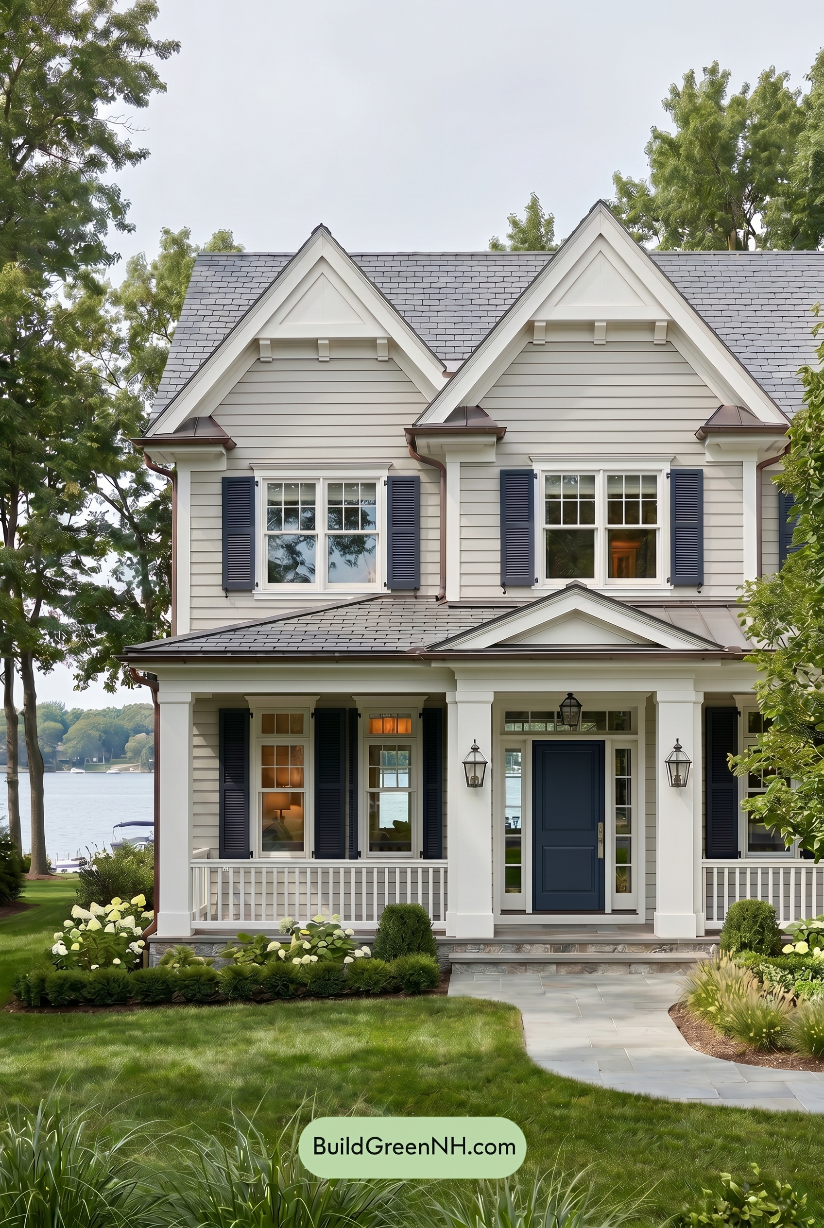
Under overcast light, the gray siding loses a bit of crisp brightness compared with neutral daylight, reading cooler and more muted as its warmth softens. The white upper walls, trim, columns, and railings look less sparkling and more gently shaded, with fewer sharp highlights to separate each architectural detail.
The blue shutters and front door gain a deeper, steadier presence: saturation feels slightly toned down, but the shade appears richer because glare is reduced. Shadows flatten and contrast eases across the façade, shifting the mood from bright and fresh to calm, polished, and quietly elegant.
Golden Hour
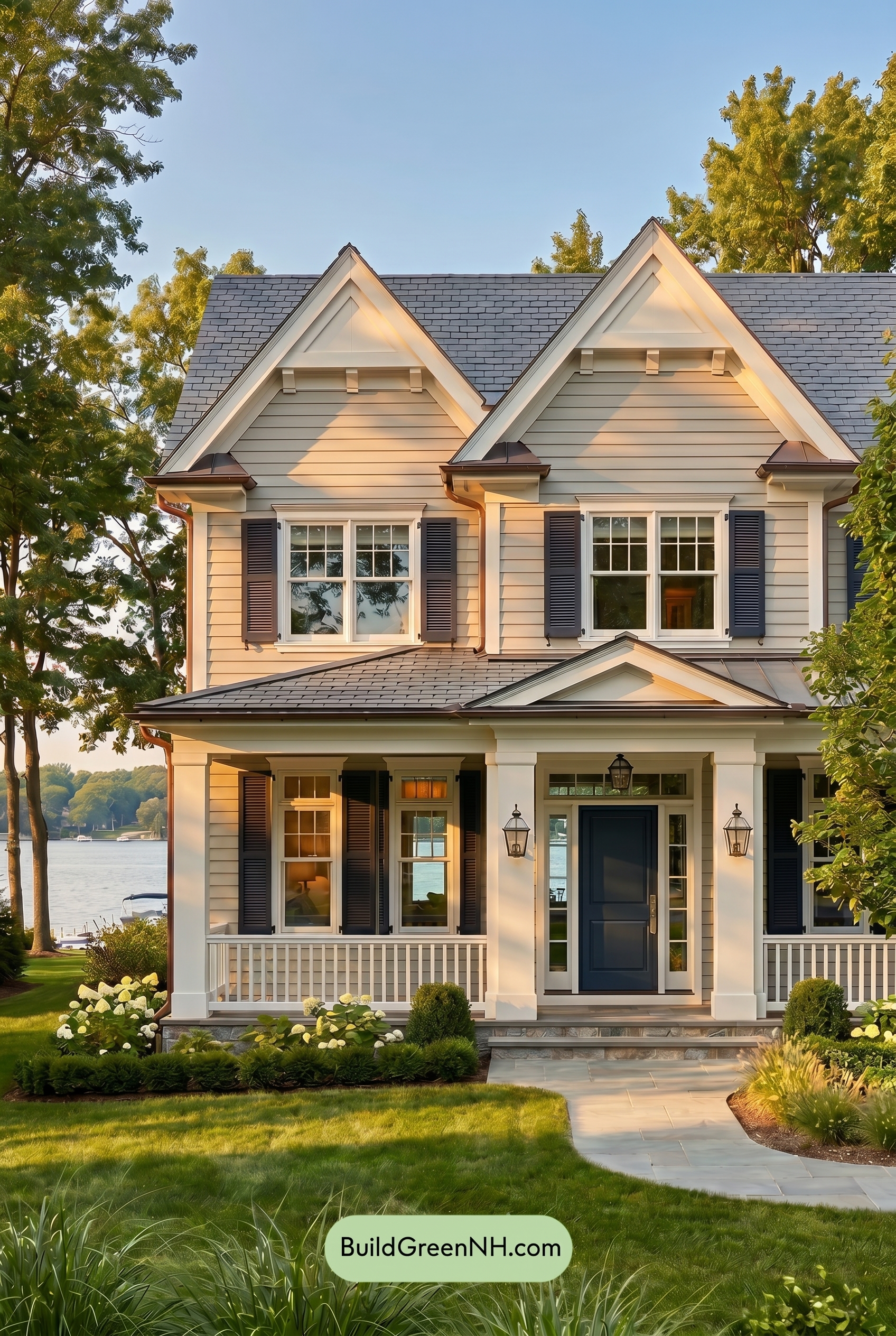
Under Golden Hour light, the gray siding takes on a warmer, softer cast, shifting from a cooler neutral daylight look into a gentler beige-gray shade. The white trim, columns, railings, and upper accents feel creamier and more luminous, with sunlit edges glowing while shaded areas become richer and more dimensional.
The blue shutters and front door appear deeper and slightly more saturated than they would in neutral daylight, especially where long shadows add contrast. Overall, the palette feels warmer, cozier, and more inviting, with stronger shadow play giving the exterior a calm, polished evening mood.
Shade
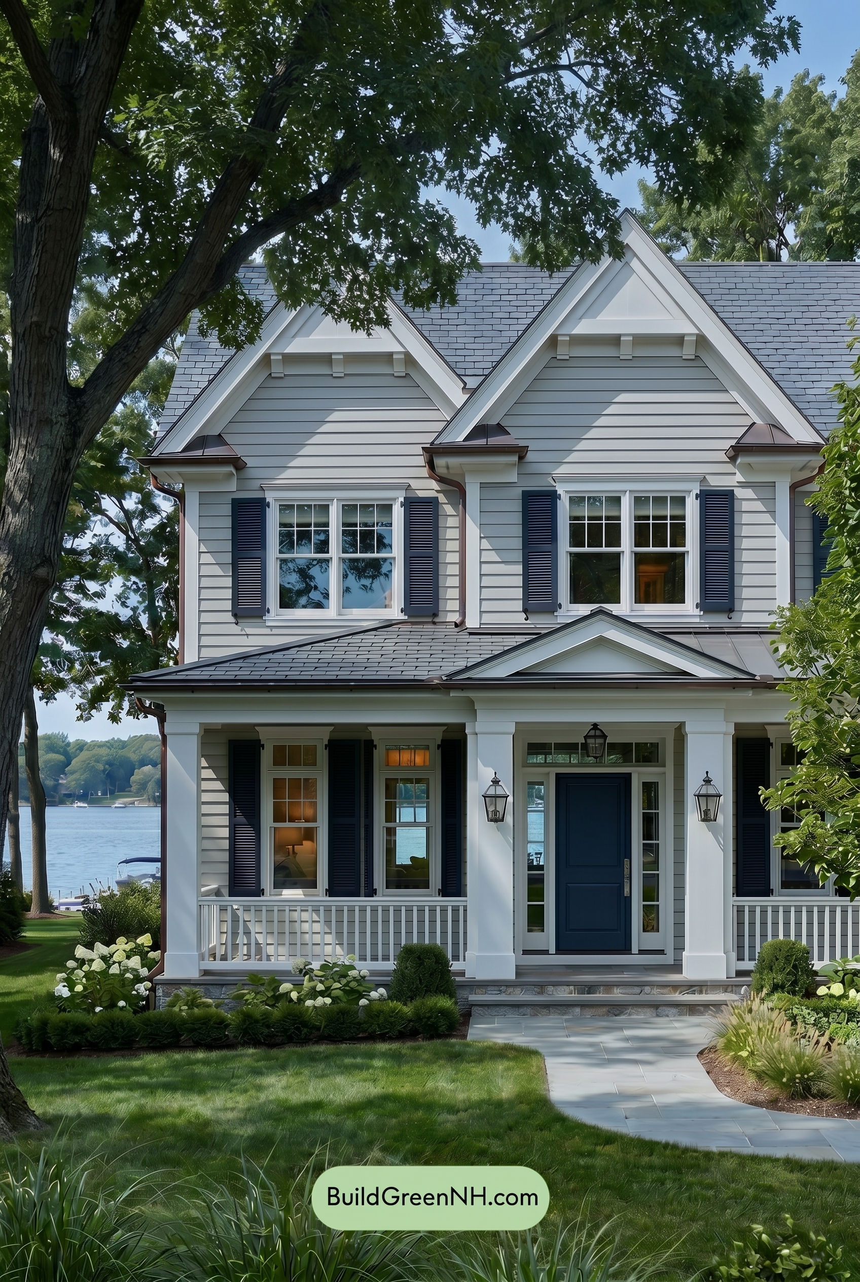
In shade, the gray siding takes on a cooler, slightly deeper cast than it would in neutral daylight, with less brightness and a softer sense of saturation. The white upper details, trim, columns, and railings feel more muted and gentle, shifting away from crisp brightness toward a calmer, shaded white.
The blue shutters and front door appear richer and more dramatic in the shade, gaining depth as shadows increase contrast around the windows and entry. Overall, the palette feels quieter, cooler, and more refined, with the shaded areas creating a relaxed mood while still letting the blue accents stand out beautifully.
Nighttime
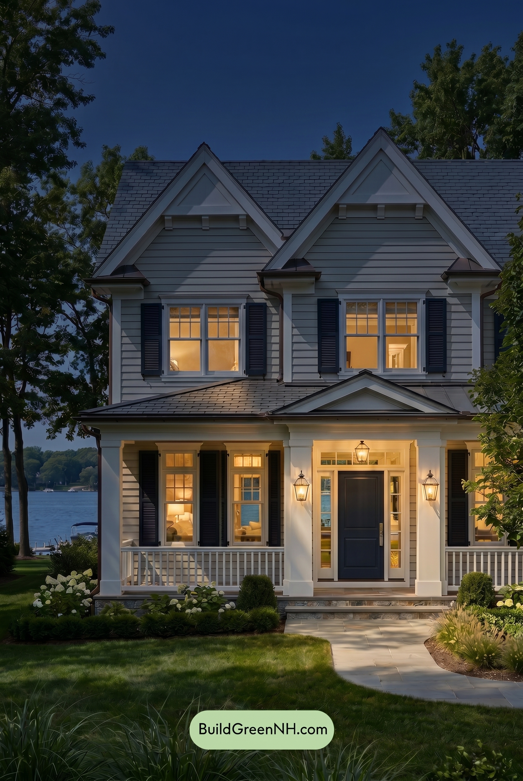
At night, the gray siding reads deeper and more saturated than it would in neutral daylight, with shadows adding a cooler, layered quality across the horizontal lines. The white trim and upper details shift from crisp and bright to softer, warmer shades wherever porch and window light touches them, creating a gentle glow against the darker facade.
The blue shutters and front door become richer and moodier after dark, gaining contrast against the illuminated white elements and subdued gray walls. Warm interior light adds an inviting balance, making the overall palette feel cozier, more dramatic, and more intimate than its cleaner daytime appearance.
Pin these for later
Want More?
 American Craftsman Green Exterior Color Schemes: Deep Green Hearth
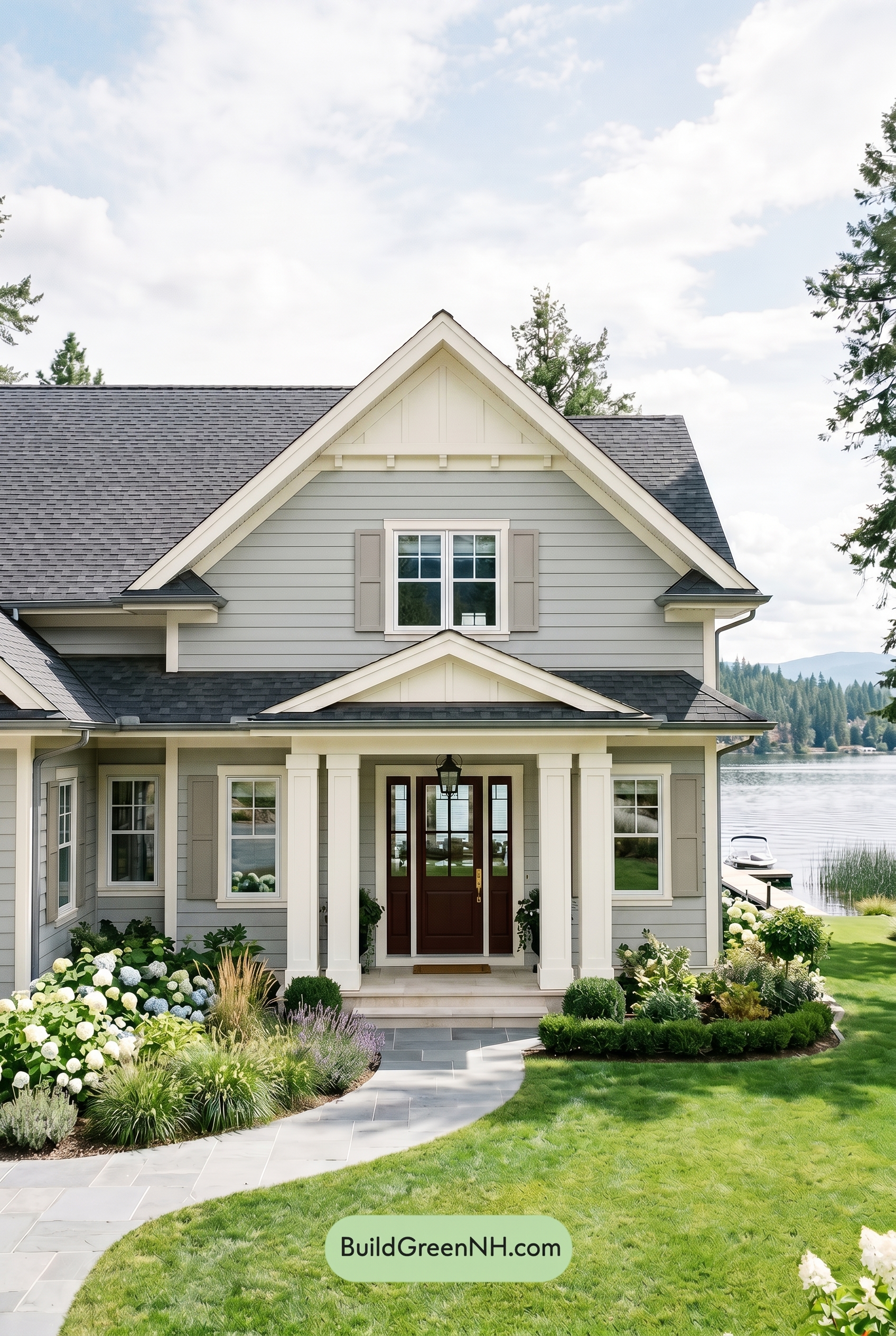 Light Grey Exterior Color Scheme: Smoke Gray Elegance
 Small Modern Light Grey Exterior Color Scheme: Dove Grey Teal
 American Craftsman Green Exterior Color Schemes: Olive Porch Calm
 Light Grey Exterior Color Scheme: Pale Gray Warmth
Table of Contents