Last updated on
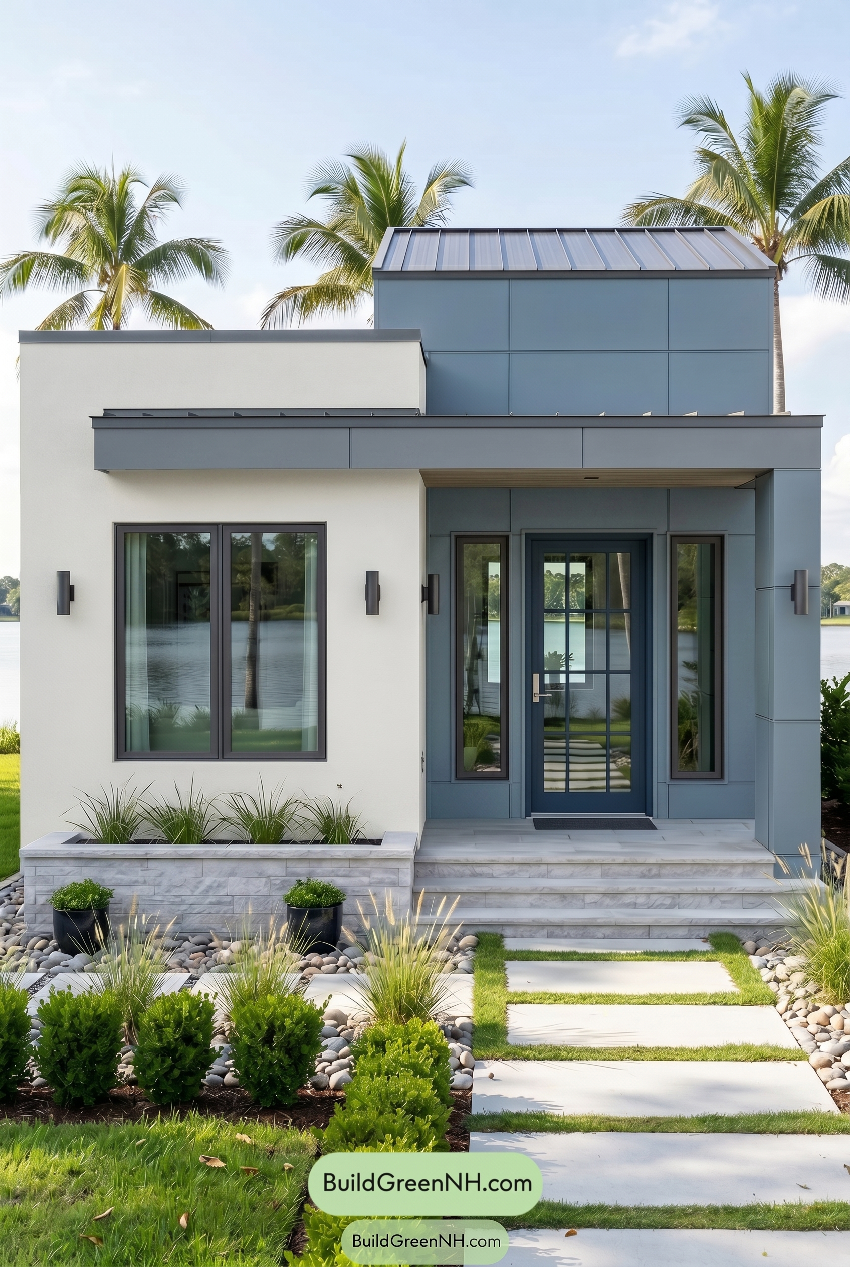

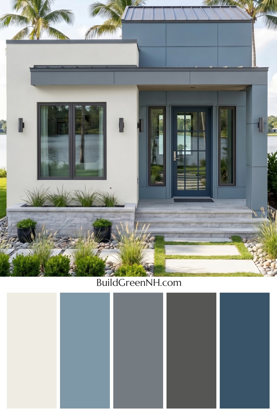
This crisp mix of airy white, muted blue, and cool gray gives the home a fresh modern presence that feels calm, coastal, and beautifully composed.
A Clean White Base With Modern Warmth
The main wall color sits in the white family, giving the house a bright, open feeling without looking stark. This soft shade of white works beautifully across the larger wall sections, especially on the left side of the facade, where it keeps the architecture feeling light and balanced.
Because the home has strong modern lines, the white exterior helps soften the overall look. It reflects natural light, highlights the clean geometry, and creates a calm backdrop for the richer blue and gray elements to stand out.
Muted Blue Adds Depth and Personality
The upper wall and entry surround use a muted shade from the blue family, adding a cool, sophisticated layer to the exterior. This blue has enough depth to feel substantial, but it stays soft enough to suit the relaxed setting.
The blue columns around the front entry are especially effective. They frame the doorway with confidence and create a welcoming focal point. Rather than using blue as a small accent, the design gives it real architectural presence, which makes the home feel intentional and polished.
Gray Trim Keeps Everything Sharp
Cool gray trim ties the white and blue together with a refined edge. Around the rooflines, fascia, and window frames, the gray details add definition without overpowering the softer wall colors.
The window frames in a deeper gray shade create crisp contrast against the white siding and echo the modern metal roof. This repeated gray family keeps the palette cohesive from top to bottom, giving the home a streamlined, contemporary finish.
A Blue Front Door That Feels Seamless
The front door continues the blue family, making the entry feel integrated rather than separate. Set within the blue-paneled porch area, it creates a layered tone-on-tone effect that feels calm and architectural.
This approach is subtle but strong. The door does not need a loud accent color because the surrounding blue already gives the entry depth and character. The result is elegant, modern, and easy on the eye.
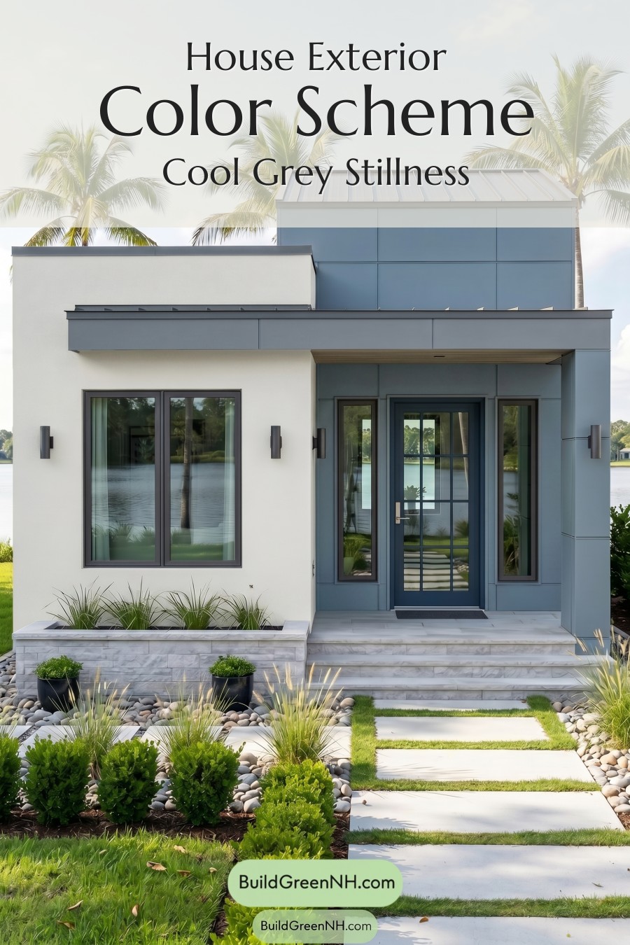
The Overall Mood
This exterior color scheme feels fresh, breezy, and upscale. The white brings brightness, the muted blue adds personality, and the gray trim provides structure. Together, they create a look that feels perfectly suited to a modern home near water, greenery, or any sunny landscape.
What makes the palette work so well is its restraint. Every color has a purpose. The white opens up the facade, the blue emphasizes key architectural volumes, and the gray sharpens the details. It is a calm, confident combination with just enough contrast to feel memorable.
Next, see how this color scheme looks under different lighting simulations throughout the day.
Overcast
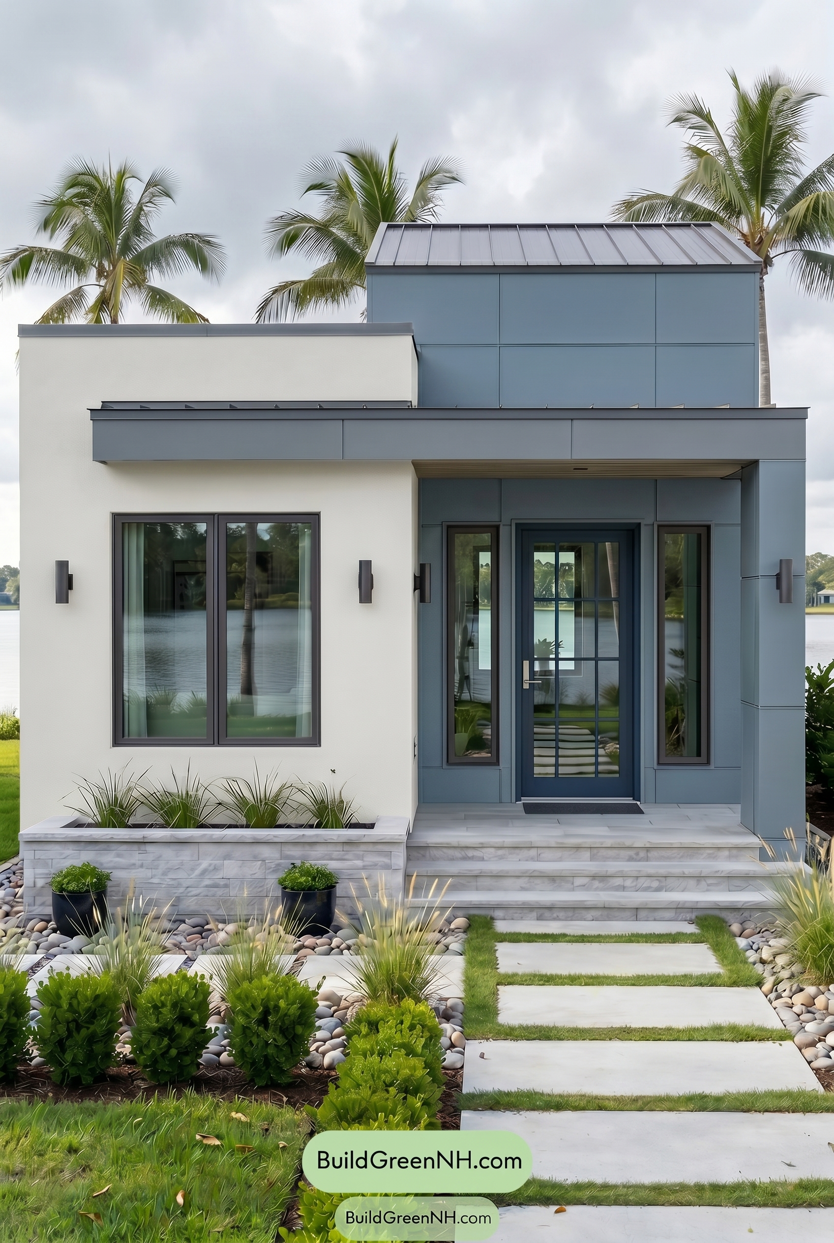
Under overcast light, the white family on the main wall looks less bright and crisp than it would in neutral daylight, taking on a softer, slightly cooler cast. The blue family on the upper wall, columns, and front door appears more muted and deeper, with saturation dialed back so the shades feel calm rather than vivid.
The gray family in the trim and window frames blends more gently into the blue shades because shadows are diffused and contrast is reduced. Overall, the palette shifts from clean and defined in neutral daylight to quieter, cooler, and more atmospheric, giving the exterior a refined, relaxed mood.
Golden Hour
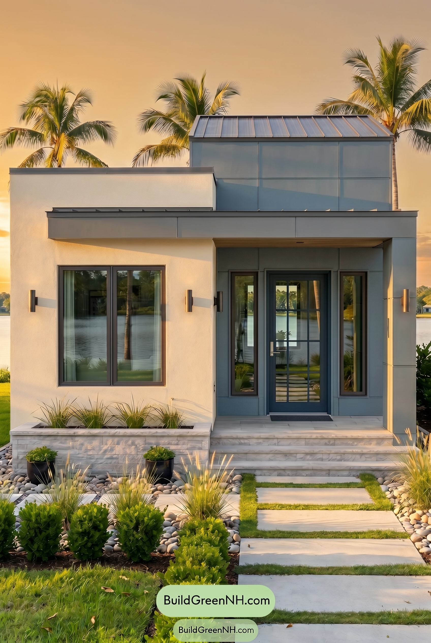
Under Golden Hour, the white family on the main walls takes on a creamy, sun-washed warmth instead of the cleaner, crisper look it would have in neutral daylight. The blue family on the upper wall, columns, and front door appears more saturated where the light grazes it, while shaded areas deepen into cooler, moodier blue shades.
The gray family in the trim and window frames shifts softer and warmer, with long shadows adding contrast along the rooflines, recesses, and entry. Compared with neutral daylight’s flatter balance, the whole exterior feels more relaxed and inviting, with brighter highlights, richer darks, and a warmer overall mood.
Shade
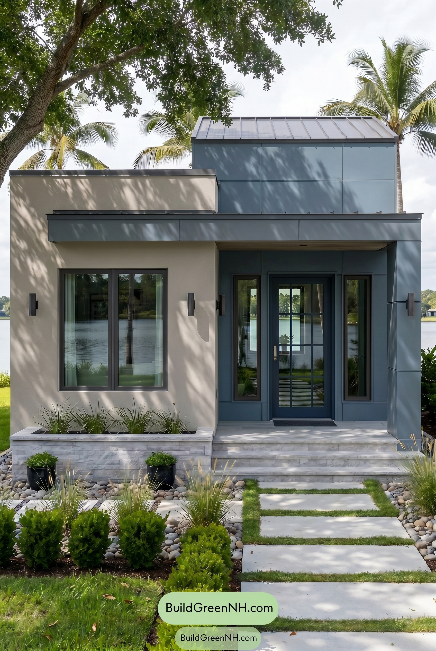
Compared with neutral daylight, shade pulls back the warmth and softens the brightness of the white family, giving the main walls a cooler, quieter feel. The blue family on the upper wall, columns, and front door deepens into a moodier shade, with saturation feeling richer but less crisp.
Layered shadows from the trees add movement across the facade, making the gray family trim and window frames appear darker and more defined. The overall contrast becomes stronger in the recessed areas, shifting the mood from bright and airy to calm, shaded, and architectural.
Nighttime
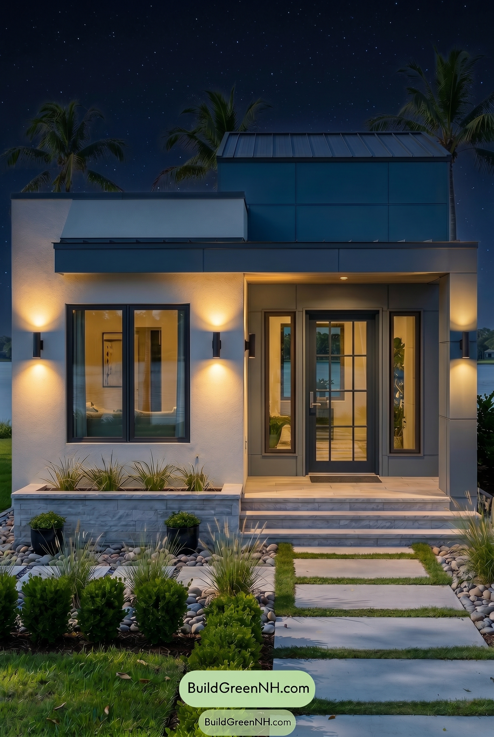
At night, the white family walls shift away from the crisp balance they would have in neutral daylight, taking on a softer, warmer glow wherever the exterior lights wash across them. The blue family upper wall and columns deepen in saturation, reading moodier and more dramatic as shadows gather along the panels and roofline.
The gray family trim and window frames appear stronger against the illuminated walls, with sharper contrast around the openings and entry. Warm pools of light make the overall palette feel more inviting, while the darker blue shades and deeper shadow pockets add a sleek, calm nighttime mood.
Pin these for later
Want More?
 American Craftsman Green Exterior Color Schemes: Deep Green Hearth
 Light Grey Exterior Color Scheme: Smoke Gray Elegance
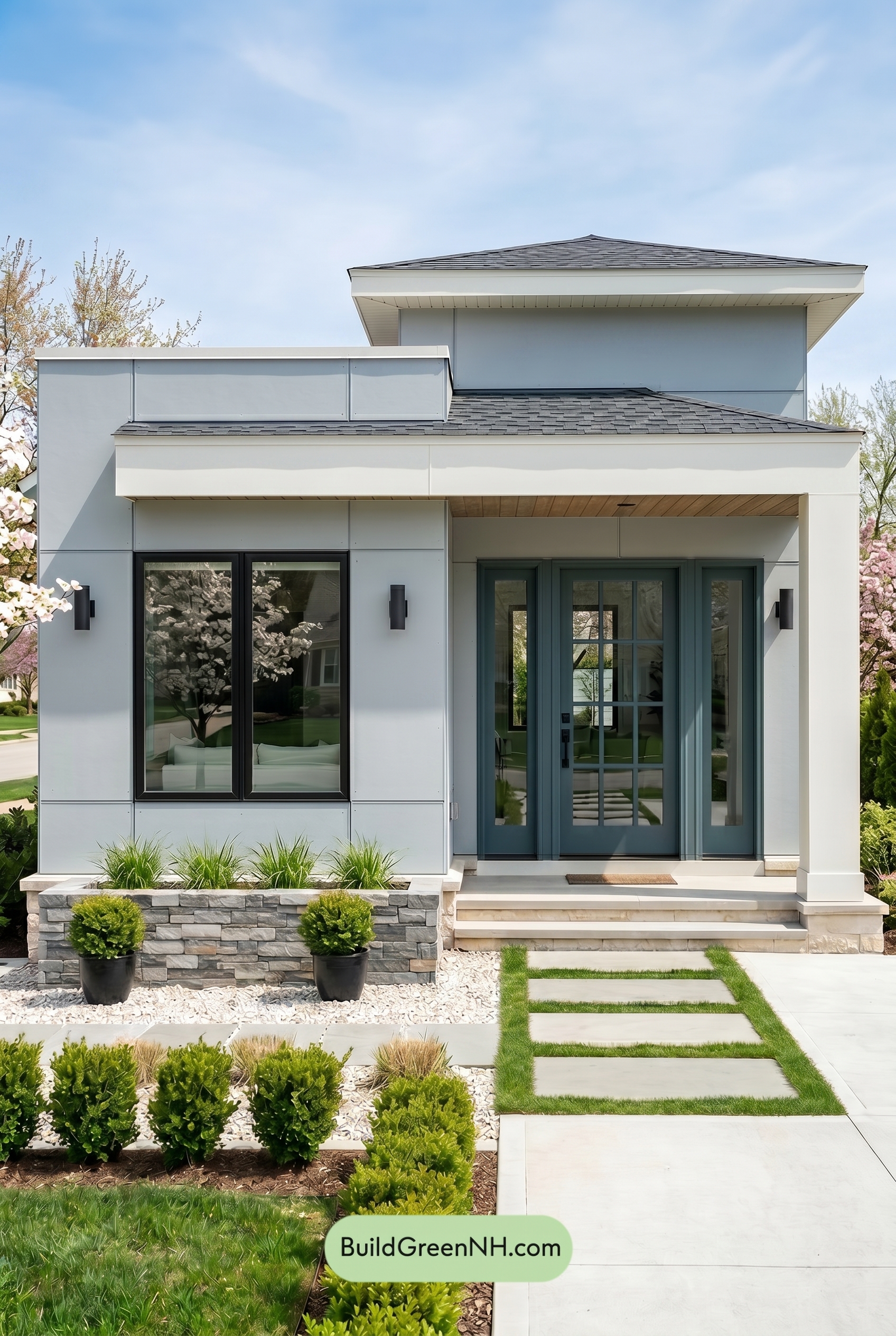 Small Modern Light Grey Exterior Color Scheme: Dove Grey Teal
 American Craftsman Green Exterior Color Schemes: Olive Porch Calm
 Light Grey Exterior Color Scheme: Pale Gray Warmth
Table of Contents